Monday, September 26, 2011

October Class Schedule

October 2011 Classes


  • October 6- Colorful Aspens
I’ll show you how to capture the gorgeous colors of aspen trees turned to gold. 

You’ll get a review of the basics of tree anatomy, a bit about how to approach light colored bark in and out of the shadows, and some ideas about how to handle a background and the sky behind them.


Bring your own photos or borrow one of mine (reserve your print in advance, please). Any medium is welcome.


  • October 13- Fall Mountain Vista Paint Along

A NEW class!
Join me to paint an inspirational photograph together! I have a beautiful shot of a grand vista in Colorado with some very interesting challenges in it: distant aspen-dappled mountains, a blue lake, and a large pine and aspens in the fore. I’ll pass out the photo at class and lead a discussion on how to solve the problems. You bring your materials and come ready to explore what you think will work. Use any media you like. I'll be working in PanPastels.

 
  • October 20- How to Make a Lousy Photo into a Wonderful Painting

I’m going to share several of my own ‘awful’ photographs with you and discuss how we might go about making them into good paintings. So often a picture has some promising elements, but it just misses. Don’t toss those out! Let’s discuss how you can use several photos and combine them into one successful composition. So look through your photos for some awful inspiration! 

  • October 27- Sunlit Snow and Shadows

The rules for shadows are so clearly seen in the snow. I’ll also give you a review of the basics of how to paint snow in sparkling sunlight (but I'm not going to paint all those snow-dotted trees--come see why and what I do instead!)

I’ll be painting in gouache with PanPastels over the top, so you’ll get a taste of wet and dry media together. Any medium is welcome.


  • PLEASE NOTE: At the present time I plan to continue classes until November 17th, so if you have any credited classes, please arrange to use them during this time. No carryovers  to 2012, please! Thanks, gang!

September 29- Critique and Potluck Brunch


We’re planning a painting critique and potluck brunch this Thursday, and we’d love to have anyone join us. You might have attended our critiques before-- if you have you know how fattening delicious it can be and how much fun we have!

Bring your paintings ready to show, but not necessarily matted or framed. I’ll be happy to look at work in progress, as well. I’d love to view a small body of work so that we can get a sense of the direction you’re traveling, and will happily guide you in questions you have about individual paintings, too. Any medium, style, or subject matter is welcome.


At the critique we’ll start with brunch and a discussion about what it means to grow as an artist, especially as you become more mature in your work. Does that mean that you cease to change? Of course not. But the changes change, if you know what I mean. Let’s talk about it! Then we’ll view the work of one artist at a time.

We’re in a new location, in case you haven’t joined us recently, at Christ Community Fellowship church. We still have a small kitchen with a microwave, if you need to heat anything. It’ll be informal--we’ll be using paper plates. Bring your artwork and some kind of wonderful dish to share. 

Class begins at 11:30, but the doors open earlier to set up the meal. As usual, the cost is $25.00, payable at the door. If you plan to attend, please RSVP. 

See you Thursday!
Deborah


Tuesday, September 20, 2011

Cloud Boxes Tutorial

I just have to link you to this wonderful little tutorial by artist John Hagan on CLOUD BOXES.

I've used this as a theory for years, taking things a little farther, but I want you to see the original idea, and his wonderful illustrations. Here in New Mexico we often see this kind of perspective in the sky.

Put this one into your favorites!
Deborah

Monday, September 19, 2011

September 22- Extract Nature’s Colors


Let nature inspire the colors you use.

The colors of nature are truly the inspiration for the way we think about and use color, of course. In this class I want you to spend some time making a record of various colors you see together in the natural world, extract color charts from what you observe, and then create an interesting abstract painting using the charts. 

Perhaps you see cottonwood leaves turning colors, or the grasses in the front yard. Maybe you’re inspired by a ristra on your deck or some flowers, or weeds that are beautiful (the colors can be!) Remember—not the pot on the porch, not the paint on the wall—only natural colors. It’s best if these are strictly related colors (i.e. not the sky behind the trumpet vine, only the colors of the plant itself; the flowers and their leaves, not the warm, dark dirt below them.) 

You can see in the photo how I've chosen some of the colors from the trumpet vine and arranged them into a palette of colors above the photo. You can do one of several things: 
  • You might want to take good color photos that are fairly current before this class and print them out to bring with you.
  • You could make some color studies on location and bring photos with you of the things you studied. This could be more practical if you decide the entire cottonwood tree is your best inspiration, for instance. 
  • You may alternatively choose to bring items to study in class, perhaps a ripe pear, a beautiful flower or weed, some leaves on a branch, whatever you like.

In class we’ll make a palette of colors from nature, whether you use a photo or work from life—but the trick is, we will NOT paint those references. Instead, I want you to find beautiful harmonies of colors and analyze the proportions of each one, as well as analyzing the dark and light, warm or cool colors, and then use them to make a color chart.  

From this you will paint an interesting abstraction in class. Do I hear someone muttering that you don’t like abstracts, that they never work out? Well, never fear--this exercise will give you a template to use, so that won’t be a problem.

To do the class you'll need a clean, white surface large enough to accommodate a palette of five to seven color swatches, as well as whatever paper or canvases you want to use to paint the abstractions. I have templates for the experiment in abstraction that are 7" x 8" or 6" x 6"-ish, which you can adapt to make larger. I suggest keeping it somewhat smaller in size, however, because if you're inspired by this experiment, you might want to make more than one palette and/or abstraction. It's really quite interesting to see the results.

So come this week with an adventurous spirit and see what happens! I'm sure it will be fun and inspiring! 

As usual, the class is $25.00, payable at the door. If you plan to attend, please RSVP now.  
 
The studio opens about 11:00, and class is from 11:30-2:30. (Feel free to bring your lunch. We have a microwave.) Remember, we're at the new location at CCF.
See you Thursday!
Deborah

Inspired by the Artist class results

I often find the work of other artists inspirational, and over the years have come to rely on dipping into the visual stimulation of looking at artwork to spur me to be more creative. In this Internet age that has become easier to do than ever before. Our recent class was meant to stir up some creativity this way.

We began by reviewing the elements of art to help analyze what this artist did so well and give us a handle to grab onto as we experimented. I challenged my students to look at this list and find three of the key descriptors about the artwork they were examining. It's just too easy to be overwhelmed by how good an artist is at doing what you would like to do, and thus missing the way or ways you might actually learn from them!

Here's a list of basic art elements to examine:
  • Color
    • Is the color soft, harmonious, monochromatic or brilliant, exciting and saturated? Is there a pleasing unity or contrasting variety of color? Color creates mood.
  • Contrast
    • Many elements may contrast in a painting; size, colors, values, etc. The area of highest contrast draws the eye first.
  • Texture
    • Physical strokes on the paper make texture, as does the look of a surface quality. Varied textures makes interest: rough, smooth, soft, hard. One texture is flat and boring.
  • Strokes
    • Consider the variety, energy, and the scale of strokes. They can be thick, juicy and descriptive, contrasted with smooth passages.
  • Detail
    • Smaller touches that describe how something looks. Eye-catching. Too much overall becomes no detail at all.
  • Edges
    • Soft and hard edges, both “lost and found”, help to sculpt space in a painting.
  • Line
    • The continuous mark made on some surface by moving a pen or brush, or the edge created when two shapes meets. Often an outline, contour or silhouette. Adds emphasis, but can detract if over used.
  • Gradation
    • Gradating of elements in size makes linear perspective, and in color and value makes aerial perspective. It creates form, and moves the eye around a form.
  • Repetition
    • Repeated elements make interesting variety. Monotony results when there is little variation.
  • Balance
    • Balance is created by repeating same shapes or giving equal weight to all quadrants or parts of a composition, or may result from a harmonious use of the elements.
  • Dominance
    • One to three dominant elements are interesting and may harmonize a composition, adding needed emphasis.
  • Form
    • Form has height, width, depth, defined by light and shadows. There are two types of form, geometric (man-made) and natural (organic form). Often key in painting a still life or a portrait.
  • Movement 
    • The overall direction of the eye through the painting, giving action to the piece.
  • Rhythm 
    • Syncopated movement that starts and slows the eye’s path through the painting.
  • Proportion
    • Creates a sense of correct scale so that all the objects appear to be related properly in space.
You'll recall from last my last post that I was inspired by Richard Schmid's floral sketches. My demonstration painting was meant to use three key elements of his work that I wanted to emulate: the clean edges and soft transitions he creates; the exquisite rhythms of his work, and the beautiful variations in texture he uses, especially in the backgrounds.

I worked in gouache on a piece of Arches 300 lb. cold pressed watercolor paper that's approximately 6" x 8" in size, using a photograph of some flowers I had on hand.


While I can't claim to have digested all of the information in this one quick painting, I was greatly inspired by his work and I learned a lot from emulating him. That's exactly what I hope this lesson will do for my students. Be inspired!

Keep going, gang,
Deborah


Monday, September 12, 2011

September 15- Inspired by the Artist


(I've made a slight change in the direction of this class. Hope you all find it ...well, inspiring!)

If you could paint like another artist, who would it be? Why? what does that artist do that catches your attention? In this week's class you have a chance to emulate that artist's work!

You’ll need to do a little research ahead of time for this class: find paintings by an artist who truly inspires you. You may not paint like Degas, but that doesn't mean you can't derive some inspiration from what he does--or anyone else does--to add to your work.  

The idea is not to copy one of the artist’s paintings. I want you to examine a small body of work and ask what it is about that work you’d like to learn to do. 
  • For instance, I don't think there is anyone who does floral still lifes better than Richard Schmid. If you want to paint flowers like he does, search out examples of his work and see what he does so beautifully. 
  • Likewise, I think Marc Hanson paints the best nocturnes. In 2010 he did a nocturne every night, and you can look at some of his results on his blog. If night paintings turn you on, explore this work! (Page down to look back over the range of paintings there.)
  • Do you want to learn how to paint juicy, expressive portraits that are gestural and strong? Karin Jurick painted 100 faces last year. Check out what she's done, and ask yourself how she did it!
You need to be able to look at a range of paintings on the subject you want to explore, not just one. I suggest a minimum of five paintings that have some commonality. For instance, if you want to emulate Degas, choose five of the ballet dancers. Don't mix up figures and landscapes. Stick to one subject. Bring these five pictures to share in class this week, ready to post so we can all look at them (from books, magazines, or the Internet--email a link so I can easily access it online, if you want to look at them together on the computer.)

Think about this ahead of time: what are the  most salient elements--the color, gesture, line, detail, contrast, or...? Ask yourself what this artist did that makes you want to imitate the work. Yes, you can translate from one medium to another to some degree, so if an oil painter inspires you, go for it. 

Then I want you to derive a composition using the key elements you observed, and give it a shot in class. Keep it smaller in scale but not miniature in size. Any subject, any paper, any medium is fine. 

Do your homework on this one! 


Friday, September 9, 2011

Three Square Inches of Inspiration class results


Boy! This turned out to be a fun and productive class! Above you can see my little bits of inspiration, using a few paintings I admire. Dreama's cat was a total blast to paint. Loved the colors and gestures. I didn't come anywhere close, but it was still fun! My buddy Ralph Parker's painting had mixed results, and I love Mike Hindle's work, but it's tough to emulate. I enjoyed every moment of my experiments, however.

It's too easy to get overwhelmed by trying to copy a whole painting, and usually copying presumes you have already developed a facility with the medium and are simply learning the fine points of painting. This  experiment is different. These little paintings give you the chance to:
  • limit  the scale (small is easy and fun!)
  • notice different parts (look closely)
  • try new solutions (how did she DO that?)
  • make new observations (look how she did it...)
  • be inspired!
As you look at a painting by an artist you admire, you start to look into different things. Things like the basic, underlying abstraction, the really challenging spots, those places where the artist solved a problem you're having (reflections, glistening eyes, transparency, etc.), or just plain gave you a chill with the beauty created there!

So I suggest you make a little 3" viewfinder and start to move it over the surface of the paintings you have hanging in your house to look for special ideas, solutions, and inspiration. Then set up to let that guide you, as you make it your own.

Have fun!

Keep going, gang!
Deborah

Monday, September 5, 2011

September 8- Three Square Inches of Inspiration


a 3" part of Dreama Tolle Perry's painting 'Wanted'


Have you ever copied another person's painting to try to figure out how they did it? I have and it can be really helpful! For instance, I'm  inspired by the painting above. (Please be sure to go fall in love with Dreama's work!)

However, copying can have its drawbacks. I often find that I'm less than satisfied with the end result. It's a bit of a losing situation, after all. I can't really do what the artist did, yet I'm constrained from making it too much my own by the premise. So, why copy the whole thing? I mean, you learn things from different parts of the painting, so maybe just looking at those parts would be helpful.

That's how the idea for this class was born. I want you to be inspired. Look for work that you want to emulate. Any subject, and kind, any time... Analyze what it is you like about this work, and locate the areas that just jazz you. Choose 3” square portions to replicate. This gives you the opportunity to examine the colors, strokes, layering, and details the artist chose to use, as well as giving you a look at the underlying abstraction in each small section. It’s fascinating to see how just a small section of a painting can be a work of art in itself.

It's far more helpful if the painting is in the same (or an applicable) medium, and about the same scale as it was originally painted. If you find a reproduction that was originally a 24" x 36" painting and is reduced to 6" x 8" in size, when you print it you'll be trying to copy strokes the size of cat hairs! Instead, consider using  the work by other artists that you have on your walls at home, or search the internet to find a painting that's one-to-one in size (not easy to find--and you may need permission to print it), or come to class and use one of my pastels...which I hope will be inspiring. (I'll bring my portfolio with me.) You might find smaller paintings reproduced in books or magazines that approximate the scale of the original.

We'll do three different little paintings 3" in size in class, all of which may be derived from the same painting, or different ones. That's up to you. It's very helpful to make a 3" square viewfinder out of stiff paper or mat board to use for finding that area that inspires you, and to put in place over the painting as you work. Yes, you may take a photo, crop and print it, and paint from that, if you prefer, but make sure it's printed the same size as the original, and that the color and quality are excellent. Painting from the real thing is best--but we can be flexible and still learn things! Do what appeals most to you. 

You're welcome to bring three small pieces of paper, or mask out three areas on one sheet--it doesn't really matter. You might find it so much fun you want to do more of them, so take that possibility into consideration. They aren't laborious and don't take very long to do. Feel free to bring other paintings you're working on to continue in class, as well.

I bet you’ll start to look at everyone’s paintings differently after this class! It’s quite inspiring. 

See you Thursday!
Deborah


Friday, September 2, 2011

Cliffs in Detail class results

Our cliff class was very successful, and I saw some tremendous work being done by my talented students!

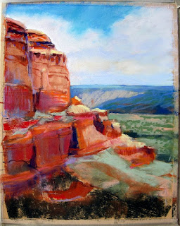
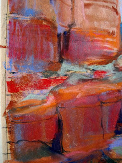
I demonstrated using stick pastels on yellow Pastelmat this week, to show the process of building up to the details. It's not finished yet. Here's a shot of it, and a couple of details for you to examine. I like to keep things very loose and build up to the details slowly. As I worked on this demo the area of greatest interest emerged as the middle-right section of the painting where the light is strongest.


All rocks are shaped by pressure, temperature, erosion and friction. Most notable is the wind that blows dust and sand, smoothing and sculpting rock; the falling rain, flowing water and crashing waves that tumble and carve rock; the scorching heat and sub-zero cold that stress and crack it; and the tremendous forces of rock sliding over rock that pares it away with the ever-present pressure of the earth itself. Time and gravity move and change rocks. They’re slowly pushed up into mountains or sifted down riverbeds and gradually ground away, becoming smaller and smaller. We don’t sense this change because it happens so slowly. Rocks seem stable, constant, firm. It’s this seeming permanence that must first be communicated.

Look for the special way that rocks relate to one another, whether the rocky face of a sheer precipice or a pile of loose boulders that have tumbled together. The weight of rocks causes them to fall to the lowest point possible, often leaning into or on top of one another. Even the rocky faces of a mountainside lean together as one giant cliff, made up of many facets, most often slightly receding as they climb upward. Smaller stones are then slowly sifted into crevices or between and around boulders, creating more visually engaging complexity.

As always, I recommend you do a good underdrawing, sorting out all the planes of the rock. Find the relationships of the cliffs, how they run into one another and change angles, how the details of light and shadow show depth.

Start with three values. Find those rocks that are darkest and be sure to get them in place, then look for the medium values -- usually where the most color will reside. Then look for and establish the lightest values. Be sure you understand where all the various planes of the rocks lie. Look for characteristic fractures, striations and places where wind has worn the rock smooth. Draw in any holes, caves or hollows using light and shadow to indicate them. Draw stains and chelation (where salts have risen to the surface) accurately in order to paint accurately. This is the part of the process where you can resolve any difficulties, simplifying anything that is too complex for you to portray.

Because cliffs are large and upright, usually they will face into or away from the sun to one degree or another. This means that you must identify the direction of the light and stay consistent throughout the painting. Remember that the angle of the sun remains the same, though various rock planes may jut into it or be deeply hidden from it. Shadows have no random shape of their own so be certain that the angles of the shadows and light explain the various rock planes to your viewer. Shadows shouldn’t be too black. Be sure to make them colorful, using a variety of dark blues, browns, reds or purples. Don’t let sunlit areas become overly chalky and whitish in color.

The cliffs may be any color, but around New Mexico we find red rock cliffs. If your cliffs are red you have a chance to use a large variety of pinks, oranges, purples and yellows, even greens and blues. If your cliffs are gray be sure to construct grays using tertiary colors (red, yellow, blue or green, orange, purple) or complementary colors in your palette (red and green, blue and orange, yellow and purple combinations) rather than picking up your gray pastel first. If, after layering them or using them as broken colors, you haven’t arrived at a good gray, it’s perfectly acceptable to use gray very lightly over the top, allowing some of the other colors to emerge.

Take into account linear perspective, especially where there are strong striations in the cliff face. Find your eye level, where the straightest level occurs, and establish the proper angles for the strata above and below that line. A strict vanishing point isn't necessary, nor is any strong adherence to plumb or level lines. Let the cliff remain natural and not forced looking, but respect the linear perspective to give an additional sense of depth to your painting.

Use characteristic vegetation in your painting to soften edges and contrast with the rock cliffs. Be careful not to obscure too much of the cliff with trees or other vegetation or you’ll lose the continuity of the rocks. Pay close attention to scale. Nothing destroys the illusion of depth like a strangely out-of-scale tree or bush.

To give the illusion of space in your rock cliffs you must remember the laws of aerial perspective. Blue each color slightly and lighten it as it recedes from the eye. Soften edges and diminish details in the distance, and lessen value contrast in the distance. Save the interesting details for the foreground rocks.

I look forward to seeing what comes of this class exploration. 

Keep going, gang!
Deborah