Monday, January 31, 2011

Class 4— Feb. 3 – Vloothuis’s “No-fly” Zone

Almost Spring, pastel, 11" x 17"
Recently Johannes Vloothuis used a phrase that caught my attention: the "no-fly" zone. This is the area along the bottom and the edges of a painting where elements are subject to the effects of peripheral vision. I'll discuss the details with you and we'll spend some time looking at the successful use of this idea in other artists' work.

This is really a lesson in looking and thinking, so I invite you to bring one or two of your finished or unfinished paintings, unframed or framed (but only if you're truly open to a critique), so that we can examine how to apply this idea to the nuts-and-bolts painting. 

The studio portion of this class is open. Bring whatever pieces you're working on, and please bring last week's Value of Value painting to show me at your easel, as well.

See you on Thursday!
Deborah

Sunday, January 30, 2011

The Value of Value class results

We really did have class last Thursday, and it really was of value. (Groan if you must. I couldn't pass that one up.) I've just been tied up and didn't get to the computer to post the results until now.

I'm going to post my notes for you, which don't quite read as a lecture, per se, but should help to get you there. 

The Role of Value in Composition and Color

Value before color! Why?  
It organizes the painting. 
It's the principal visual experience.

In black and white you understand color. In other words, you don’t need color to describe what you see, only tonal values. Value defines the shapes, volume, textures, transitions, movement and contrasts.

An apple without color still has the contour, form, volume and tone as an apple in color.

We hear:
"Use any color as long as the value is right." Is this true?
"The value can go wrong even if the color is right." Is this true?

"Value does the work, color gets the credit." Do you think so?

Value creates a visual pathway. How you mass the values moves the eye.You control the speed with tonal contrast.
            Speeds up to get to a strong contrasting value: black next to white.
            Slows down in gray areas.

Values make the underlying abstract pattern.
            Use three to five value shapes.
            Begin with larger, simple shapes first, to organize the painting.
            Make them unequal in weight using the size to draw the eye.
Divide them into smaller detailed areas.

Value is built on its surroundings, thus no tone remains independent of is background.
            Medium gray when surrounded by dark looks lighter, but when surrounded by light looks darker.
            Thus you control the value using its surroundings.
            Consider the overall tone of your painting: its Notan—reduced to black and white only.

Fewer values (three to five) often produce a more successful painting. More is not always better.

Value creates the mood of a painting.
            Low-key (dark) paintings, using chiaroscuro are dark and dramatic.
            High-key (light) paintings create lighter mood.
Use a dominant value.

Value is the underlying motivator of color.
            Mass together values and you strengthen color.
Use three to five colors of the same value for strength, beauty.
It’s not more color that makes a painting successful.
It’s understanding the value relationships and how they work together to build the painting.

Here I'm going to quote myself, from Landscape Painting in Pastels:
Color and value are inextricably intertwined. They're very much like a hand in a glove; although the glove exists independently in the material world, it does not function until the hand is inside it. So it is with the glove of color, which needs the hand of value to motivate it. Artists rely on color as one of the fundamental elements of painting. Value is an issue that comes up as the artist advances in skill and consideration of the theory of painting. Value or tone, which is the lightness or darkness of any color, is independent and exists with or without color. It's black and white and all grays in between, as well as all of the dark to light tones of any given color. It's an essential component of any color. You cannot separate color from its value, but you can and should consider value as an issue of primary importance, separate from color.

Understanding value can strengthen color. Most artists use color easily, almost without thinking, far more often than they consider the underlying, driving force of value. This doesn’t mean that they disregard value -- quite the contrary. Value is so intimately linked to color that they seem not to consider the hand apart from the glove. As the artist progresses through her career, value sneaks in, becoming increasingly important. As fundamental as it is, value is often left to the consideration of the more experienced painter. This should not be a surprise since, as in so many other disciplines, the further one goes into the depths the more elemental the concepts become. Still, the most experienced painter can learn new things, which is why art is one of the richest and most varied of pursuits and may continue for a lifetime.
 ________________________

You'll recall that I referred you to Sally Strand's work in the list of Basic Art Elements I posted in the Emulation Class, urging you to look at the great value structure she uses. She's renowned for her color, but explore it from a value standpoint!

Look at this painting she did, titled 'Awake'. First I reduced it to grayscale:

Analyze how she has massed the dark, medium and light values to move your eye around. Where to do you want to look first? Where does your eye skim over, and where does it linger? Why?

Now look at the same painting reduced to nothing but black and white shapes:

Do you think this is an interesting abstract painting in itself? Are the shapes still compelling and interesting?

And here's the painting in color:
I find that looking at work in grayscale shows the underlying structure of  the painting, while reducing it to purely black and white shapes massed together shows the value structure as an abstraction. If this is good, the painting is more likely to succeed.

(Thanks so much for allowing me to use your painting, Sally!) 
Click here to enjoy more of  Sally's work.

____________________________

The assignment was to make a finished black-and-white piece. This is a drawing I did in pencil, on an 8x11" piece of bristol board:


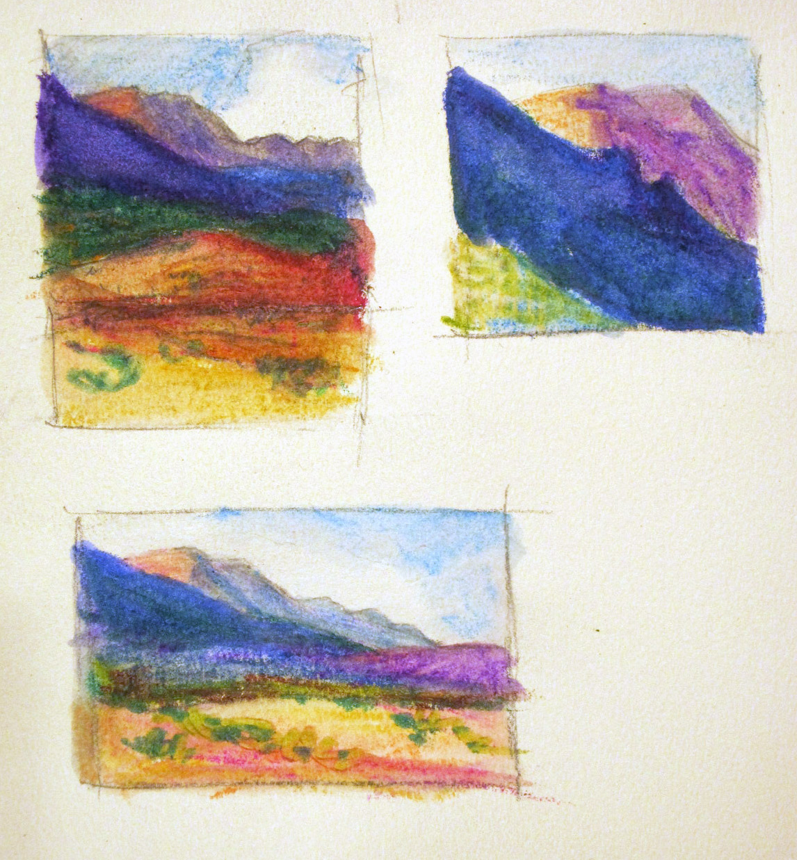
I saw some good work going on, this among them:

Gina's pastel

Looking good! Keep painting, gang!
Deborah

Monday, January 24, 2011

Class 3— Jan. 27 – The Value of Value

In this class we’ll use no color at all, only black, white and gray. You can paint in pastels, use black and white paint, or draw using pencil, charcoal or whatever media you like—but no color

What's the point? Value is the dark-to-light relationship of all colors in context to one another. It's what color is all about at its root. If you want to learn the effective use of color, you really must consider value (or tone.) Composing from a standpoint of value is a tool you should keep in your art box, too, so we'll be examining both color and composition in grayscale.

Yes, you may most certainly use this as a plan for a future painting to be done in color, but please approach it this week as an independent, finished black-and-white piece on its own. The difference is that if you think of this as a little exercise, you'll most likely just do a quick sketch, not far different from anything you'd do to plan the values of a painting. This piece is meant to be far, far more! It may be quite formal or it can be more casual, but it clearly should be a finished, framable artwork.

Spoon Basket, 12x9", charcoal
Shadowed Gate, 6x4", pencil

In order to help inspire you, I want you to search for an artwork that you think is successful even though it uses no color. Bring a print of it with you to our class on Thursday to share. This could be a piece done by anyone, at any time, in any medium, depicting any subject, but executed in black-and-white. Go look at what other artists have accomplished and spend some time analyzing why it works. You might look at pencil artists, those working on scratchboard or printmakers as possible sources, aside from painters. The graphic arts abound with good black-and-white work--but please seek out original work, rather than someone rehashing an image, which is also common.

Because I occasionally receive requests to use my photos, I'm also posting three photographs here that you may use as inspiration for your black-and-white piece. If you have your own photo that inspires you, feel free to use it. Please, gang, do NOT 'borrow' someone's photograph! I really don't want to see a calendar photo, or something from National Geographic, even if it's 40 years old. Consider taking some of your color photos and changing them to grayscale as a resource for this painting. (Hint: Plug your color photo into a Word document, highlight it and, using the photo toolbar, click on 'Color' and select 'Grayscale'. Adjust the contrast to your liking....Voila! One grayscale photo you can print.)

Anyone has permission to paint from my personal photographs below. Click on them to get a larger printable version. They have no copyrights or exclusions:


Feel free to tweak these grayscale photos any way you want to, flipping, cropping, lightening, darkening--anything you desire to make it your own. Just keep it grayscale for our class this week. The idea is to explore a detailed composition in black-and-white to hone the values. Don't feel trapped by the photograph. Change what needs changing in value! If an area is overly dark or too washed out, you can easily create the detailed values needed to better express that area in your piece. Come prepared to work in black-and-white in class, any size, any medium, any surface you care to use. 

Also bring with you the Repaint It piece from last week, if you like. I'll be interested to know if changing to another medium has gotten you thinking a little differently! We'll do a quick critique of ONE painting from each student to start our class, as usual. 

See you on Thursday,
Deborah

Thursday, January 20, 2011

Repaint It class results

I heard more people comment on how much fun we had today! There's something about diving in and just splashing around in a different medium that loosens you up and brings out the kid in you, I think.

The idea was to repaint something that didn't quite satisfy you. I saw a lot of different subjects, all of which were promising paintings in their own right. We did a lengthy critique of each one, examining the strengths and weaknesses in them, and making suggestions on various ways to approach changing things. I showed some sketches I did last night, just to prime the pump. (I had planned to repaint one of these, but my plans changed, so I'm not showing the original pastel paintings.) Anyway, here are the drawings I did:


Each one of these is maybe 1.5" x 2" in size. The idea is to take the original painting and nudge it. Change the underlying shapes, or the color or composition, or choose one part you're most intrigued with and crop in close to it. I used a plain old #2 pencil and some Aquarell Crayons that were a gift. Interesting and fun to do. It's such a good way to get the juices flowing without spending too much time or materials...

I decided to paint from this old pastel painting that I found interesting but not particularly successful:


There are some very compelling parts to it, but all in all the underlying shapes don't work at all well, and the colors are pretty weird. It's on Canson paper, so there isn't much hope of reworking it.

In class today I used a piece of white Pastelmat paper and Createx Pure Pigments with soft charcoal, to make this WIP:


Here's a side-by side comparison that shows the light, color and energy of the new one even better:

 I still plan to go into the painting with gouache, I think, to add some opacity to it and continue the details. It's much improved already, IMHO.


I want to share a painting Bill did in watercolor that I think shows how exciting and fun it can be to play with a new medium:

Bill--watercolors
He remarked on how it wouldn't let him do the details he's so used to using, which is a distinct advantage for him at this stage of his development. He was painting on Wallis sandpaper, so he plans to use some pastel over the watercolor--I hope with a light hand.

Keep painting, gang!

Monday, January 17, 2011

Class 2— Jan. 20 – Repaint It

First a reminder: You can find the current class schedule here. Copy it and print it out for your records, if you like.
 
This week we'll be using a painting that you feel came close but just didn’t quite make it. My challenge is to repaint it, but instead of painting with your usual medium I want you to change your medium. I believe that this will enhance the process you use in your more accustomed medium. We’ll begin with a short group critique of the painting to help you decide what needs to be done. When completed we’ll look at the two paintings side-by-side. 
 
Let's talk a little about using another medium. I know most of us work in pastel or oil in the classroom currently, and you might not have a complete set of supplies to take you into another medium, however, think of it this way: How can you challenge yourself to think differently about your painting? Personally, over the years, I've found that when I get stuck on a painting it's incredibly freeing to go to another medium because it forces me to think about it all differently. 
 
 Don't keep doing the same thing hoping for change.
 
So instead of pastels or oil, try pencil, pens, charcoal, colored pencils, water soluble pencils, watercolor, gouache, or your kids' crayons--or any other medium you have on hand and want to try. 
 
Bring in a painting that you like but you know you can improve on, perhaps, instead of the one you hate and can't stand to look at. (The hated one should be wiped out, most likely.) We'll look at this almost-there painting together, and brainstorm how you could approach it in your new medium. Line up the materials you plan to use and bring them along so we can all help one another think about how to go about creating the second version. It need not be the same size, and I advise using the painting alone. If you happen to have the source photo, feel free to bring it along too, but it's not necessary.
 
No, I don't want to see a new, improved version of the old painting! At the end of our class on Thursday, I'm going to set aside the last half hour so the entire class can tour your easels and see the old and new versions side-by-side, in whatever state they've reached. You will probably continue to work on the new one at home, so feel free to bring both back the following week to show us, as well. (And if, after we've seen the old and new comparison, you believe you know how to continue to work on the original, of course you're more than welcome to do that. Just don't jump the gun on this.)
 
Pencil drawing
I think you'll be amazed at the fresh insight using a different medium will give you. This is a great technique to use when you get 'stuck' on a painting, or when you find yourself in the doldrums, unable to paint, which happens to every painter I know.
 
Too often we develop tunnel vision and think some new technical approach to the medium we're using will solve the problems, when in fact it's the thought processes and insight we bring to a painting that work effective changes most of the time.

I'm looking forward to seeing what you decide to do! If you have any questions feel free to ask. 

I'd also like to view and comment on your Emulation painting from last week at your easel, if you want to share it with me.

See you on Thursday,
Deborah

Saturday, January 15, 2011

Emulation Class results

It was so nice to get back to the classroom again! I think the class really jazzed up a few of the students, judging from the paintings I saw in progress.

We began by going over the elements of art and examining each one. It's challenging to take a close look at your work and see what's missing, so I find it helpful to look at these elements one at a time. Here's the list for you to examine:

Basic Art Elements
  • Line
    • The mark made by a pastel or brush, or the edge created when two shapes meets. Often this is an outline, contour or silhouette. Line can add emphasis, but can detract if overused.
  • Color
    • Ask yourself if the color is too flat, wimpy,and weak, or too bright and overpowering. Do you have a pleasing unity or contrasting variety of color? Are colors missing from your palette?
  • Contrast
    • Many elements may contrast in a painting; size, colors, values, etc. The area of highest contrast draws the eye first. Is there too much contrast, making things spotty? Or is there too little, making the painting dull?
  • Value
    • The lightness or darkness of a color. Do you have an excellent range of values to express the place, person or thing you’re painting?
  • Space
    • Is there an overall flatness to your paintings, no matter what the subject? There are devices you can use to create a feeling of space: overlap, hierarchy, value shift, etc.
  • Form
    • Form has height, width, depth, defined by light and dark. There are two types of form, geometric (man-made) and natural (organic form). Often in painting a still life or a portrait you might lack form.
  • Texture
    • Physical strokes on the paper make texture, as does the look of a surface quality you create in portraying it. Varied textures makes interest. Lack of texture is flat and boring.
  • Detail
    • Those smaller bits that describe how something looks draw the eye. Does the detail overwhelm your work, or is there too little of it?
  • Strokes
    • Do you use the same size stroke, in the same scale and with the same touch all the time? How can you vary that?
  • Edges
    • Hard and soft edges help to sculpt space in a painting. Consider the edges in your paintings to see if you use a good variety to describe your subject.
  • Harmony
    • Harmony is achieved in a body of work by using similar elements throughout. It gives an uncomplicated look to your work. 
  • Unity
    • Unity comes when all the parts create a whole, not appearing disjointed or confusing.
  • Gradation
    • Gradation can add interest and movement. Gradating of elements in size makes linear perspective, and in color and value makes aerial perspective. It creates form, and moves the eye around a form.
  • Repetition
    • Repeated elements make interesting variety. Monotony results when there is little variation.
  • Balance
    • Balance is created by repeating same shapes or giving equal weight to all quadrants or parts of a composition, or may result from a harmonious use of the elements.
  • Dominance
    • One to three dominant elements are interesting and may harmonize a composition, adding needed emphasis.
  • Movement 
    • The overall direction of the eye through the painting, giving action to the piece.
  • Rhythm 
    • Syncopated movement that starts and slows the eye’s path through the painting.
  • Proportion
    • Creates a sense of correct scale so that all the objects appear to be related properly in space.
  • Style
    • Do you have six paintings that look like they were painted by six different artists? Which appeals most and why?
I also suggest that you look at some of my favorite artists for examples of various uses of these elements

Line:    
Derek does gorgeous line work, but he never forsakes tone.

Color:  
Two very different painters, both strong colorists.

Contrast:
Nathan Fowkes
One of my personal favorites, and the guy knows his way around contrasting values.

Value:  
Sally's color is surpassed by none, but explore it from a value standpoint!

Space: 
He creates a lovely sense of distance whether in an intimate or vast scene.

Form:  
Look at his flower paintings, especially!

Texture:  
van Gogh 
What can I say? None better!

Detail:  
Again, very different painters approaching detail in very different ways, equally valid.

Strokes:  
Both of them use bold strokes, but very different.

Edges:  
Bill manipulates space beautifully with edges.

Harmony: 
I find his little, tiny pieces done in gouache are incredibly harmonious.

Unity:  
Great unity of all elements in this work.

Gradation:  
Look at the boulders and rock faces in particular.

Repetition:
Liz knows how to use this element particularly well.


This isn't an exhaustive list, just ideas to launch you on your search. Take the element you find missing from your own work and study the work of another artist, perhaps copying a painting, or choosing parts of the painting to emulate.

Kris copied a piece she admired, to learn loooooooser strokes. 
Carol used two paintings to inspire her own composition.
I hope that's helpful. Have some fun.

Keep on painting, gang!
Deborah

Monday, January 10, 2011

Class 1— Jan. 13 – Emulation

If you could paint like any other artist, who would it be? Most of us can answer that pretty easily, I think! You may have two or three artists in mind, but for this class you need to choose one. 

First, I want you to analyze the art elements that you identify as lacking in your own work. This is going to take some introspection, so I suggest you lay out a small body of work, perhaps 6 or 8 paintings, so that you can look carefully at your work. It's preferable to look at the painting themselves, not thumbnails or photographs. Then ask yourself which ONE element you plan to improve in this lesson.

This requires a little review of these elements, of course, so here are sites for you to look at:


Among these elements might be: 
  • texture
  • color
  • contrast
  • space
  • form
  • strokes
  • style
  • detail
  • edges
  • line
  • harmony
  • unity
  • variety
  • emphasis
  • opposition
  • gradation
  • repetition
  • balance
  • dominance
  • movement 
  • rhythm 
  • proportion
  • value
I want you to decide which specific element your overall work needs in order to improve and find an artist whose work you really want to emulate (in that one part, not in whole.) Spend time assessing where your work is lacking and then search for artwork that does well what you need to improve on

Once you've found your inspiration, please bring photographs of two paintings by that artist that you think show the element you're concentrating on

For instance, if I think I need to work on creating more contrast in my paintings I might bring in photographs of paintings such as these by Nathan Fowkes to emulate:


I'm going to analyze how he has handled contrast, what it is that seems to make these paintings eye catching and compellingly interesting. I might consider the way he has used his values, how he has balanced dark and light, and how high in chroma and light in value the lights are compared to the darks. I could change the paintings to grayscale and think about them in terms of values only, or do several thumbnail sketches of them using black, white and gray, in order to help me see how he has done it. I would then be able to come into the classroom on Thursday with some very specific goals to shoot for in my own work.

Please prepare to explain the ONE element you plan to improve on and show the artwork that inspires you. Come with paper and materials on hand, ready to paint after the lecture portion of the class.

To start our discussion, I’ll share with you the work of artists I admire and show you why I believe their paintings are successful, pointing out some specific art elements I believe they use well. 

I can't resist... It's ELEMENTARY, my dear... (I wish I had thought of that for the class title!)

Remember the classroom opens at 11:00.  If any of you are planning to come to the class and haven't enrolled, come on along!

See you on Thursday.
Deborah 

If anyone wants to join in who cannot attend the class, the offer of working privately with you online stands.

Friday, January 7, 2011

Private Online Class and Critique Offer

I've had a few messages from people who are following the blog, reminding me that it isn't just the students I see in the flesh each week who are benefiting from the information here. Some of you live out in the country and simply haven't the option to take classes, while others tell me they can't get out easily and have to study in the privacy of their home. Whatever the reasons, I'm glad to have you along!

You may be aware already that I offer Online Painting Critiques as a service to artists. However, in addition, if you decide to paint one of the experiments from these classes, I'm happy to offer you a little more personal attention.

For $30.00 US I'll help you set up your class, advising you on materials and techniques to use, send you further written information about the subject, and then critique your painting, offering some suggestions for improvements or further study on the topic, as well as looking at the changes you make on your painting(s). 
Think of it as a private tutoring session, based on any one of the classes listed here on Today's Art Class blog. Look at the Blog Archive in the left hand column to explore classes. You'll find two listed for each one, usually a topic followed by the class results.

I have a limited schedule, so it's necessary to enroll in the class ahead of time. That way I can schedule your class, discuss with you what you hope to learn, and be sure to have the time set aside to help you. You may pay with PayPal or arrange to send a personal check (ONLY if drawn on a US Bank.)

Send an email to me at: d.d.secor(at)gmail(dot)com, drop a message on my Facebook page (clickable link), or a PM at WetCanvas, any time.

I hope these private classes will be of help--and a lot of fun, too! Let me know what you want to do and we'll go from there.

And to the students who are enrolled in the upcoming class, it starts NEXT THURSDAY. Maybe we should all clean our palettes, right?