 |
| Spring Pinks, 12" x 9", soft pastels on yellow Pastelmat |
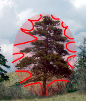
This class is meant to help you see the rhythm, balance and shapes of different trees. Start by looking at the overall outside shape of a tree: Is your tree an oval, triangle, square, rectangle or a circle? This should include all or most of the upper branches, but not slavishly. Squint to decide, and if a few little branches or leaf clusters are lost that’s okay.
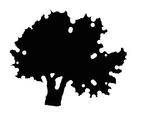
 First, in your sketchbook draw the geometric shape of the tree and fill in the area with charcoal or pencil. Then remove the shapes that describe the overall branch patterns.
 This is partly to see what’s actually there, but I also want you to spend some time designing the shapes. Don’t allow any indentations to be identical is size, scale or shape. Trees tend to repeat patterns, but artists look for interesting visual variations.

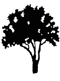
I like to do this in Photoshop. Make a positive shape filled in with black, and use the eraser tool to remove the negative ‘sky’ shapes. Whether you use charcoal, a pencil or your computer, the trick here is to keep thinking of the negative shapes as much as you can. Design these to be varied and rhythmical and you’ll arrive at an interesting shape. Don’t try to draw the background, only think of it as empty sky behind the tree. Don’t look at them as trees, but tree-like patterns.
 Find the sky holes that are most descriptive, including the trunks and branches if you can see them. Scale may play a role in this, in that a smaller tree with flowers on it may show far more gaps, while a larger tree may only show a few. Squint to decide which ones are key and what can be ignored.
 I want you to approach the painting the same way, to some degree, as a positive tree against a negative sky (or background). Sketch from your design the interesting and varied tree shape you chose. Don’t look at the photograph of your tree, only your drawing of it. Think flat!
Take some time to get this shape recorded on your paper. I use charcoal to do this. You may find yourself wanting to tweak the drawing as you go along, so at that point you can begin painting. But here’s the catch—only paint the negative. It might be best if you tone white paper or use a colored ground for this. Carve away the shapes with a color or colors.In the demo below I used Wallis paper toned magenta, drew the outline with charcoal, and carved away the negative with sky blue.
 |
| quick demo carving away negative shapes only |
Have fun--and keep going, gang!
Deborah

No comments:
Post a Comment