
The secret is that white isn't a color, it's a value, as I mentioned in the last post, and that all the colors of the rainbow are contained in white light. This should free you to use any color at all.
Remember the photo (posted here)? Well, look what you can do with it!


Notice that each one contains all the same VALUES but recorded in different colors. You could paint using any or all those colors, as long as you match the values closely. Why not have peach-magenta-purple-green snow?
I'm going to copy and quote myself here, from a chapter in my online book, Landscape Painting in Pastels.
This is only a portion of the chapter, but I think it explains what we were doing in class:
My challenge to my students was to use my photo, recomposing it into an interesting set of shapes to make a snow painting using NO WHITE. I did a quick demonstration on white Wallis paper that I toned a fairly light neutral beige color. I did a quick charcoal sketch to capture the values, and then painted this:The painting looks washed out, as though someone poured bleach over it and left it in the sun too long. All the colors appear faded, like jeans after years of wear or an old flag left to disintegrate, a vague suggestion of once-bright colors. The overall effect is dull and flat. Chalkiness is a problem that can crop up in any medium, but is often found in pastel paintings, partly because of the abundance of pale colors that are available. The whitish, wishy-washy colors of a chalky painting suggest a lack of control over value, contrast and color.
A high-key painting need not be bland and characterless. Instead it can celebrate the light by maintaining control of tones, using a range of values and the right contrasts for the subject. Although the darkest dark may only be a medium value in the final painting it must nevertheless present a selection of values leading to the lightest light.
One way to defeat chalky color syndrome is to try two different challenges: First, paint an all-white subject using no actual white pastel. Second, paint a very high-key subject in which a medium value functions as the darkest dark. Each of these exercises will strengthen your understanding of how to control values while using colors. Value is the element that describes the shapes of objects and is the underlying abstraction of all painting, so increased awareness of value improves composition as well as color.
How much color can you put into white? One of the most interesting aspects of white is that it’s made up of all colors in the light spectrum. Overlapping red, blue and green spotlights can make white light on a stage, as long as the colors are equally balanced. For the artist, this means white may be flavored with any color found in nature. Consider the color cast that varying light sources give to objects. Our sun is a yellow star and gives warmth to all colors seen in daylight. In shade, the blue of the sky influences all colors, so whites seen in daylight can generally be thought of as warm yellow in the sun and cool blue in shade. However, there are varying kinds of daylight. On an overcast day the light is often cool in color, having been filtered through clouds, while at sunrise or sunset the light is strikingly warm in color. Whites seen under these conditions can be darker shades of blue and green or warm, bright tones of red and orange. Moonlight, because it is so pale, bleeds all color from a scene, leaving ghostly grays in place of whites. Firelight and candlelight make white into hot red and orange. You’re free to select from an endless array of light colors because of the fact that white contains all colors.
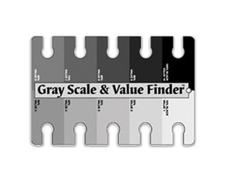
One particularly important tool to have on hand is a value finder. While there are many varieties, essentially this is a card printed with a scale of grays from black to white, each of which is pierced with an opening. This allows you to hold the card above a color, squint until your eye is almost closed and see where that particular color blends into its value of gray. For instance, you can hold the card above a photograph of clouds and perceive the lightest lights in the white of the billows, as well as the paler grays of the blue of the sky. There is no standard number assigned to values on the value finder. The number 10 does not always represent white. In fact, 10 might easily be called black, so disregard the actual number but understand that there is a scale of dark to light.
White is by definition the lightest value in the palette. To paint white subject matter you must first realize that no other color can possibly approach white in lightness. Therefore the challenge is to build near-whites into the painting, using far more colors in the light range of your palette. Hold the value finder above the lightest values in your photograph or painting, noting that only white registers as the lightest light. Now find colors that are slightly -- very slightly -- darker than white. This may be only a pale pearl gray value. If your palette of colors is not strong in this light range, consider purchasing very pale blues, greens, yellows, peaches, pinks, lavenders and grays that you can use when very light values are needed. However, do not rely on light colors alone to make an effective painting of a white subject. You must structure a strong range of all values into the painting, and these too must be made using colors. Particularly important to the success of the white subject is the use of interesting middle tones, where the strongest color often resides. The strongest darks will also benefit from the use of colors.
To check the values of your colors change a photograph to grayscale on your computer. This will allow you to clearly see how the colors translate into values. Check to make sure that your subject appears to be white in the grayscale version and that you have the proper array of values.

And I assure you that there is no white in it at all! The snow is made of many, many different colors layered together. It's the control of the contrasting darks and lights that gives the impression of snow.
Good job, gang. Keep going!
Deborah