Showing posts with label night. Show all posts

Monday, June 27, 2011

June 30--Paint the Night Sky


Nighttime paintings can be a lot of fun but rather challenging, too. At this class we're going to explore painting the landscape at night, with a closer look at the mystery and beauty of the night sky. 

First of all, I want you to go outside and LOOK at what you can see. Get away from bright lights as much as you can and notice how dark or light the sky is, what value difference there is in the hills or trees or plants around you. Look at your feet, note the shadow of your car or house. Analyze the value structure... Not everything at night is black! Take some photos, if you're able, and just see what you get. Digital cameras are fairly remarkable this way. 

I find it hard to take a good night photo showing everything I want, although I occasionally get the "lucky shot" that works out. It's more satisfying to me to seek out other interesting pictures and combine several different ones to make a more exciting painting. look around and see if you can find photos to use, perhaps as many as three, and think creatively about how you'll put different parts to use. You might grab the hills or city lights from one, the sky from another, and the closer trees or foreground information from a third.

Do you know that there are websites containing photos you can use for paintings? Naturally, if you copy one of these photographs faithfully you won't be able to enter it in the big shows, so be cautious how you use them, but for our purposes it's fun to find some different resources to use, and combine them into one different place altogether. Here are some from Morgue File that I might use this week in my demonstration:


(And remember, you might use some of your new found Photoshop skills to make a combination you like!)

We'll do a quick critique of work in progress, so feel free to bring your painting along for us to view and discuss briefly.

Our class is at the Paradise Methodist Church on the west side of Albuquerque, 11:30-2:30. Come at 11:00 to get set up, and feel free to bring a sack lunch. I'll have iced tea for us. Please RSVP (<--clickable link) if you haven't reserved your space already, but don't hesitate to come on along at the last minute! The charge is only $25 at the door.
Any medium is welcome (as long as there are no strong smelling solvents), but I'll be doing a demo with my PanPastels for the class.
See you on Thursday!
 Deborah

Thursday, October 14, 2010

Night class results

Painting night scenes on the black boards we made today was really an interesting experiment. I love the textural  qualities they have, and it's quite effective working on the very dark color.

We began with a review of last week's class devoted to turning up the contrast. Here are a few pieces we analyzed. None of them is quite finished, but the resolution is coming along on each one.

Lisa (we saw the beginning stage last post)
Adriana (done on a black board, but painted last week)


Charles

The lecture was just about right out of the chapter on painting the night from my book, with a few other excursions. The basic rules of painting the night go like this:
  • Use colorful darks, not just black.
  • Accentuate the patterns of the lights.
  • Use exciting colors in the light areas.
  • Look for haloes around light bulbs.
  • Moonlight can cast pale shadows.
  • Use medium-light colors, not white, for most stars.
  • City lights form strings of colored lights following streets.
  • Keep city lights in perspective, massing them in the distance.
I think it's a good idea to crop and recompose the photograph before printing it, if you can, but thumbnails or sketches can do that job just as well. I like to print out my photo close to the same size as the board, if that's practical, which it was today. Most of us were working on 8x10" boards.

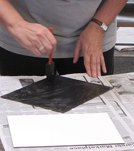
Probably the most interesting part of the day was making and working on these toothy boards. Barb Clark brought all the supplies we need, including the pre-primed Masonite panels, black (and various other colors) of Art Spectrum Colourfix Primer, and foam brushes. The process is simple. She uses a couple of different textural approaches. In the first she just lets the strokes go catywampus (HER word) creating a nice scumble of ridges and textures. In the second she places the strokes all in one direction, lets it dry, and runs the strokes the other direction, creating a sort of canvas-like look. In both cases she lets the first application dry and applies a second coat.


I did my demonstration on one of the boards. It's not too far along but you can see how it's coming. I loved working with the dark ground, which makes the colors just glow. I didn't leave the black 'raw', but covered it with deep, rich dark colors, as you can see. The black ground is still evident throughout the piece, and will be when it's finished. Barb told us that one nice thing about using the primer is that if you over-blend something and lose the contrast you can brush off the pastel, even in just a small area, and reapply some of the Primer, thinned down with water, to recover the same surface. Very convenient! I enjoyed the way the catywampus texture made the tree look snarled with little branches almost effortlessly.


I'll carry this painting farther, of course, but we wanted to get our hands dirty. This was serious stuff, as you can see from the looks on their faces. Don't worry, we lightened up! It was a fun class and the results looked promising.

You're doing great. Keep going, gang!

Deborah