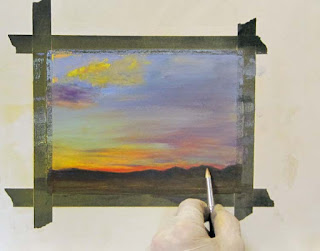
Tuesday, September 28, 2010

My first video: the working palette

I thought I'd figure out how to make a video, and decided to upload my first one here so people can see my well-used, dirty pastel palette. This is the real thing, folks, not some shiny, cleaned up version for video!


I hope it's interesting and helpful to see it. The Ludwig pastels I mention are a few of the confetti colors Terry makes. If you haven't tried them, give it a go--what fun to swipe a gold and find bits of red, green and blue making a gorgeous stew on your paper!

You'll also see a 3" foam brush, which is a trusty tool I use every day, and several Colour Shapers, as well as a Sofft sponge, a stick of extra soft vine charcoal, and a 'white' (more black now) plastic eraser.

If I can learn how to make decent video clips, I'll add an occasional ones here to show you how I do things. Let me know how I did...

Monday, September 27, 2010

Class 1— September 30— The 3-D Painting


Perspective, value, color and composition all work together to create depth. We’ll analyze those elements to make a painting that recedes. Bring a photo with a good sense of depth to it and we’ll look more closely at these elements.
Hi gang,

Our class this week, which starts our new session, is devoted to creating depth. The illusion of three dimensions is, to some degree or another, a combination of perspective (linear and aerial), value (paler as it recedes), color (cooler as it recedes), and composition (using overlapping objects, relative size, etc.) working together. 

Find a photograph that creates depth--not a difficult assignment. Unless you point your camera directly at a piece of white paper, for instance, you have some illusion of depth. 
(c) D. Secor
 How deep is the space in a composition like the one above? The depth from elbow to face is no more than a foot, yet key to creating three-dimensionality. What elements are at work here?

(c) photo: 'aphid dew' @ WetCanvas RIL
In the photo above the space between the feeder, the hummer and the distant trees is a matter of a few feet, while in the one below it's a matter of more than 20 miles. Again, what elements create the illusion of space?
(c) D. Secor
We'll explore the idea that some of the same devices are used in each one of these to add the illusion of depth to your painting. 

Please bring your sketch pad and drawing materials with you, along with photos you want to use for paintings, and together we'll explore these key elements that combine to create the illusion of 3-D in your paintings. 

See you on Thursday,
Deborah


Thursday, September 23, 2010

New Class Session Begins September 30--Join Us!

I hope you'll plan to join us for the next eight-week session of classes. As you'll see in the class schedule below, I'm trying some new things geared to honing some skills and thought processes!

If you'd like to join us please contact me.


Class Schedule
September 30-November 18, 2010
                                                      

Class 1— September 30— The 3-D Painting
Perspective, value, color and composition all work together to create depth. We’ll analyze those elements to make a painting that recedes. Bring a photo with a good sense of depth to it and we’ll look more closely at these elements.
Scent of Rain, 12" x 18"

Class 2— October 7— Turn Up the Contrast
Contrast is one of the elements that creates movement and gives pizazz to a painting. Find a photo that has a good range of values from dark to light. In this class we’ll ask how we can create effective contrast that draws and moves the eye.

Class 3— October 14— Night
Find a nighttime photo with an interesting pattern of colorful lights to paint. We’ll analyze what makes the nighttime painting successful, painting on dark paper. We’ll discuss how you can make your own dark colored surface for this painting.

Class 4— October 21— Complexity Behind it All
At this class I’m going to try to help you see and understand better how to approach a complex background that resides behind your subject matter by patterning light and dark, as well as identifying and repeating shapes, colors and textures. Your photo should have something like a tangled forest or textured hillside overlapped by the subject matter in front of it.
Almost Spring, 12" x 18"

Class 5— October 28 — Palette Shift
A subtle shift in color can make a huge difference in mood, so today we’re going to do three small (4x6” to 6x9”) paintings, one in grayscale and two others with a limited value scheme. We’ll slightly shift the palette and see the beauty of using subtle varieties of colors for each one.

Class 6— November 4— Lost and Found
Edges are compelling! Today we’ll work from life, drawing and painting some simple objects that overlap one another. We’ll use “lost and found” edges to sculpt space and move the eye through the composition. Bring three small objects and a background for them, your sketchbook and drawing tools.

Class 7— November 11— Asymmetrical Square
The directional thrust of a square painting is challenging, so today we’ll look at how to make an asymmetrical composition in a square piece. You’re welcome to work from life, if that helps you, or find a photo that you can recompose into a square composition.
Sandia Square, 9" x 9"

Class 8— November 18—Final Critique and Class Potluck
We’ll do an in-depth crit of the paintings done in this class or anything you’re working on outside of class. Food and fun!
For cost and other class information, go to the Upcoming Classes tab at the top of the page.

Monday, September 20, 2010

Class 8— September 23—Final Critique and Class Potluck


Hi gang,

I hope you don't feel like this little gal when you think of final critique! This is always my favorite class, and not just because you all cook or bring such good food. I enjoy seeing your progress and getting a sense of the direction the class as a whole is heading. If you have some insight on that, whether individually regarding your own work, or corporately as part of the class, I'd certainly welcome your thoughts.

Bring any work you want to share, whether done in class or outside it, in any medium. It might be only one painting or it could be a dozen, whatever you want to share. As always, it helps if the work is ready to lean against the wall (or tipped-over tables, as we usually do), and doesn't need the tape removed from each painting. Most times folks display them grouped together on a piece of foam core, mat board or cardboard. You don't need to bring your painting materials. This class is all food and talk.

The point of the critique is to identify your "point of friction", the place where, as you let out the clutch, the vehicle begins to move forward. This is where what you know and do well meets the friction of something you need to learn or move farther into. It could be something simple like learning to control contrast or adding certain values or colors to your palette.  Maybe it's a matter of exploring a particular subject matter. It may be more subtle and complex, such as finding your own voice or style. If you're frustrated because you can't accomplish something, the critique is the place to bring it up and discuss it.

We'll eat first, so bring along a dish to share. As ever, buy it or cook it, whatever works for you. If you have some paper plates, napkins, forks, etc., bring them along, since all those supplies were taken last session, and I don't know what we have on hand any more. The classroom will open at 11:15 this week.

Our next class begins on September 30th. If you have any suggestions for specific classes you would like to see included, let me know now, and I'll be happy to consider including them in the session. I should have a schedule of classes ready this Thursday for you to see at the critique. If you could check your schedule for the next four weeks (9/30, 10/7, 10/14, 10/21) and make sure of your availability for those classes, I'd appreciate knowing this week what you plan to do (if possible.) Please remember the new class policies of no refunds or credits. I have instituted this only because it helps hold the line on increasing costs, and thus keeps the class going. If financial need is keeping you from joining us, please talk to me individually about it. We can work it out!

Starting next session, I'm going to open our final critique to anyone who wants to come, at a cost of $35.00 per person, with  a limit on the spaces available and the number of works shown. Please let your friends know that the next critique is on November 18th at 11:30 a.m. I'll send out announcements previous to that, but pass the word now.

In the future you'll be able to go back over the classes here on the blog, but we started with class four, so I'm adding the schedule. 

Class 1— August 5— 20-Stroke Paintings
To refresh us and get started again, we’ll begin with 20-stroke paintings, however this time you can work in any size and try to paint three or more of them. I suggest you prepare some thumbnail sketches ahead of time, just to sort out the major shapes and values from your photos. That way you can make every stroke count. Extra points for fewer strokes, as always! How low can you go and still express the place well?

Class 2— August 12 — Negatives/Positives
Please bring or find an object or objects that you will use to paint only the negative space (for now.) It can be anything, large or small, simple or complex: a cup, a chair, your hand, a plant, fruit, flowers, whatever! You might also consider bringing a simple background for the object, such as a colored mat board, paper or cloth, if applicable.

Class 3— August 19— Hot, Warm, Cool
Today we’ll make a chart experimenting with temperature. You’ll chart some color combinations and from that you’ll create three small compositions, one with warm, one with cool, and one with hot predominating. Bring paper or canvas large enough to accommodate nine 3x3” experiments, and three surfaces prepared for your small studies.

Class 4— August 26— Increased Scale
Today we’ll do something a little bit different. I want you to work in the range of 16x20” or larger. Bring an excellent photograph and your corners to crop the view. You’ll begin painting in a small area taped off on the page, which will contain the area of interest, then remove the tape and continue the rest of the painting, experimenting to see how the small scale start affects your overall painting. You’re invited to be creative and try various things with this painting.

Class 5— September 2 — Collage
You’ll receive a mystery photograph to paint today. Come prepared to paint a 5x7” painting whether it’s paper or canvas. At the end of the day we’ll assemble our collage of paintings to reveal what we’ve painted.

Class 6— September 9— Memory Painting Exercise
Find a photo you want to paint, carefully composed just the way you want to paint it. You’ll be given ten minutes to memorize it, and then you will paint strictly from memory. You can draw or paint it at home, ahead of time, if you like, or use a photograph that you’ve painted from already, but you will start fresh in class on a new painting.

Class 7— September 16— Emotional Colors
We’ll discuss the link between color and emotion and how it affects the overall mood of a painting. Please bring samples of other artist’s paintings that you feel express a particular feeling or emotion well. Also find a photo that you would like to paint and identify the emotional link you want to achieve (i.e. photo of empty field: loneliness.)

Class 8— September 23—Final Critique and Class Potluck
We’ll do an in-depth crit of the paintings done in this class or anything you’re working on outside of class. Food and fun!

See you on Thursday,
Deborah

Thursday, September 16, 2010

Emotion of Color class results

Moody Sky, 8" x 10"

Color is one of my favorite topics and I think this class was a blast! Above is the painting I did in class (not as a demo.) The challenge was to use a moody looking photograph and enhance the feeling even more using color. It's not finished, but I think it already expresses a sense of foreboding that driving into a storm can bring. You can see the resource pic in the post before this one. I removed all the trees and made it into a sterile desert environment in order to enhance the feeling of exposure, and to remove the darkness of the trees themselves. This gives the sky all the power, since it contains the darkest darks, and creates a subtle warm color that counters the blues, greens and grays of the sky.

First I gave them a test.Feel free to print it and fill in the blanks. You might be surprised, but I also suspect you'll find some strong connections to color and emotion. No, it doesn't matter what the colors are, you can envision and red, yellow, blue, green, orange or purple you want to.


So, of those choices, what color is innocent? Disgusted?Confused?Again, there are no right or wrong answers, but ask a couple of other people to fill in the blanks, too and see if there isn't some agreement. You might be surprised!

In order to further explain the link between color and mood I showed this:


You can see the hastily scrawled list of feelings on the left and these blocks of colors, which have no content whatsoever. There's no 'thing-ness' to get in the way. Take a minute to study each one and choose an emotion from the list that describes the mood created by it. There may be more than one mood, and there are no right or wrong answers, only your opinion. I think this shows you the power of color, independent of anything else. Here, it's all color. In most other compositions the content flavors the response.

For instance, here's my original painting:

I like the pink sunglasses, and used a light yellow and blue to express the beach, summer, sunlight. I wanted to give it a fun mood.


Notice how the shift in palette (made by Photoshopping the original) has enhanced the feeling of heat, as if the sun it too hot and this poor gal is getting beet red. The mood is still cheerful and upbeat, but we want her to get in out of the sun. It's almost painful.


And now it reads completely differently. The blue shift has darkened it enough that we have the feeling it's wrong. It seems a little spooky and sinister. That's the power of color. She's still smiling. There's still a spot of sunlight and a cast shadow on her neck, the beach is still kind of yellow and the sky is blue--but the smile seems to be out of place.

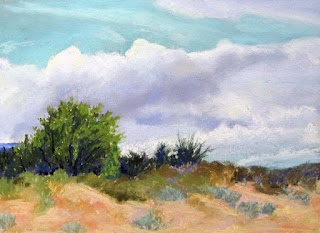
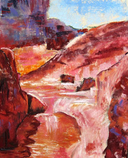
We enjoyed a good discussion and shared our photos. We talked about how we could enhance the feeling we wanted to create. Here are some of the works in progress my students were doing. None of them is finished, of course, but they were looking quite good, I think.
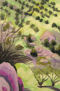
Kris

Carol

Catherine

Adriana
I'll let you decide what you think the gals were expressing in these. It was a very fun experiment, and I think the paintings are strong statements about the emotive power of color.

Good job, gang! Keep going.
Deborah

Monday, September 13, 2010

Class 7— September 16— Emotion of Color

Class 7— September 16— Emotion of Color
We’ll discuss the link between color and emotion and how it affects the overall mood of a painting. Please bring samples of other artist’s paintings that you feel express a particular feeling or emotion well. Also find a photo that you would like to paint and identify the emotional link you want to achieve (i.e. photo of empty field: loneliness.)

Hi gang,

Mood is an interesting topic, one that’s intimately linked to color (although not exclusively so.) Compare these two versions of my painting, which I have simply tweaked in Photoshop:

yellow theme

blue theme
What feeling does the yellow one express? The blue one? What's the difference in the emotion you feel? Does one seem more emotive and powerful than the other? Does one seem right and the other wrong? Why? That’s the emotive power of color. Of course, portraits give us an immediate link to a feeling to begin with, since faces are the seat of these expressions, and my painting is strongly emotive, but what about a landscape, still life, floral or animal painting? Any of these subjects can be painted using a strong color link that can enhance the feeling you want to express.

I want to spend some time looking at work to help us see the emotional link to color. Bring examples of other artist's paintings you think show a particular feeling well using a strong link to color. Think about the deep feelings a painting can express, not predicated on the subject matter but via the colors used. Try to find various subject matter--not just faces. 

I’m going to give you a color test to see how you personally interpret certain links to color, and see if there's a general overlap. Bring your sketch book with you.

Find a photograph that you plan to use for your painting and decide what emotional link you want to create. I used the example of the empty field expressing loneliness. What feelings do you think these photos might express?


Photo: Matt Taylor


We’ll discuss as a group what feeling it gives and how you might best express via color the emotion of the photograph you bring to use for your painting. At the end of class we’ll do a walk-around to see how the painting is going for each of us. 

Please also bring with you the paintings done last week in our Memory Painting class, as well as the photo  you used. 

See you on Thursday,
Deborah

Friday, September 10, 2010

Memory Painting results

Memory painting done in class.

The class yesterday was very interesting, and a couple of the students had small breakthroughs as a result of it. That always pleases me.

Original photo with Photoshopped changes.
Let me review what I did. To begin with I Photoshopped my original picture, moving the tree closer to the center, and playing with the contrast and color saturation in the foreground and mountain.

Photo taped on top of paper.
At class I taped my paper, UART 400, to my board and then taped the photograph directly on top of it. They were close to the same size, which meant I could "see" the image on the paper.

I ran my hand over the photo as I spent ten minutes looking at it, finding the movements I would use to draw it. I repeatedly traced the top of the mountain, the area where the tree sits, and the shapes of the clouds. Notice that I taped it a little higher on the page, knowing I could add foreground easily and this would place the mountain top above center. I found the most effective thing was to simply spend time looking at the picture and describe to myself what I saw there.

I put the photo out of sight after ten minutes and began a charcoal sketch on the paper. There's a certain distress you can begin to feel when you don't have a photo to look at, but the idea is to make a painting that's a memory of the photo, not a copy of it, so I force myself to paint through that uneasy feeling, making it my own.

Initial charcoal sketch.
I made my first color layers very lightly, leaving plenty of room for more color layers and changes. After about a half hour I took a break to evaluate the painting. I wanted to change the clouds, which seemed boxy and similar in shape (two and two), and I had lost the shape of the shadowy mountain top that I particularly enjoyed.

Color layer @ 30 minutes.
Then I put another half-hour to forty-five minutes into the painting to arrive at the 'finished' painting you see at the top of this blog post. When I was nearly through I walked away from the painting, took out the original photo and spent a minute examining the shadowed mountain, where I couldn't recall the shapes. I then put the photo away and walked back to my easel to tweak those shapes.

I like it a lot because it isn't like the photograph, though it has the DNA of it, so to speak. I may yet do a few more touches to it--and no, I won't look at the photo! This is my own version of this place now. You understand that this is a view I see quite frequently as I drive from my home o the city, so I can analyze a lot about it from memory.

One student told me that she felt she had suddenly made a connection with just how much she relies on the photograph for information.  There's some real freedom in painting this way, once you get past that urge to check to see what's 'right.' Another told me she felt she had discovered that by using some of the measuring tools shown in the last blog post she had found the shapes and was able to feel free to make the painting her own.

Below is some of the student work in progress during the class. Great stuff!

Betty's memory painting.

Kris's memory painting.

Gina's memory painting.

Keep going, gang,
Deborah

Monday, September 6, 2010

Class 6— September 9— Memory Painting Exercise

Find a photo you want to paint, carefully composed just the way you want to paint it. You’ll be given ten minutes to memorize it, and then you will paint strictly from memory. You can draw or paint it at home, ahead of time, if you like, or use a photograph that you’ve painted from already, but you will start fresh in class on a new painting

Hi gang,

This week should be another enjoyable challenge. Of course, we’ve done classes based on memory paintings before, with variations on the theme, but this version seems to be one of the best. Familiarity helps, so if you want to use a photo you’ve painted many times before, or one you feel you know very well, that’s fine.

I want you to find a photo that you honestly think you can paint from memory. (Just to clarify, this is NOT a photograph of a painting but a resource photograph.) Spend some time before class thinking it through. Decide if there are things you want to remove and if so, crop or rearrange them as best you can ahead of time and print out the photo. Remember, this need not be a landscape. If you want to paint a still life, portrait, floral, or animal, anything is fine. It will help immensely if you have prepared ahead, giving you the freedom to spend ten minutes carefully studying the exact thing you want to paint. As you compose it, take time to think about the geography. Where on the page do the large shapes occur? Are there major divisions that you can easily measure?

For instance, in this photograph the major shape is the big diamond of the head:


As you look at it you’ll want to find the major shape and carefully note where it resides on the paper. This requires you to think about the size and proportions of the paper—how big or small the image, and whether you want to make it square. Any kind of paper is fine with me. Would you paint this cat face on a 12x12” sheet of paper? Remember, that will make the head larger than real life! Maybe 8x8” makes more sense. You might also print it out at close to 8x8” so that as you study it you can more easily measure the geography one-to-one.

Let’s take another example:


What is the major shape in this composition? I think it’s the large blue shadow. If I can reduce that shadow to a flat shape, and see exactly where it resides on the page, I’m on my way to composing a nice rendition of this photograph.

In both of these, however, I want to think about the major intersections of shapes:
  • cat head/body/shadow/ground/background (I reduce it to seven shapes, if I ignore the ears for now)
  • blue shadow/flowers/dark tree mass, sky, light tree mass (seven here, too, if I keep the sunspot one shape only)

I want to analyze where they go off the page, and what the distances between masses and the edge of the page, reducing it to lines alone. That will help me to think through the image, the paper, the proportions, and prepare to come into class with a sheet of paper that contains nothing (although it can be reclaimed), ready to memorize and paint from the photo.

Preparation such as this will help you paint on Thursday. However, you will start from scratch that day. No drawing ahead of time on the paper!

Please bring anything else you’re working on to class for us to see and critique.

See  you Thursday!
Deborah

Friday, September 3, 2010

Class Collage Results (and some other classroom work)

We had a small group yesterday, probably due to the Labor Day weekend, but it's always fun to have a intimate group. We began with the scale paintings done in our last class. It seems to have been a mixed review. I think any lesson that teaches us something is a good one, but it gets frustrating if the resulting image isn't pleasing. Still, most of the students found it helpful and freeing to do the small-scale painting inside the bigger one, because once they got to the larger part the scale was already determined. We also observed that it gave a wonderful sense of distance and focus to the paintings. (See Kris Gorman's work in progress at the bottom.)

Moving on to the collage, we cropped the 8-part photo to 6 parts (since I finally figured out how to accommodate a fluctuating number of students), and divvied up the collage photographs by shuffling them and randomly handing them out. Each of us used paper the same size, but we did little else that was the same. One used home made black paper, one used Richeson-Unison black, some used reclaimed Wallis, and I used peach colored Pastelmat. Here's the photo, divided and numbered:

It's a photo from WetCanvas, which I changed into grayscale. I printed each one so that it was about  5x7" in size. That way we could measure the geography more easily. I also let them know it was a garden so they could be free with the color. They really went to town! Here's how it came out:

Class Collage: garden
It's so much fun seeing the different interpretations, yet there's a unity to it that is quite pleasing. We put all our finished paintings on the table and found the arrangement that made sense without looking at the photo, and originally the top right and top left paintings were reversed. It actually worked that way, too--maybe even a bit better in a visual sense!

Here's another picture showing the original color photo, which I let everyone see at the end:

Grayscale, color photo, collaged images.

I think we all had a fun and relaxing day. We also painted (and talked) for about an hour. Here are some of the projects the students are working on in class.

 Barb Clark


Kris Gorman
Patti Gladstone

And just for fun, here are a couple of the palettes people use in class.

Barb's palette
Gina's palette
Keep going, gang,
Deborah