Thursday, March 31, 2011

Puzzle Painting class results

 
Bosque Colors, (second pass) soft pastel, 12" x 18" Wallis paper

Whoo hoo! Color is a blast! 

Okay, I had so much fun  in our class today that I couldn't wait to show you the outcome. Above is how my demonstration painting stood when we left class. Now let me show you how I got to this point, which is technically not completed, but is well on its way.

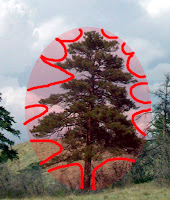
First I cut one of the grayscale photos into sections by value. (See this post for materials.) This sounds easy but people over-think it too much sometimes and make it harder. I literally use a pencil to draw an outline of the simplified value shapes, ignoring details or complex shapes, and then cut them out like a jigsaw puzzle. Then I organize them into values, grouping areas of similar value together, to arrive at 4 or 5 values. Today's photo had five values. Here's the original photograph I used:
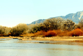
(c) 2011 Deborah Secor (Please do not use.)
I reduced it to grayscale and arrived at this:

(c) 2011 Deborah Secor (Please do not use.)
I also used Photoshop to posterize it, as I mentioned in the post below this one. Here's how it looks:

(c) 2011 Deborah Secor
 I love the elegant simplicity of the shapes this way, however as the artist you should feel free to choose the shapes you'll use.

I did something like this:


Don't get tied in knots over this part too much. I cut the photo up and taped the matching value sections on a piece of paper, grouping all the light values on one sheet, all the darks on another, etc. Then I selected each of the 5 colors. This part is so valuable and sometimes a bit challenging.

Below is a photo of one color grouping, as well as all five sheets with their value shapes taped in place (taped at the top in the first one, and on the right-hand side in all the rest of them), as well as the colors I chose. I made a little mark next to the cut-out, matching it in value as closely as possible, then used that chosen color as my benchmark. I made a long stripe of it on the paper and placed color candidates alongside, touching the two color edges to see if they were the same or similar in value. If I can't see a line dividing them they're close enough. You have to close one eye and squint like crazy, allowing your eyelashes to filter out the color, to see if they match--or you can hover your value finder over each color and make sure they're the same value that way.

Medium values
Nothing is perfect, and frankly if you don't find the exact right values it doesn't matter that much. You'll probably make yourself crazy if you try to do this by reducing photos of your colors to grayscale. Instead, learn to do it by eye. You'll develop your own color sense, and choose colors you like. Just do your best and have some fun finding a nice variety of colors for each value. You don't need to become slavish, just take your time looking and deciding. You're going to make a painting with ALL these colors, but it won't look 'real'. It will be a color explosion!


**NB: your photo will most likely make the lights white, but go just a step darker, since nothing is as white as white.

Then tape your paper in place, and using the second grayscale photo make a quick line drawing of the shapes in charcoal. Then close your palette, place the pieces of paper with the color charts and chunks of pastels on them next to the easel and begin plugging your chosen colors into the correct areas. At first it will look like a crazy hodge-podge of colors, but don't worry, just do it. Put ALL the light colors into the light area, ALL the medium-lights into those spots, ALL the colors chosen into their appropriate areas. It will look messy and fun, something like this:

Pass 1: Plug colors into the appropriate value areas.

You'll be much happier if you use the grayscale photo to begin with. It's hard enough to decide where the mediums reside, or where the medium-lights should be, without being driven insane looking at a color photo. You don't have those colors--and that's why this experiment is useful, so don't fight it. Go with all the crazy-fun colors, applied where they're meant to be, determined by the values.


Broken color close up.

After you've plugged in all the colors in the value areas, and have completed one pass, so that the whole page is covered with a layer of pastels, you'll begin to paint using this very select palette of colors. Don't open up your palette and start using more colors. Only use the 20-25 colors you've specially chosen already. Do at least one more pass with them, and if you're able, I challenge you to complete the entire painting using these colors alone!

I believe this slightly frustrating, somewhat confusing, but more than worthy struggle will help you determine the value of a color, and see that you can paint a piece with a limited palette. Value is the motivating force of a painting, and color is the energy. Go on painting, layering colors, using broken color, finding nuances. Don't strictly adhere to the puzzle. After a while, you might want to begin painting from the color photo, but only use the limited palette of colors to paint. You'll be amazed. I suspect you'll be using colors you never would have chosen from the original photograph. Just let yourself enjoy the color experience.

And have fun!

Wednesday, March 30, 2011

Addedum: Posterize the image

I'm preparing the demonstration for our class tomorrow in which I show how to determine the values of the colors, grouped into masses. I'm using Photoshop Elements 2.0, which has a neat feature. You can POSTERIZE the image. 
 To do it use 
>Image >Adjustments >Posterize
I find that 5 values works best in most instances... It's a great way to start thinking values of colors
I'll show you in class tomorrow. If you want to bring your laptop, that might be a good way to go. 
For the rest of you following along (lurking), I suggest you experiment with Photoshop and see what it can do!
See you tomorrow, 
Deborah

Monday, March 28, 2011

Class 3— Mar. 31 – Jigsaw Painting

Using a photograph of a landscape subject we’ll reduce it to jigsaw puzzle pieces, defined by value, in order to better see the underlying shapes. Bring identical prints of your photo (**one in color, and two reduced to grayscale, i.e. black and white prints of it), scissors, tape, a grayscale finder, a sketch pad a little larger than your photo and your materials and paper with you. We’ll cut and paste today. 

This class is completely explained in Chapter 24 of my book, Landscape Painting in Pastels, "Make a Puzzle Painting", if you would like to look over the entire concept ahead of time. There are illustrations of all the materials needed there. I'm a bit reluctant to point you to the chapter because too often students try to do the whole lesson at home ahead of time, and then come to class to show the results. Those who are not participating in the weekly classes will most likely benefit from doing the experiment shown there, of course, and I urge you to give it a go, but those enrolled in the class will find additional information and help at class, plus we'll be doing things slightly differently.

So, for my enrolled students, I suggest you look over the chapter and come prepared to do the work in class. I'll do an extensive demonstration showing you how to find the values of the colors you'll use, and we'll make one finished piece derived from ALL the colors you found, rather than making three color sketches, as is shown in the chapter. 

Find a good photograph, one you have taken yourself. Be certain it has at least 3 values represented clearly. However, you may use this photo if you prefer.

permission for class use granted

Bring with you to class:
  • color photograph of a landscape subject with an excellent range of values
  • grayscale copy of that photograph to cut up (blurred, if you want to)
  • grayscale copy to view (not required, but helpful)
  • sketchpad
  • a few sheets of copy paper
  • value finder
  • scissors
  • tape
You'll find it easier to do this with a clean palette of pastels, so that you can view your colors clearly.

(If anyone wants to, you most certainly can adjust and apply the principles used here to oils, acrylics, watercolor or gouache, using the time honored tradition of making color charts. It will aid you in determining the mixes of colors used, and their specific values, before applying them to a painting. I suggest painting alla prima, of course, rather than mixing colors on your canvas or paper. Think "one stroke = one color".)

Please also bring your tree threesome from last week, to show in class, and any other paintings in progress that  would benefit from a 'curbside critique' (not the same as the final critique.)

See you on Thursday, gang. 
Deborah

Friday, March 25, 2011

Stylized Negative Trees class results

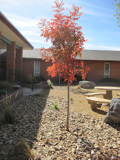
Spring Pinks, 12" x 9", soft pastels on yellow Pastelmat

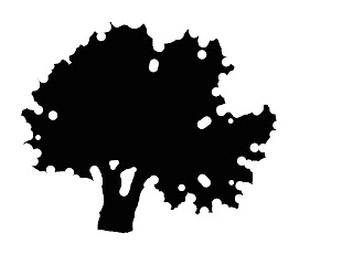
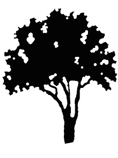
This class is meant to help you see the rhythm, balance and shapes of different trees. Start by looking at the overall outside shape of a tree: Is your tree an oval, triangle, square, rectangle or a circle? This should include all or most of the upper branches, but not slavishly. Squint to decide, and if a few little branches or leaf clusters are lost that’s okay.

First, in your sketchbook draw the geometric shape of the tree and fill in the area with charcoal or pencil. Then remove the shapes that describe the overall branch patterns. 
 
This is partly to see what’s actually there, but I also want you to spend some time designing the shapes. Don’t allow any indentations to be identical is size, scale or shape. Trees tend to repeat patterns, but artists look for interesting visual variations.


I like to do this in Photoshop. Make a positive shape filled in with black, and use the eraser tool to remove the negative ‘sky’ shapes. Whether you use charcoal, a pencil or your computer, the trick here is to keep thinking of the negative shapes as much as you can. Design these to be varied and rhythmical and you’ll arrive at an interesting shape. Don’t try to draw the background, only think of it as empty sky behind the tree. Don’t look at them as trees, but tree-like patterns.

Find the sky holes that are most descriptive, including the trunks and branches if you can see them. Scale may play a role in this, in that a smaller tree with flowers on it may show far more gaps, while a larger tree may only show a few. Squint to decide which ones are key and what can be ignored.

I want you to approach the painting the same way, to some degree, as a positive tree against a negative sky (or background). Sketch from your design the interesting and varied tree shape you chose. Don’t look at the photograph of your tree, only your drawing of it. Think flat! 


Take some time to get this shape recorded on your paper. I use charcoal to do this. You may find yourself wanting to tweak the drawing as you go along, so at that point you can begin painting. But here’s the catch—only paint the negative. It might be best if you tone white paper or use a colored ground for this. Carve away the shapes with a color or colors.In the demo below I used Wallis paper toned magenta, drew the outline with charcoal, and carved away the negative with sky blue.

quick demo carving away negative shapes only
The painting at the top of this blog post is the one I did during class from the exercise. I think seeing the negative shapes helps--you really have to paint what's behind before you paint what's in front. I began with a charcoal shape drawing, then added the grass, far greens of the trees and the blue of the sky, thinking negatively. Then I completed the tree.

Have fun--and keep going, gang!
Deborah

Monday, March 21, 2011

Class 2— Mar. 24 – Stylized Negative Trees

'Apple Tree', gouache

Class 2— Mar. 24 – Stylized Negative Trees
We’ll explore painting three different trees using a technique that carves away the negative spaces. Bring photographs of three different trees that you can view completely from top to bottom and side to side, or nearly so.  You’ll make one painting containing all three trees, much like a botanical illustration, using the negative painting technique. 
__________

The 'style' I refer to in the title of this class is about the approach to seeing and drawing the trees, not necessarily creating a negatively painted tree, as you might have envisioned! No, this isn't a dark where there should be light painting, it's a tree designed by carving away the negative shapes. You'll see a demonstration explaining the process, which will employ some of the same steps we used in this class

You have a choice. You can either use a small sheet of paper for each tree, or one larger sheet on which you paint each tree individually. I simply want you to approach each tree as a separate project. 

Please find photographs that clearly show the entire tree, of any type, in full leaf or bud, of any size or shape or age, in the spring, summer or fall (excepting bare winter deciduous trees.)  Try to find ones where you're easily able to sort out the tree from its background, not a grove that makes it hard to decide where one starts and the next stops. 

Feel free to use any of these photos, with my permission, for your paintings.


Bring the paintings you began last week of rocks underwater, as well as your drawings, for a quick critique. 

See you on Thursday!
Deborah


PS I suggest you consider signing up for this webinar on Tue, Mar 29, 2011 11:00 AM - 12:00 PM MDT: FREE Online Event: Painting from Photographs with Maggie Price

Saturday, March 19, 2011

A short video on how to erase a portion of a pastel painting...


Hope you enjoy this. This short bit was recorded in my studio and is totally an experiment, but might help you see what I do. Please feel free to ask questions!

Friday, March 18, 2011

Rocks Under Water

Yesterday's class was intense, with not just one but really two demonstrations. First I did a couple of quick drawings in pencil to show how to sort out rock shapes, especially finding the three planes: light, medium (or half-light), and dark.

Then using a sheet of white Pastelmat paper about 9" square I did a charcoal underdrawing, changing it from a rectangular format (see photo and sketch at bottom) to a square, and painted using PanPastels. Here's the result, which is still in progress:


In order to paint rocks underwater it's necessary to consider the rocks first. I suggest drawing them well, showing the underwater rocks with their shadows, if they're visible, and then consider the water's action, reflections, and ripples.

A drawing will help you see more accurately. Do a good sketch showing the placement of the rocks, either in charcoal or pastel. It’s not necessary to draw every single stone, but locate the major players, and then loosely indicate the size and general placement of scattered stones in non-essential regions.


Ask yourself what makes the rocks look wet. In the sketch above you can see that the dry rocks are generally lighter in value, while submerged ones are slightly darker. The water line indicates the shape of the rock, as well. You can clearly see the shapes and shadows cast by those beneath the water, although the contrasts are not as dramatic.

WetCanvas RIL pic by Godzoned
Also notice  that underwater rocks take on a monotone, colored by the prevailing light and any sediments carried by the water, influenced by the local colors of the rocks themselves. Ripples cast additional lines of light that sculpt stones underwater.


Reflections, along with light and shadow, affect how you see the water and stones under the surface.

I suggest you paint from bottom to top, beginning with the river bottom, any stones seen beneath the water, then its surface and any rocks above water.

I saw some wonderful pencil drawings begun in class as my students started to sort out rocks, both wet and dry, water and its reflections, bubbles and foam, and the shoreline rocks and trees.

Keep going, gang!
Deborah

Monday, March 14, 2011

New Class Session This Week

Sketch on gray Pastelmat, charcoal, white and sienna pastels

Class 1— Mar. 17 – Rocks Under Water
Find a photo that shows rocks under the water, including large and small, wet and dry rocks. It’s nice if it also has some shadows caused by interesting light, and features some reflections on the water to indicate its movement, if possible.

In this class, which launches our next eight week session, we'll take a nice, long look at some of the special characteristics of rocks under and out of the water. I don't want you to think of it as a painting of a stream, or even as a painting of rocks, but as a study of the habits of light and shadow, value and color,  texture and detail, that creates the illusion of wet and dry rocks.

Find a photo something like these (found in the  WetCanvasReference Image Library The images posted below are free for you to use, per the agreement at  WC RIL.)

by tonyjazz

by Stalksthedawn
by Kathryn Wilson

by a friend

In this class we'll begin with a drawing demo, to explore how a simple pencil sketch can express the needed elements. Print out your photo and bring it along so that you can examine the details. Bring a sketch pad and pencils, or whatever you would like to use for the drawing. 

In addition, I'll also demonstrate a study painting on Pastelmat (available for sale in class by the sheet) using PanPastels, charcoal and two or three stick pastels, much like you see at the top of the blog today. I'd like this to remain a good study, rather than trying to complete it as a painting, and may use several photographs for various sketches to show you how to approach this study and teach the rules about rocks and water.

Oh, and if you want to join our class this week, we're in the same place as always, at Paradise Methodist church on the west side of Albuquerque. We meet at 11:00 to set up and the demo starts at 11:30. Class goes until 2:30. The cost is only $25.00 per class.


See you  on Thursday!
Deborah


Monday, March 7, 2011

Class 8— Mar. 10 - Final Critique and Class Potluck

Feeling Lost, gouache, 3.5" x 2.5"--in honor of our Critique Potluck!
This will mark the end of our current session, so come to the critique ready to show your work from class and anything else you want to share with us. We'll have our usual class potluck brunch, too. Bring along a dish to share. We always have such interesting food! If anyone has some paper plates to donate, that would be helpful.

It's easiest if your paintings are ready to lean against the wall, already taped on a board so that you don't have to laboriously remove a lot of packaging or tape them up to view. We've found the Clearbags are great for transporting artwork, and wonderful to view paintings you're holding in your own hands, but not that great for the critique because of the reflections.

I want to review each of our classes, so please spend some time thinking back over this session as you prepare your paintings and think about which one or ones seemed to inspire you most and why. Here are the topics we studied:

Class 1– Emulation
Class 2– Repaint It
Class 3– The Value of Value
Class 4– Vloothius’s “No-fly” Zone
Class 5– Evergreen Trees
Class 6– Snow: White Without White
Class 7– Abstract Landscape Painting: Robert Genn

Next week we'll begin our new eight-week session, so I'd like to know if you plan to join us for those classes. The dates are March 17- May 12 (with no class on April 21).  Anyone else who would like to come along is welcome, too!

See you on Thursday, gang.
Deborah