Monday, April 25, 2011

Class 6— April 28 – Seascapes

'Honeymoon Sea', pastel, 9" x 12"

Even though we don’t live near the sea, let’s take some time to explore some of the rules of painting the ocean, waves, cliffs and sky. Bring a good photo with excellent contrast, a simple subject, and good color.

I'll be concentrating on how to paint the incoming waves, the beach along the shore, and a bit on rocks and reflections. 

'Beach', gouache, 2.5" x 3.5"

'Cliffside View', gouache, 3.5" x 2.5"

'Island Sea', gouache, 2.5" x 3.5"

You're welcome to approach this subject in any medium, any size you like, and on any paper that works for you, although I generally recommend using a lighter colored ground. 

See you on Thursday!
Deborah

Monday, April 18, 2011

Reminder--No class

There's no class this week, but I hope you'll paint anyway.

  • You might take another look at the interiors painted by David Lloyd and be inspired. Set up in the house and paint a quick, loose piece capturing the light and color there, or perhaps shoot a photo at the restaurant you visit and give that a go. 
  • Or take your easel out into the sunlight and paint the garden. My iris are blooming!
  • Or spend a quiet couple of hours at the easel completing work you began in class. After all, you have a "spare" day, since you won't be coming to class.

And may each of you enjoy this season when we celebrate the Passover and the resurrection of Christ!

Blessings--but I won't see you on Thursday this week.
Deborah

Monday, April 11, 2011

Class 5— April 14 – Be Inspired by: David Lloyd (interiors)

Last session I presented the first inspirational slide show and discussion (devoted to Robert Genn), and it was so well received and instructional that I'm doing another one.

This time we'll look at the interiors painted by a favorite of mine, David Lloyd. Although he isn't as high profile as Genn, I think his light-filled, painterly visions of gracious homes painted in acrylics are quite worthy of study. I'm always looking for inspiration to try new subjects, and the idea of painting a "roomscape" or cafe scene is something I think would be interesting, so I offer this class to encourage and stimulate both of us.

(c) David Lloyd , @ Edward Montgomery Fine Art
'Tradition and innovation are of equal interest to David, and he believes one need not be shunned for the sake of the other. The familiar, impressionistic underpinning exhibited in his work reveals his roots as a traditional oil painter, while he currently utilizes the vibrancy and flexibility of modern acrylics to push the boundaries of this orthodox foundation. Often working in the abstract, David believes that freeform rehearsals are key in keeping his realistic pieces fresh, loose, and full of movement. This marriage of abstraction to verism, and modern medium to classical technique serves the artist's drive to create exceptionally dynamic paintings. Whether using simple washes, complex layers, or impasto techniques, David stretches his medium to its limits.

Influenced by 20th century illustrators, graphic artists, and classical painters alike, from realists to abstractionists, the breadth of David's interests yield a technique he describes as "a painterly fusion."'


We will also do a mini-critique of anything you're painting. This is meant to give you a boost along the way on one or two works-in-progress, to help you see where to go or trust what is already working. (Please understand that this is not meant to replace the final critique, at which I want to see how you have RESOLVED some of the issues we discuss in the mini-crit, as well as viewing a small body of your work and talking about your goals for the future.) And bring along your 10 Minute Challenge paintings to show us, please!

We'll have an open painting session after that, in which you can begin to apply some of the critique information, under my supervision, so bring along your materials and supplies as usual.

See you on Thursday!
Deborah


Friday, April 8, 2011

Ten Minute Challenge class results


Personally, I found this exercise to be one of the BEST we've done in my classroom in a long, long time. I learned a lot from it, and I saw some wonderful things happening in my students' work, as well. I must give a hearty thank you to Carol Marine for this idea, which was one of the Daily Paintworks Challenges in February this year. I've admired her paintings for a long time and I know she's a busy workshop instructor. No wonder!

At the top is the sheet I painted yesterday and below are some close-up shots to show you the details. I found gouache to be a great medium for this experiment, although I was certainly tempted to use pastels. The ease of making color adjustments, as well as using edges and overlapping in pastel, lends itself to quick work, while the color shift and drying time of gouache may seem to work against you, but in actuality I think it resulted in some 'happy accidents' (a phrase I'm a bit tired of using...let's say 'pleasing incidents' instead.)

apple 1

apple 3
apple 5

Let me share some of the work done by my students. These were all in progress, and all are in pastel. Most of the divisions were in the 4"x6" range or smaller. We painted a total of 80 minutes yesterday, in 10-minute increments with breaks, of course. A few were a little frustrated at first, some just took off flying, and we all had to push ourselves to do the last couple of them, but in the end I think each of us benefited from this.

Annie's apples

A couple by Carol

 Jaffa's red bottle


Lisa's apples

All in all, this was another good class. I hope those of you who are taking part remotely will try this one and find it as helpful as we did.

Good job, gang!
Deborah

PS I have had to adjust this class schedule. Some dates have been changed and one class has been added, so please see the Current Class Schedule page for details.

Monday, April 4, 2011

Class 4— April 7– Ten Minute Challenge

You’ll divide your paper or canvas into eight smaller squares/rectangles, select a single simple object and paint it eight times, allowing only ten minutes for each one! You can change the viewpoint, alter the light, angle it differently—but only ten minutes per section. Can you say spontaneous? 

This class was inspired by the Daily Paintworks Challenge posted by Carol Marine. I suggest you take a look at the paintings there for some wonderful inspiration! 

It's easiest if you use one simple object and paint from life. I find it inspiring to have a colorful ground, too, since I'm painting the object over and over, so you might bring colored paper, a cloth or whatever you desire as a background. You aren't trying to paint the thing in radically different settings, or vary things too much, it's just that painting the same object eight times can get a little bit boring, so if you want to change the shadows or vary the arrangement a little, I think that's fine. However, don't lose sight of the main point and get bogged down in the variations. 
 
Go look at Carol Marine's painting, as well as what the others have done at DPW, but with an eye to the lesson, not the final product. It's not a competition to be creative or original, it's an opportunity to learn to express an object quickly and effectively. Speed will add fresh strokes to your work, and repetition shows you how to most effectively describe what's there. In theory the progression will show!

The idea is to paint it fast and well, learning to distill your strokes as you go, in order to express the thing effectively. If the object or the ground is too complex, with too many details, it takes longer to paint it effectively. I'll have my timer on hand and we'll paint together for ten honest minutes at a time. So remember KISS--keep it simple, sweetheart!

I think it's best if the squares or rectangles are in the 4x6" range, minimum, or a little larger. You can also use two small pieces of paper/canvasses and divide each one into four. Keep them the same size. I'll do a demo of one quick example in class.

See you on Thursday!
Deborah


Thursday, March 31, 2011

Puzzle Painting class results

 
Bosque Colors, (second pass) soft pastel, 12" x 18" Wallis paper

Whoo hoo! Color is a blast! 

Okay, I had so much fun  in our class today that I couldn't wait to show you the outcome. Above is how my demonstration painting stood when we left class. Now let me show you how I got to this point, which is technically not completed, but is well on its way.

First I cut one of the grayscale photos into sections by value. (See this post for materials.) This sounds easy but people over-think it too much sometimes and make it harder. I literally use a pencil to draw an outline of the simplified value shapes, ignoring details or complex shapes, and then cut them out like a jigsaw puzzle. Then I organize them into values, grouping areas of similar value together, to arrive at 4 or 5 values. Today's photo had five values. Here's the original photograph I used:
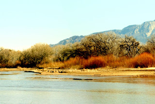
(c) 2011 Deborah Secor (Please do not use.)
I reduced it to grayscale and arrived at this:

(c) 2011 Deborah Secor (Please do not use.)
I also used Photoshop to posterize it, as I mentioned in the post below this one. Here's how it looks:

(c) 2011 Deborah Secor
 I love the elegant simplicity of the shapes this way, however as the artist you should feel free to choose the shapes you'll use.

I did something like this:


Don't get tied in knots over this part too much. I cut the photo up and taped the matching value sections on a piece of paper, grouping all the light values on one sheet, all the darks on another, etc. Then I selected each of the 5 colors. This part is so valuable and sometimes a bit challenging.

Below is a photo of one color grouping, as well as all five sheets with their value shapes taped in place (taped at the top in the first one, and on the right-hand side in all the rest of them), as well as the colors I chose. I made a little mark next to the cut-out, matching it in value as closely as possible, then used that chosen color as my benchmark. I made a long stripe of it on the paper and placed color candidates alongside, touching the two color edges to see if they were the same or similar in value. If I can't see a line dividing them they're close enough. You have to close one eye and squint like crazy, allowing your eyelashes to filter out the color, to see if they match--or you can hover your value finder over each color and make sure they're the same value that way.

Medium values
Nothing is perfect, and frankly if you don't find the exact right values it doesn't matter that much. You'll probably make yourself crazy if you try to do this by reducing photos of your colors to grayscale. Instead, learn to do it by eye. You'll develop your own color sense, and choose colors you like. Just do your best and have some fun finding a nice variety of colors for each value. You don't need to become slavish, just take your time looking and deciding. You're going to make a painting with ALL these colors, but it won't look 'real'. It will be a color explosion!


**NB: your photo will most likely make the lights white, but go just a step darker, since nothing is as white as white.

Then tape your paper in place, and using the second grayscale photo make a quick line drawing of the shapes in charcoal. Then close your palette, place the pieces of paper with the color charts and chunks of pastels on them next to the easel and begin plugging your chosen colors into the correct areas. At first it will look like a crazy hodge-podge of colors, but don't worry, just do it. Put ALL the light colors into the light area, ALL the medium-lights into those spots, ALL the colors chosen into their appropriate areas. It will look messy and fun, something like this:

Pass 1: Plug colors into the appropriate value areas.

You'll be much happier if you use the grayscale photo to begin with. It's hard enough to decide where the mediums reside, or where the medium-lights should be, without being driven insane looking at a color photo. You don't have those colors--and that's why this experiment is useful, so don't fight it. Go with all the crazy-fun colors, applied where they're meant to be, determined by the values.


Broken color close up.

After you've plugged in all the colors in the value areas, and have completed one pass, so that the whole page is covered with a layer of pastels, you'll begin to paint using this very select palette of colors. Don't open up your palette and start using more colors. Only use the 20-25 colors you've specially chosen already. Do at least one more pass with them, and if you're able, I challenge you to complete the entire painting using these colors alone!

I believe this slightly frustrating, somewhat confusing, but more than worthy struggle will help you determine the value of a color, and see that you can paint a piece with a limited palette. Value is the motivating force of a painting, and color is the energy. Go on painting, layering colors, using broken color, finding nuances. Don't strictly adhere to the puzzle. After a while, you might want to begin painting from the color photo, but only use the limited palette of colors to paint. You'll be amazed. I suspect you'll be using colors you never would have chosen from the original photograph. Just let yourself enjoy the color experience.

And have fun!

Wednesday, March 30, 2011

Addedum: Posterize the image

I'm preparing the demonstration for our class tomorrow in which I show how to determine the values of the colors, grouped into masses. I'm using Photoshop Elements 2.0, which has a neat feature. You can POSTERIZE the image. 
 To do it use 
>Image >Adjustments >Posterize
I find that 5 values works best in most instances... It's a great way to start thinking values of colors
I'll show you in class tomorrow. If you want to bring your laptop, that might be a good way to go. 
For the rest of you following along (lurking), I suggest you experiment with Photoshop and see what it can do!
See you tomorrow, 
Deborah