Monday, August 15, 2011

August 18--Color Wheel Paintings

Color is the lifeblood of a painting. Do you ever wish your paintings had more expressive color? The kind of color that makes your toes curl? Exciting! Inspiring. Gorgeous. Inviting. Brilliant. Mellow. Lush. Strong.

Is there art you look at and just long to be able to do what the artist has done with the color? It might be bright, saturated color. It could be muted, moody color. Perhaps it's a certain set of colors that just grabs your heart. Well, this week I want to help you analyze and think about  color, and challenge you to push it a little farther in your own work. It's a simple, concentrated but fun exercise!

First of all I want you to find art that has color that inspires you. Take some time before this class--and this is CRITICAL to the class--to find examples of paintings with color that really, truly catches your breath, thrills and delights you. It can be from any era, any artists, any medium, anything--but remember, it's about the COLOR. Bring prints from magazines, books, or photos you print out of these paintings with you to class. Find at least three different color examples, and even more if you're inspired.

Bring a virgin white sheet of paper or canvas that you can divide into four 4"x6" sections (or bring four smaller pieces), your painting materials, and the photos of other artists' paintings you love.

We're going analyze colors on the color wheel, except we aren't going to use a wheel. We're going to use this color chart, designed by Don Jusko.

courtesy Don Jusko, www.realcolorwheel.com

It will simplify things if you print out a chart for yourself. I've broken it into two 8.5" x 11" halves. I'll have my chart at class for you to use, but you'll have to share.

I'll give you a simple, fun color exercise in class! Come ready to think and play. It's a color class, so pastelists take note and bring your colors. Painters have it easy. Any medium will work.

Please RSVP if you aren't already listed as attending, because I'm preparing handouts and would like to know the number to bring. Space is limited!

Remember, we're in the new location, meeting at Christ Community Fellowship near I-25 and Paseo del Norte.  If you need directions, email me and I'll send them.

See you on Thursday!
Deborah

Saturday, August 13, 2011

Beginning Critique and Through the Water class results


Clear Water Stones, 5" x 7", gouache on Arches #300 c/p

It was so good to get back to class again!

We began with a  critique, looking at 3 or 4 paintings from each student to determine the direction and improvements each one wants to make, not only in individual paintings but on the whole. I really have a talented and enthusiastic group of students.

Following that, I gave a short lecture on how to paint rocks underwater, with a demonstration that was done mostly using PanPastels. Above is a painting I prepared to show how effectively you can paint this subject using gouache, and below is an example of how you can approach this subject in pastel.


High and Dry, 9"x 12", pastel on Pastelmat
To paint underwater rocks I suggest you begin with a photograph that inspires you. Find a photo that shows large and small, wet and dry rocks, has shadows caused by interesting light, and features some reflections on the water to indicate its movement.

Choose a medium tone that will allow you to build both light and dark areas. Do a good sketch showing the placement of the rocks, either in charcoal or pastel. It’s not necessary to draw every single stone, but locate the major players, and then loosely indicate the size and general placement of scattered stones in non-essential regions.

Don’t be afraid to go dark in the early stages. Using saturated colors of the proper value will also work to your advantage when you mute the underwater rocks with further layers of pastel.

To create the impression of water over rocks is really a fairly simple process. Select a color that will portray the water, whether it’s a blue-gray or green-tea color, and lightly glaze or feather over the color in place. Don’t cover the lights and darks beneath, and don’t obscure all the color with a thick layer.

Then add highlights in the reflections, bubbles, floating objects, and ripple lines in the water. A reflection obscures what is beneath, so paint from bottom to top, but leave room for paler areas on top. To paint a ripple, think of two mirrors pointed in different directions, catching the color of the object they’re pointed at. Use sharp edges to create the impression of liquidity. To paint a floating bubble, draw an ellipse on the water in a color darker than the surface, then ring it with light and carefully draw in the light colored dome. Pay attention to the direction of the light and shadows, and where you see highlights. 

Keep going, gang!
Deborah

Friday, August 12, 2011

Pay Attention: Photos

 A little dividend for my student friends about....


TAKING BETTER RESOURCE PHOTOS
Focus on what you most likely will paint.

Look for subjects that you actually want to paint, not just ones you respond to on the scene. It might be true that the thousand flags flying over the capital are stunning, but ask yourself if you really think you’ll spend the time needed to capture all the myriad colors and details, or if you might more reasonably want to focus on one or two flags for a painting. Serendipity is delightful, but composing the photo with your painting abilities and skills in mind makes for a better resource in the long run.

Take more than one photo of a subject.

If you find a subject you think will make a good resource, don’t limit yourself to one quick ‘grab’ shot if you can. Take several shots from different angles, close up and farther away. You may be able to stitch them into one shot, or make one painting out of several of them. You never know when you’ll want to know what was to the left or right, or what was casting that weird shadow! More is better.

Let the day and place work for you.

It’s easy to say the light is wrong, and you just can’t get good photos, but that derives from your attitude and what you hoped to get. Forget about it! If the day is gray, look for beautiful color amid the gray, focus up closer to details or look for textures, or shoot into things like shops or through car windows. If the wind is blowing, look for subjects that show the movement of the wind, tipsy flowers, blowing hats, or dust and leaves obscuring the sky. If it’s rainy, look for reflections or raindrops. Don’t neglect to take interior shots, or shots looking from the inside out.

Remember what your camera does.

Do more than point and shoot. Pay attention to how the scene changes when you lift the camera to look at the viewfinder. Does it put everything way out at arm’s length? If so, you might need to use your zoom. Would the photo be clearer if you walked closer to shoot the photo? (Sometimes the quality of a zoom shot is lower.) If you’re shooting people, using the zoom is a good thing, as it puts them at ease, unconscious of the camera. Be sure, however, that if you take a ‘character’ shot you get a signed model release. If you have a recognizable person in the painting you need one.

Don’t forget you can control the settings manually.

When shooting into direct bright light you can end up with silhouettes, lens flares, and an overly contrasted photo. Move to one side or point the camera upward or downward, or arrange to shoot with your camera in the shadow cast by an object. You can change the camera settings so that you shoot darker or lighter photos, too. Bracket pictures so you have a range of light conditions, if you’re unsure. Shooting in shadows is equally challenging, sometimes resulting in gloomy photos. Learn how to adjust the ISO to a higher setting, if needed.

Focus on the main thing.

Don’t get distracted trying too include too much in one picture. Are you shooting shadows? Get several shots of the shadows from different angles, close up and further back. Then take a shot of the thing casting the shadow. In this way you defeat the propensity of the camera to average the light. Shoot light pics, then dark pics.

Pay attention to the background.

If you have a choice, try to position yourself to avoid complicated overlapping patterns. Look at what’s in front of the shot, too. Again, several shots might be in order here. As the artist you can pick and choose what to use from each photo.

Straight and level is best.

We’ve all seen the cute tipped-camera shots. You basically get more into a frame that’s straight and level. Sometimes it’s hard to correct the sloping horizon line in a painting, so getting it straight helps.

Horizontal or vertical?

Don’t forget that you can change the format of your camera! There may be times when shooting a vertical shot will give you much more interesting possibilities, including elements in the he foreground to higher in the sky. At other times the horizontal format is far preferable. Just don’t’ get into one habit. Change it up. Shoot the scene both ways!

Basic geometry counts.

Look at the underlying geometry of the place you’re shooting. Compose so that the circle moves into the square, or the oval is at the one-third mark. Don’t forget the ‘rule of thirds’ when composing: visualize that tic-tac-toe game drawn over the scene and place key elements where the lines intersect. Remember that these rules are made to be broken, but it takes good planning to break them effectively.

Get creative.

Lie down under the tree. Climb up on the wall or stand on the bench. Put your hand into the shot, or include your foot. Shoot into or through something. Look for reflections to shoot. Find a strong diagonal line. Look for a smiley face to shoot—they’re everywhere. Sometimes these shots give you a creative boost for a painting. Sometimes they just keep you looking and thinking, so you’re excited by the process again.
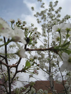


Blowin' Blossoms
It's spring in New Mexico!


And the Girls Looked On...

Monday, August 8, 2011

August 11--Beginning Critique & Through the Water -- New Location

As I was out walking this morning there was just a hint of a taste of a bit of a cooler feeling in the air, and I realized fall is actually headed our way. We still have a few weeks of warm weather to come, and I hope some more rain, but fall is waiting in the wings! 

So, are you ready to settle down and start to paint again? I know I am.

This week we're going to have a beginning critique. We've come to think of a critique as a way to end a class or workshop but Iet's shift our thinking a bit. What is a critique meant to accomplish? I think it should be a means to keep or get you moving. I often talk about finding the "point of friction", that place where as you let out the clutch the engine engages, so look over the work you plan to bring and see where you think you'd like to go. Usually that means finding the place where you need to know or need to grow. We'll certainly look at each piece with an eye to improving it, if you're still in the process of working on it, but try to paint the 'big picture', too. 

Rock photo to use in class.

Then I'll do a lecture and demonstration about how to paint underwater rocks. If you would like to, you have  permission to copy and print the photograph here and use it for the class lesson. We'll examine the way the colors change in and out of the water, how the edges shift and the values mute when the rock is beneath the water. There's a bit more to it--things like refraction and ripples and light patterns, but come to the class to learn about those! 

Please RSVP (clickable link) if you haven't already. The class is $25.00 and you may pay at the door. 

_*_*_*_*_*_*_*_*_*_*_*_*_*_*_*_*_*_*_*_*_*_*_*_*
Now for the big news: we're going to start meeting in a NEW LOCATION this week!

_*_*_*_*_*_*_*_*_*_*_*_*_*_*_*_*_*_*_*_*_*_*_*_*

We will be meeting in a nice room inside Christ Community Fellowship, 5908 Anaheim Avenue NE, located off of San Pedro north of Paseo del Norte Blvd. So many of you responded positively to the idea of relocating to a more central spot that I’m even more enthused than I was about this change. 

The classroom is quiet and private, has plenty of tables and chairs, a nice little kitchen for coffee and tea (plus a microwave if you want to heat your lunch), and the parking gives us easy access. You can come via Interstate-25 or travel on surface streets. If you plan to come to this class, let me know and I'll email directions. 

Class will be the same time as always 11:30-2:30. I'll open the classroom around 11:00 if you'd like to come and set up ahead of time. 

See you Thursday!
Deborah

Tuesday, August 2, 2011

August Class Schedule

Starting this month I’m scheduling four-class blocks. I think it will be easier for you to check your busy schedule up to a month in advance. YES, you may sign up for individual classes. As soon as you know you will be able to attend, click the link and let me know. You may pay at the door. I'll post the class announcement on the Monday previous to it. I need a minimum of four students to make the class a go!


The cost of the 4-class session is $100.    Please RSVP for ALL FOUR classes here. < Clickable link 


Beginning Critique & Through the Water
Please bring up to three paintings for the critique. Then we’re going to warm up after our summer away with a look at rocks underwater. I’ll supply the photographs, you bring your materials, and we’ll examine the way that colors change, edges shift, and values mute when a rock is beneath the surface of water.  
August 11 RSVP < Clickable link


Color Wheel Paintings 
Here’s a chance to play with some creative color work. Have you wanted to enhance color? This may help you begin, or move farther along, in your experiments. In this new class we’ll use the color wheel to locate the major color groupings, and analyze how to further harmonize colors from there. I’ll help you select colors that shift away from the photograph to further enhance the painting’s mood and voice.  Please bring some examples of other artist’s paintings that you think use excellent color that intrigues you (books, magazines, photos.)  
August 18 RSVP < Clickable link


The BIG Vista
We’ll be painting the open, vast spaces today in order to be able to see the evidence of how the air affects the landscape. Find a good photo with lots of rich information leading well back into space, including all four value masses: the sky, mountains or mesas, trees, and foreground. We’ll discuss ‘the rules’ of distance and look at how to control values, colors, edges and use effective strokes. Think BIG, at least in scope, if not in scale.  
August 25 RSVP < Clickable link


Cliffsides
In this new class we’ll examine the drama, light and color of rocky cliffs. The challenge often is how to use enough color, detail and line, without overburdening the painting with too much detail. Look for a good close-up with at least as much detail as in the photo at left. This may be a good chance to find out how to approach painting your photos of the Grand Canyon or Canyon de Chelly!   
September 1 RSVP < Clickable link


Class is held Christ Community Fellowship Church from 11:30 to 2:30 on Thursdays. Bring your lunch along and watch the demo for the first hour, then work at your easel. Classroom opens at 11:10.

Monday, July 25, 2011

Summertime....and "rearranging the furniture"

Evening Dance, gouache, 2.5" x 3.5"

Coral Downpour, gouache, 2.5" x 3.5"

Summer has finally come to Albuquerque. Well, at least the monsoons have finally come! Last night we had a good old-fashioned summer thunderstorm. Lightning, thunder, and a real gully-washer. True, the humidity is up high today and the swamp cooler isn't really very cool, but I'm still grateful for every drop of much needed rain.

I'm on hiatus from classes for now, which has given me time to do a few other projects and to paint a little here and there. It's nice to have a break, but I love to teach so I'm planning my classes. As of now, I'm still kicking around ideas and tinkering with some techniques to show you when we resume. Lately I've found myself thinking we need a few changes. I'm in the throes of rearranging things and to see what feels right. It's kind of like rearranging the furniture and recovering a couple of pillows--fresh and fun, but not so you bump your toes too badly when you walk through.

I'm planning to resume our class the second week in August, but I'll let you know when I have more details!

Meanwhile, hope you're painting! Think summer skies. This is most definitely the season for them. Have fun!

Deborah

Monday, July 11, 2011

July 14--How to Use Photoshop for Paintings

I'm going to refer you who are enrolled to this post, which has all the information about the class, and you might also look at the one after that for the results, too. 

Class is from 11:30 to 2:30. Bring your sack lunch. I'll have iced tea and coffee available. The lecture portion is approximately 2 hours, with Q&A follow-up. I'll send direction to my home in Taylor Ranch to those already enrolled.

See (some of) you on Thursday,
Deborah