Monday, October 18, 2010

Class 4— October 21— Complexity Behind it All

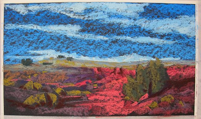
San Carlos, pastel, 12" x 12"
At this class I’m going to try to help you see and understand better how to approach a complex background that resides behind your subject matter by patterning light and dark, as well as identifying and repeating shapes, colors and textures. Your photo should have something like a tangled forest or textured hillside overlapped by the subject matter in front of it.

Look for a photograph something like this:


I often take my photos into Photoshop to manipulate them. For instance, you might do something such as this, blurring the area behind so that you see it as shapes.


Or it can be helpful to do a drawing from a complex photo that reduces the tangles to areas of value and patterns, so if you have time this week you might try a pencil drawing such as the one below to help you see the areas of complexity as values and shapes only. Bring the drawing(s) along with your photo(s).


Any kind or size paper is fine with me, but I always think it's a good idea to consider the amount of information in the painting and how you plan to paint it, and then choose the size of the paper to suit it. It can be hard to cram a lot of background shapes onto an 8x10" paper, so choose accordingly. 

Bring your night paintings done last week to show, as usual. I want to talk about the night paintings, and see the results on the black boards you made.

See you on Thursday,
Deborah

Thursday, October 14, 2010

Night class results

Painting night scenes on the black boards we made today was really an interesting experiment. I love the textural  qualities they have, and it's quite effective working on the very dark color.

We began with a review of last week's class devoted to turning up the contrast. Here are a few pieces we analyzed. None of them is quite finished, but the resolution is coming along on each one.

Lisa (we saw the beginning stage last post)
Adriana (done on a black board, but painted last week)


Charles

The lecture was just about right out of the chapter on painting the night from my book, with a few other excursions. The basic rules of painting the night go like this:
  • Use colorful darks, not just black.
  • Accentuate the patterns of the lights.
  • Use exciting colors in the light areas.
  • Look for haloes around light bulbs.
  • Moonlight can cast pale shadows.
  • Use medium-light colors, not white, for most stars.
  • City lights form strings of colored lights following streets.
  • Keep city lights in perspective, massing them in the distance.
I think it's a good idea to crop and recompose the photograph before printing it, if you can, but thumbnails or sketches can do that job just as well. I like to print out my photo close to the same size as the board, if that's practical, which it was today. Most of us were working on 8x10" boards.

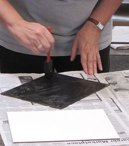
Probably the most interesting part of the day was making and working on these toothy boards. Barb Clark brought all the supplies we need, including the pre-primed Masonite panels, black (and various other colors) of Art Spectrum Colourfix Primer, and foam brushes. The process is simple. She uses a couple of different textural approaches. In the first she just lets the strokes go catywampus (HER word) creating a nice scumble of ridges and textures. In the second she places the strokes all in one direction, lets it dry, and runs the strokes the other direction, creating a sort of canvas-like look. In both cases she lets the first application dry and applies a second coat.


I did my demonstration on one of the boards. It's not too far along but you can see how it's coming. I loved working with the dark ground, which makes the colors just glow. I didn't leave the black 'raw', but covered it with deep, rich dark colors, as you can see. The black ground is still evident throughout the piece, and will be when it's finished. Barb told us that one nice thing about using the primer is that if you over-blend something and lose the contrast you can brush off the pastel, even in just a small area, and reapply some of the Primer, thinned down with water, to recover the same surface. Very convenient! I enjoyed the way the catywampus texture made the tree look snarled with little branches almost effortlessly.


I'll carry this painting farther, of course, but we wanted to get our hands dirty. This was serious stuff, as you can see from the looks on their faces. Don't worry, we lightened up! It was a fun class and the results looked promising.

You're doing great. Keep going, gang!

Deborah

Monday, October 11, 2010

Class 3— October 14— Night


Night Street, pastel, 12" x 9"


Find a nighttime photo with an interesting pattern of colorful lights to paint. We’ll analyze what makes the nighttime painting successful, painting on dark paper. We’ll discuss how you can make your own dark colored surface for this painting.

We'll start our class with a review of the work done last week, so bring along your contrast paintings. 
Then I'll do a lecture/demonstration on painting the night, and after that concludes I've asked Barb Clark to show us how she makes her toothy, black Masonite boards. 

Painting the glow of lights at night can be fascinating. I find it's best to work on a dark colored surface, making the addition of light streamlined. Black or very dark paper is sometimes hard to come by, so in the past we've "blackened" Wallis paper by adding a thick layer of very dark pastel and spraying it with water. It takes time to stretch it flat and, once done, it fills a bit of the tooth. 

Since most of you work in pastel, I'll demonstrate a night painting on one of Barb's hand-made boards using pastel, but I'm also anxious to give gouache a try on it. If you're working in another medium I hope you enjoy the idea of using a black or very dark ground. You might want to prime your surface with black gesso.

Find a good night photograph (not a sunset, as that's a different issue.) I have some photographs I'll bring, but take a look around and see what you can find or shoot this week. It really doesn't matter what the subject is, as long as it has an interesting pattern of lights against the dark. You can paint the big vista with city lights spread out, or the closer city scene, or anything else you find. Something like this:


Albuquerque panorama

Nighttime at El Pinto

If you would also like to make your own board you need to give Barb $3 in cash, please. The ones she provides are 8"x10", unless you want to bring a larger Masonite panel, or another surface such as rag mat or heavyweight watercolor paper. In choosing a photograph, you need to consider the scale of the board. It's very challenging to paint a vast panorama on small surface, not to mention detailing tiny spots of light on a toothy surface, so choose wisely, grasshopper. 

I'll be wearing my messy clothes so I can make my own board. See you on Thursday!
Deborah


Thursday, October 7, 2010

Turn Up the Contrast class results

IF YOU'RE ENROLLED AND HAVEN'T ALREADY, PLEASE SUBSCRIBE. 
<------ RIGHT OVER THERE!

I think this turned out to be a really good class! I always enjoy the energy of a larger group and our ranks swelled a bit today, which was fun. Good to see a few of you I hadn't seen in a long time, too... 

I offered a series of questions and asserted some pretty basic things about contrasting values and the role they play in composition. I don't think any of the things I said were a mystery to anyone there, but reminders can be good. If you want more details on this, visit the chapter in my book blog titled Letting Value Lead.

Think about these:
  • Value contrast creates a composition. No contrast, no picture. 
  • Value contrast is most evident when black is next to white. 
  • Strong contrast is useful for controlling attention. The greater the difference, the more attention the area attracts.
  • Value contrasts lead the viewer into and around the painting in an interesting, planned way.
  • Similar values placed together are not as visually interesting as highly contrasting values, which tend to attract the eye.
  • Middle values usually provide the framework for the painting, with light and dark value contrast giving the work its visual impact.
  • When the value range is reduced the eye still goes to the area of maximum contrast, but the design loses impact. 
  • A wider range of tonal values will have a stronger impact.
You construct the composition by creating a wide range of tones, controlling the movement of your viewer’s eye, and creating interest in the painting. Value contrast plays a big part in painting, the most important of which is moving the eye around, manipulating attention. More contrast, more interesting. Less contrast, less interesting. Value contrast is the visual impact of a painting, the oomph, the pizzazz, or lack thereof.

If your composition lacks a lot of contrasting values it’s visually boring. Oddly, if your composition is consistently high in contrast all over, it’s also boring. So it isn’t about just upping the contrast to make the painting interesting. Instead you have to control the contrast to move the eye. Create your value structure with well-placed medium values, massed together, providing the underlying organization, and place stronger contrasts in key areas to attract attention, and then modulate the remaining values to induce further movement around the painting.

Here's a peek at my painting in progress. First my plan, next to the photograph. I often make a plan and then see where it goes as I paint. It helps me to think it through beforehand. The reality became somewhat different, as you can imagine. 

 How can I improve the contrast to direct the eye in the painting?

In grayscale you can see that it’s very dramatic, but the light is outlining the cloud because it’s backlit. Most of the light contrast is on the right-hand side. It’s awkward to attract the eye so close to the edge. So to remedy this, I plan to move the top of the cloud to the left, and create more of that light sheen in a pattern leading the eye around the cloud.

Rather than make it two twin clouds overlapping, I’ll reduce it to one cloud, off-center in the composition, and draw out some of the interesting smaller clouds on the right to create an overall shape that points the eye into the cloud itself.

The contrast on the ground needs to remain dull, supportive but not attractive to the eye, as do the smaller, lower clouds. The blue of the sky should be dark enough to give the lights real pop, while remaining believable. 


And as you can see, I decided to move the cloud to the right, instead of the left, creating a sinuous movement of the whole cloud with the smaller, sparkling clouds in front.


I saw some dynamite work in progress, too. None of these is finished, of course, but I hope you can see how talented my students are!

Nancy

Lisa

Diana

Catherine

Barb

And this shows a few of the gals at work in our spacious classroom with wonderful light.

At work in the classroom.
Patti brought in a sculpture of a crow and is sight measuring it, of course.

It's going well. Keep going, gang!
Deborah

Monday, October 4, 2010

Class 2— October 7— Turn Up the Contrast


Contrast is one of the elements that creates movement and gives pizzazz to a painting. Find a photo that has a good range of values from dark to light. In this class we’ll ask how we can create effective contrast that draws and moves the eye. 
Have you ever noticed that the winning paintings at most shows are high contrast pieces? They have an excellent range of strong light and dark values. Does every winning painting have sock-it-to-you high contrast? Well, maybe not, but it has enough of a range of values that it's effective and interesting. Value is a basic property of color, of course, and is in essence the motor that drives where your viewer's eye moves. You have to control that movement to make your composition compelling, whatever the subject matter might be. 

At this week's class I'll do a demonstration that develops the grayscale underdrawing to create a composition with excellent contrast that moves your eye into the area of interest. We'll discuss the motivating factors and talk a bit about how value and color are linked. 

Find a photo that interests you, with a stimulating value contrast in the area of greatest interest. Bring both a color and grayscale copy of it to class to use for your painting. It can be any subject matter, and any size. 

Look for something like these, which I reduced to grayscale, as well:


(c) photo: Don Ketchek,  'Bobby'


Please bring your paintings from our 3-D class last week so we can discuss that class together. I'll be interested to know how you liked it. 

See you on Thursday!
Deborah

Friday, October 1, 2010

The 3-D Painting class results

What gives depth to a painting? There are several "depth clues" that all of us use fairly routinely and hardly think about, like perspective, value and color shift. But there are a few others that seem elementary but often do not come under scrutiny. I decided to examine these clues and challenge my students to think about them more clearly.


I find that most of us understand one-point linear perspective, which is the convergence of the road, river or railroad tracks in the distance, and even two-point perspective, making both sides of the barn recede. We might not have studied all the rules, but in our minds we get that. 

Aerial perspective, on the other hand, is a tool my students have had drummed into them over and over. John Carlson's Law of Aerial Perspective states: All colors become cooler in color and lighter in value as they recede from the eye, except white. 

The rest of these clues are fairly simple but together can add great depth to a vista.
  • Think about relational proportions, for instance, in which larger objects appear nearer. That can become more complicated when a small object is closer and a large one farther away. They can look about the same size, which may be literally accurate but destroys the illusion of depth.
  • Modeling shapes gives form to objects in the composition, which is another key element in creating three-dimensionality. A well-rounded tree or bush, or modeled mountain or mesa adds to the illusion.
  • Overlapping shapes is another biggie. We all know that things in front overlap things behind. I always tell my students they must paint what's behind before painting what's in front, and part of the reason is this overlapping, which adds more to the illusion. 
  • Your point of view can also contribute depth clues. Think of the ant's eye view verses the bird's eye view. A high viewpoint gives majesty to the vista, while the low one adds drama and intrigue. Both enhance the sense of depth by engaging the viewer in feeling small or large, low or high.
  • Shapes can create depth by contributing directional forces. The shape of masses of value add dramatic depth when seen as one, such as the 'arrow' of a grasses and low-growing shrubbery in the foreground pointing the eye into the distance.

We spent some time looking at a few of my paintings, examining the various depth clues in them. In the portrait the depth is a few inches from the back of the hat to nose tip, accomplished using color, while in the figure painting it's the overlapping of shoulder and chin. In the floral painting (a gouache piece), the clues are color contrasts and dark-light contrasts, along with overlapping shapes. The shapes of the shadows contribute some depth clues to the trees, while linear perspective is at work in the painting of the window.


I asked my students to take some time to sketch out the composition they planned to use for the painting and identify, as well as enhance, some of the depth clues they saw there. Here's a nice drawing done by Adriana:

I saw some very nice work starting to take shape in the class, but will wait until next week to show you some of the results. It seemed to clarify some things for folks, at least making us think more seriously about things we often take for granted.

Good work, gang!
Deborah

Tuesday, September 28, 2010

My first video: the working palette

I thought I'd figure out how to make a video, and decided to upload my first one here so people can see my well-used, dirty pastel palette. This is the real thing, folks, not some shiny, cleaned up version for video!


I hope it's interesting and helpful to see it. The Ludwig pastels I mention are a few of the confetti colors Terry makes. If you haven't tried them, give it a go--what fun to swipe a gold and find bits of red, green and blue making a gorgeous stew on your paper!

You'll also see a 3" foam brush, which is a trusty tool I use every day, and several Colour Shapers, as well as a Sofft sponge, a stick of extra soft vine charcoal, and a 'white' (more black now) plastic eraser.

If I can learn how to make decent video clips, I'll add an occasional ones here to show you how I do things. Let me know how I did...