Monday, October 24, 2011

October 27- Sunlit Snow and Shadows


What is more beautiful than sparkling snow and shadows? This gorgeous subject is inspiring. We'll take a good look at the basics of painting snow, including the value shift that occurs and the challenge of a white subject, as well as looking at the rules for shadows that are so clearly seen on snow. This will probably be a rather lengthy lecture and demonstration, but should be packed with information for you to take to the easel.

I’ll be painting in gouache with PanPastels over the top, so you’ll get a taste of wet and dry media together.
 
The studio opens about 11:00, and class is from 11:30-2:30. Any medium is welcome, as long as there are no strong smelling solvents. Bring a drop cloth for the table and floor, please. 

As usual, the class is $25.00, payable at the door. Please RSVP  <---(clickable link) if you haven't signed up already. Because these are my last few classes (ending on November 17th) I've had a little more participation, and our space is limited. If I know you're coming we can arrange things so everyone has enough room. Thanks.
 
See you Thursday!
Deborah

How to Make a Lousy Photo into a Wonderful Painting class results


A less than perfect photograph gives you, the artist, the opportunity to add to what you see, bringing your own vision into the process. Whether you're combining several photos into one, or simply have one of those photos that has something you like but isn't quite satisfying, I encourage you to experiment and see what you can come up with.

Here's one of my awful photos. It has such beautiful shapes in it, but the color and values are awful. Compositionally it needs help, but not a lot.


I suggest doing several credit card sized thumbnails to help you see. Start by drawing what is there, in order to be able to find exactly what it is you really find visually stimulating and interesting. I suspect you will easily spot things that don't please you.


I'm not at all happy with the tall dark tree. Half or less of an object never seems to work very well, plus the shadow it casts really cuts off the entrance to the picture. You can't enter it easily. But I love the massing of the bushes on the left side and the curve of the dirt road. The middle and far planes need work, but they should support the foreground, where I believe the interest lies.


After playing around I found this composition seemed most satisfying. I further refined it in a final thumbnail sketch:


This would be a good starting point for the painting, and from here I would do a more complete drawing, somewhat larger in size and further developed.


'Awful photos' demo, Pans/sticks on gray Pastelmat, 9x12"
 Here is my unfinished class demonstration painting, which combined five photos into one composition. All the photos were taken on the same day in the same location, yet each had different aspects that contributed to the success of the whole thing.

At the moment I wouldn't call it a "wonderful" painting, but I think it holds the promise of becoming one, given a bit more studio time.


You can see the three key photos I cobbled together, and my finished sketch, which is 4x6" in size. I like to sketch in pencil first, then move to the Pitt markers for the values they provide.

I believe that sketching from your photographs will inspire you, whetting your appetite to paint. It should help you see the beauty and rethink the problems.

Often using 'awful' photos as resources results in the most beautiful paintings, perhaps in part because the struggle helps you see more clearly.

Keep painting, gang!
Deborah

Monday, October 17, 2011

November Classes--The End of an Era

As I announced previously, I've decided it's time to move on to some other things, so I'm not planning to teach any more weekly classes next year. As far as I know, these will be my last three classes. Hope you can join me!

November 2011 Classes


November 3— The Mesa (and Volcanoes)

The low growing bushes and grasses, and various colors of rock surrounding the old volcanoes on the west side of Albuquerque are a special subject to me. We’ll examine how to paint the mesa and the beautiful sweeping vista beyond. Look for your own resource photographs of this area to use for paintings.


photo (c) Larry Seiler
November 10— Moving Water

Let’s look at the rhythms and colors of splashing water as it moves over rocks. Find a photo that inspires you to paint, with good color, contrast and interesting shapes.


November 17— Clouds and Skies

What better way to end 23 years of teaching than with my favorite subject? We’ll review beautiful clouds, luscious grays, the light of the sky and how to achieve clouds that float.


Please contact me to reserve your space in these classes now.


October 20- How to Make a Lousy Photo into a Wonderful Painting


I'm no photographer and maybe you aren't either. I usually end up with four different kinds of shots: the really horrible ones that might as well be thrown away; the occasional winner, that probably should just be framed; a certain percentage that are okay and seem like they can be used for paintings just as they are, and all the rest that are pretty awful but are too good to throw out. 

That last type is what we're going to look at this week. These awful photos usually have some promising elements, parts that could become an interesting painting, but miss somehow.  Maybe the composition is blah, needing a little tweak, or the color is dull and needs some oo-la-la added to it. Perhaps you took it from a moving car and the foreground is blurred, or it reminds you of the time and place and is your only shot, so you want to make it work.

I’m going to share several of my own relatively awful landscape photographs with you and discuss how we could go about making them into good paintings. We'll look at how you might use elements from different photos to improve the composition, or add ideas from your own experience or memories to make the painting more successful than the photo. You can use any subject, of course, but because I've worked in the landscape for so long I'll be examining that.
 
Look through your photos for some awful inspiration of your own. If you have multiple shots of a subject, or a series of the same subject taken at different times, bring them along. If you have only one photo, that's okay too. Bring along a sketchbook and pencils or whatever you like to use to draw, so you can do some preliminary sketches. Any size or color paper is fine, any medium will work.

As always, the class is $25.00 payable at the door.  The studio opens about 11:00, and class is from 11:30-2:30.

Please RSVP <---(clickable link) if you haven't signed up already. Because these are my last few classes (ending on November 17th) I've had a little more participation, and our space is limited. If I know you're coming we can arrange things so everyone has enough room. Thanks.
 
See you Thursday!
Deborah


Friday, October 14, 2011

Fall Mountain Vista Paint Along class results

This class turned out to be most interesting. We all painted from the photo below. It has so much going for it, but it's not perfect. We discussed at length what was of interest, what seemed weak, and possible ways to recompose it.

Photo (c) Jeanine Patterson.
Strengths:
  • beautiful colors in sky, lake and trees
  • excellent contrasting values
  • nice shapes in the lake and middle hillside
Weaknesses:
  • low horizon
  • two tall and two medium trees
  • trees the same height
This is a "here and there" painting. In other words, it has trees right up here in front, and a distant view out there. There's little linking here with there. We discussed using one big spruce tree right in front to establish where our feet must be, as well as possibly using one aspen as a 'pointer' to guide the eye up toward the area of greatest interest. The question was, which ones and where?

We agreed that the area of greatest interest is the sheen on the lake surrounding the curve of the hillside. The complex positive and negative shapes, the contrasting values, and curving shapes draw the eye.

It's best to make some sketches to see what looks good, of course. I tried using one large tree on the left side, but it seemed unbalanced. Then I tried one medium tree on the right to break up the large mass of the middle hill, but that seemed stunted. I liked the higher horizon line.


In the end , as a result of our discussion, I decided the composition worked well with a high horizon, a pointer gently guiding the eye into the area of interest, and the large pine tree establishing the footing for the viewer.

Demonstration (in progress), 9x12" pastel
My students took off with the idea and reinterpreted it in different ways to suit their own style and thoughts. It's always fun to see how the class discussions feed into the resulting paintings. Each one is unique.

Keep painting, gang!
Deborah

Monday, October 10, 2011

October 13- Fall Mountain Vista Paint Along

At this class I plan to hand out a printed photograph you can use for your painting, the same one I will use for my demonstration. This means that I need to receive an email from you CONFIRMING that you're coming to class at least one day in advance, or I won't have a photo for you to use! 

I have a beautiful shot of a grand vista in Colorado with some very interesting challenges in it: distant aspen-dappled mountains, a blue lake, and large pines and aspens in the fore. I’ll pass out the photo at class and lead a discussion on how to solve the problems. 

Bring your materials and come ready to explore what you think will work. I'll be working in PanPastels and sticks on Pastelmat paper, but you're more than welcome to bring any medium. The image is horizontal, and you may use any size paper or canvas you like, but it's in the standard 8" x 10" or 16" x 20" format.

This is more of a composition, design and color theory class than an actual "paint along"--but it's a close as 
I get to that, so come on along and let's give it a try together!


As always, the class is $25.00 payable at the door, and this week I need your RSVP to provide a photograph for you. 

The studio opens about 11:00, and class is from 11:30-2:30.

See you Thursday!
Deborah

Colorful Aspens class results

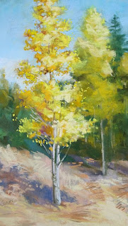
Aspens, 12" x 7", pastel

At last week's class we took a closer look at the anatomy of these lovely aspen trees, examined the bark a little, and discussed how to paint the light, leafy foliage and sky holes. Above you can see my demonstration painting, completed in the course of that day.
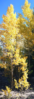
I cropped it and saturated the color of the original photo, blurring the tree behind it so I wouldn't be tempted to paint too much detail there. I removed the scanty little trees in the foreground, and reshaped the foreground considerably, as you can see. I never meant to copy the photo--in fact, it only launched my thinking and helped me to show the students how to begin the drawing/painting process. Very soon I brought to it the memory I have of the lively look of these lovely trees that shimmer in the breezes. For the purposes of our demonstration I wanted to draw near enough to show a bit about how to paint the bark and some of the details of foliage.

My best advice, when painting taller trees particularly, is to find the entire outside geometric shape of the foliage and trunk. In this case I began with a long, slim oval. If a few leaves protrude beyond the edge of that initial shape it's no problem, but encompass the entire top-to-bottom, side-to-side shape in essence. In this case I let the treetop go off the page and shrunk the trees behind it for more of an organic sense of perspective.

The light colored bark is diagnostic, but please don't use too much white to paint it. Find many colors that may be combined to create 'gray', the color that really best describes this bark, both in the sunlight and shadow. Don't pick up your standard, everyday gray. Locate the darker (not black) striations in areas where there might be stress, such as where branches protrude or the tree flexes in the wind.

Foliage is open and leafy, with the 'balloons' often elongated and loose. (See the chapters on how to paint trees and how to paint foliage for further information.) Use a characteristic rounded shape to describe aspen leaves, utilizing the 'haiku' approach at the intersections of the balloons of foliage, the sky or background. Details should be implied, not over-described.The color of the foliage can be almost a rainbow, with emphasis on warm, pale yellows, oranges and greens. Flavor those colors with lavender or magenta underneath, to give *pop* to the colors, relying on the blue sky behind the oranges for the same.

Sky holes shouldn't be mechanical, large-medium-small holes where the balloons intersect, but should be well designed, rhythmic and visually interesting. These openings give the tree dimension and help to lead the eye around the tree. Smaller gaps are slightly darker in value (but the same color) as the sky, because of intervening small branches.

I hope everyone is having fun painting these colorful, lively trees.

Keep going, gang!
Deborah