Monday, June 13, 2011

June 16—Gouache Basics


A simple "how-to" class in gouache, just to get you started. 

Gouache, which is simply opaque watercolor, has all the positive characteristics of watercolor and many characteristics that I love about pastel. Like pastel, you can work from the darks and add the light colors over the top, as well as correcting as many times as you need to, and as in watercolor you can work wet into wet, use washes and various other techniques. 

I'll teach the basics at this small class, letting the you play with whatever inspires you. We'll work from photographs, share the same color paints, play around with different brushes, and just find out what this fun and versatile medium can do. 

I'll provide two different kinds of paper, and the paint and brushes for an extra cost of $10, or you may bring your own. You'll need a small palette of some kind, such as a white dish or plate, or a plastic watercolor palette, and a small jar for water. 

This class is limited to five students. I have space left. Please RSVP (<--clickable link) to reserve a seat, if you haven't already. Pay $25.00 at the door + $10 optional materials fee.

* At my home in Taylor Ranch 11:30- 2:30, bring a sack lunch. I'll send directions via email by Wednesday to those enrolled.

Saturday, June 11, 2011

Paint the Summer Sky and Clouds class results


Who doesn't love to paint a billowing summer cloud looming over the hills? Well, I love it, as you can see from the example above. As promised, this is a PanPastel on Pastelmat, which is turning out to be the frontrunner for me in terms of painting materials, especially for these sky paintings.

I'd like to link you to two chapters in my free online book, called Landscape Painting in Pastels. First, take a look at the sky. There are some generalizations to keep in mind, among them:

  1. The sky is lightest at the horizon.
  2. The sky is darkest at the zenith.
  3. Even a slight gradation suggests this arch.
  4. Use more than one color layer.
  5. Winter skies tend to be purple-blue.
  6. Summer skies tend to be green-blue.
  7. The sky is brighter in the sun’s quadrant.
  8. The sky slightly darkens opposite the sun.
And next let's examine the clouds. Likewise, some 'rules' you might want to take into consideration:

  1. Clouds are whitest directly overhead.
  2. Clouds are dull and yellow-pink at the horizon.
  3. No cloud is pure white.
  4. Do not begin clouds with white.
  5. Try the green-peach-lavender triad for grays.
  6. Clouds have tops, bottoms and sides.
  7. Clouds cast shadows on other clouds.
  8. Clouds glow from the center outwards.
I suggest finding a photograph that is inspiring but not so complex that you're baffled about how to paint it. Do some cropping, if so, and find what expresses the scene without overwhelming you, or take it into a photo program and use a filter such as Smart Blur in Photoshop, to simplify it to shapes and values/colors. Print that out and use it as your resource, at least to begin with.

If you look down at the last post you'll see a photo of a painting demo I did at IAPS using the same photograph for inspiration. Don't limit yourself, thinking you've already painted that one--"paint it again, Sam!"

Keep going, gang!
Deborah

Monday, June 6, 2011

June 9--Paint the Summer Sky and Clouds


PanPastel demonstration painting on the easel at IAPS

Here in New Mexico our summertime skies are spectacular, with layers of beautiful clouds, blossoming thunderstorms and beautiful virga falling over the spectacular mountains and plains. I just returned from doing demonstrations using PanPastels at the 2011 International Association of Pastel Societies convention, where I painted our gorgeous skies, so I'm all warmed up for this class. 
On Thursday we'll discuss how to paint various kinds of clouds, looking at the structure, color, contrasts and 'rules' of clouds in the daytime summer sky. Any medium is welcome, as usual, but I'll be doing a demo with my PanPastels for the class.
We'll do a quick critique of work in progress, so feel free to bring one along for us to view and discuss briefly.
Our class is at the Paradise Methodist Church on the west side of Albuquerque, 11:30-2:30. Come at 11:00 to get set up, and feel free to bring a sack lunch. I'll have iced tea for us. Please RSVP (<--clickable link) if you haven't reserved your space already, but don't hesitate to come on along at the last minute!
See you on Thursday!

Deborah

Tuesday, May 31, 2011

June & July 2011 Classes REVISED SCHEDULE

There's no class this week. I hope those of you who are local will attend the IAPS convention! I'll be at The Pastel Journal booth on Friday and Saturday, as well as demonstrating PanPastels at their booth. Drop by and say hello.

Because of conflicting room availability at the church where I hold classes, I've had to revise our class schedule. Below is the new plan. I certainly hope you'll join me! Please contact me now to reserve your space.


June 9--Paint the Summer Sky and Clouds  
Our summertime skies are spectacular, with layers of beautiful clouds, summer thunderstorms, and beautiful virga falling. We'll discuss how to paint various kinds of clouds, looking at the structure, color, contrasts and 'rules' of clouds in the daytime summer sky. Any medium is welcome. (At Paradise Methodist Church, 11:30- 2:30.)  

June 16—Gouache Basics  
Gouache is opaque watercolor and has all the positive characteristics of watercolor and pastel. Like pastel, you can work from the darks and add the light colors over the top, as well as correcting as many times as you need to, and as in watercolor you can work wet into wet, use washes and various other techniques. I'll teach the basics at this small class. We'll work from photograph, share the same color paints, play around with different brushes, and just find out what this fun and versatile medium can do. I'll provide two different kinds of paper, and the paint and brushes for an extra cost of $10, or you may bring your own. You'll need a small palette of some kind, such as a white dish or plate, or a plastic watercolor palette, and a small jar for water. This class is limited to five students. Reservation required. (At my home in Taylor Ranch 11:30- 2:30, bring a sack lunch.)

June 23—How to use Photoshop for Paintings
I'll show you how I use Photoshop to prepare photographs to use for paintings. I use Photoshop Elements 2.0, but the tools I utilize are commonly available in Photoshop, no matter the version, so you should be able to adapt what I do. The space available at my computer is quite small, so we're limited to only five students. Reservation required. (* At my home in Taylor Ranch 11:30- 2:30, bring a sack lunch.)
FULL

June 30—Paint the Night Sky 
We'll explore painting the landscape at night, with a closer look at the night sky. I'll challenge you to cobble together two or more photos to create a nighttime landscape with a dramatic sky, perhaps including clouds, the moon or stars. Any medium is welcome. (At Paradise Methodist Church, 11:30- 2:30.)

July 14—How to use Photoshop for Paintings 
I'll show you how I use Photoshop to prepare photographs to use for paintings. I use Photoshop Elements 2.0, but the tools I utilize are commonly available in Photoshop, no matter the version, so you should be able to adapt what I do. The space available at my computer is quite small, so we're limited to only five students. Reservation required. (* At my home in Taylor Ranch 11:30- 2:30, bring a sack lunch.)
FULL
________________________________________________

Class Policies


The cost is $25.00 per class, payable at the door. I greatly appreciate it if you contact me to let me know you're coming. Occasionally, if the class is quite small, the location may be changed.

Monday, May 23, 2011

May 26--Final Critique and Class Potluck

You're invited to our final critique and class potluck. This will mark the end of our current session, so come ready to show your work from class and anything else you want to share with us. We'll have our usual class potluck brunch, too. Bring along a dish to share. We always have such interesting food! 

First, let's talk about what, in my opinion, a critique is meant to be. It's not necessarily a detailed analysis of each painting done one at a time, although in some instances that may come about. Instead, I prefer it to look at a body of work. This gives us a chance to see the progression of ideas through several paintings, noting things you're obviously enjoying and doing well, as well as the spots that have challenged you and may need more attention. This is why it's unwise to bring only the paintings you deem successful or finished--sometimes there are gems of information in those pieces that make us squirm. I see my role as supportive, helping you to grow and move on in your pursuits, whether you're a professional or amateur painter. Even two or three paintings will reveal a lot, although more are welcome and definitely reveal even more about your art journey. Don't hesitate to bring along work I've seen, and even pieces that have been viewed in previous critiques, framed or unframed, if you believe they will help illustrate your progress as a whole. 

What you won't get at one of my critiques is criticism. By that I mean no one is there to pass severe judgment or find fault with your work, disparage or denigrate what you're doing! I look at a critique as an opportunity to help you find the "point of friction." That's the place where, as you let the clutch out the gears engage and the vehicle moves forward. Finding this place takes a critic that you trust, someone you know has your success in mind and wants you to move forward, but understands that this can be complex and requires an artful touch. I don't want to grind the gears or fail to get you into gear, if you understand the metaphor.  

It's easiest if your paintings are ready to lean against the wall, already taped on a board so that you don't have to laboriously remove a lot of packaging or tape them up to view. We've found the Clearbags are great for transporting artwork, and wonderful to view paintings you're holding in your own hands, but not that great for the critique because of the reflections.

I think it's a good idea to spend some time
thinking back over this session, as you prepare your paintings, to analyze which classes seemed to inspire you most and why.  This session has been so fractured by various intervening events (the classroom not being available, my son's wedding, etc.) that it's hard to recall what we did back in March, so here are the topics we studied:
  1. Rocks Under Water
  2. Stylized Negative Trees
  3. Jigsaw Painting
  4. Ten Minute Challenge
  5. Be Inspired by: David Lloyd (interiors)
  6. Seascapes
  7. Mapping Movement
  8. Memory Painting
Of course, you can review the classes here on the blog by simply going backwards. Please feel free to bring anything you would like to have considered as part of the critique, in any medium.

So please come prepared to share some food and talk (AND see some of my art from 11:00-12:00, while we eat). Then we'll take time to look at one another's paintings. I'll be your critic, not the class as a whole, and each one of you will have time to show your own work. The cost is just $25, payable at the door, however please let me know if you plan to attend. Thanks. 

See you on Thursday,
Deborah


Friday, May 20, 2011

June Classes Offered

I'm offering four classes this June, all on Thursdays at the usual time, 11:30-2:30. The first two will be in my home, and the second two back at the classroom at Paradise Methodist. The charge is only $25.00 at the door. Reservations are required for the first two, as space is limited.


June 9--Paint the Summer Sky and Clouds 
(at Paradise Methodist Church)

Our summertime skies are spectacular, with layers of beautiful clouds, summer thunderstorms, and beautiful virga falling. We'll discuss how to paint various kinds of clouds, looking at the structure, color, contrasts and 'rules' of clouds in the daytime summer sky. Any medium is welcome.


June 16--Gouache Basics
(*in my home)
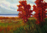
'Fall Reds', gouache
Gouache is opaque watercolor and has all the positive characteristics of watercolor and pastel. Like pastel, you can work from the darks and add the light colors over the top, as well as correcting as many times as you need to, and as in watercolor you can work wet into wet, use washes and various other techniques. I'll teach the basics at this small class. We'll work from photograph, share the same color paints, play around with different brushes, and just find out what this fun and versatile medium can do. I'll provide two different kinds of paper, and the paint and brushes for an extra cost of $10, or you may bring your own. You'll need a small palette of some kind, such as a white dish or plate, or a plastic watercolor palette, and a small jar for water.

This class is limited to five students, on a first come basis, so please reserve now if you want to take part.
Please let me know if you want to see another class like this one offered and I will form another session when we have enough participation.

June 23--How to use Photoshop for Paintings
(* in my home)

I'll show you how I use Photoshop to prepare photographs to use for paintings. I use Photoshop Elements 2.0, but the tools I utilize are commonly available in Photoshop, no matter the version, so you should be able to adapt what I do.

The space available at my computer is quite small, so we're limited to only four students
FULL--if you want to sign up for another class like this one, please let me know. As soon as there are four who want to sign up I'll organize the day and time.
 
June 30--Paint the Night Sky
(at Paradise Methodist Church)

We'll explore painting the landscape at night, with a closer look at the night sky. I'll challenge you to cobble together two or more photos to create a nighttime landscape with a dramatic sky, perhaps including clouds, the moon or stars.

Memory Painting class results

We had an intimate class...but fun and productive! I think this class is most helpful in showing you how much you rely on the photo or not. That alone can be so instructive. We talked about how the "bones" of a painting appeal most to artists, while the "skin" seems to matter more to the viewer.

I used this photo for my demo.

I spent some time looking at it and deciding where the major shapes resided, using my hand to 'paint' it. For instance, the large cloud shape along the left-hand edge stops about 2/3 of the way up, where the right-hand cloud is approximately half way. Each mass extends beyond the middle halfway mark, so they can each be described by circles that overlap slightly.

After gazing at the photo for a few minutes and analyzing it well, I put it behind me on a desk (where I couldn't cheat and sort of 'see' it--that's just too tempting!) I painted one pass over the paper to record the memorized shapes and colors and arrived at this:


It's painted using PanPastels on a piece of yellow Pastelmat paper, giving it a lovely soft focus, slightly blended look. I felt the colors were creeping into the sunset hour, so I pushed it that direction, adding a hint of color to the sky suggesting the setting sun is off to the right. This came about as I painted, not as a result of the photograph. I checked the details more as I progressed, to find the various cloud shapes when needed, but freed myself to make a painting out of it that contained my own ideas.


I hope you'll enjoy using this technique yourself.

Have fun, gang!
Deborah