Monday, February 7, 2011

Class 4— Feb. 10 – Vloothuis's “No-fly” Zone

Let's try this again! Click on this link from last week to review what we'll do this week. 

Class 4— Feb. 10 – Vloothuis's “No-fly” Zone
We’ll explore the effects of peripheral vision on all paintings, applying the concept of the “no-fly” zone to composing. Please bring one or more of your paintings, finished or unfinished, to examine for this critical means of looking at composing. The studio portion of this class is open to WIP (work in progress.)
 
See you on Thursday!
Deborah

Wednesday, February 2, 2011

Feb. 3 Class CANCELLED

I'm sorry but we have to rearrange our schedule as I can't teach tomorrow. We'll resume on Feb.10.

REVISED Class Schedule

Class 4— Feb. 10 – Vloothuis's “No-fly” Zone
We’ll explore the effects of peripheral vision on all paintings, applying the concept of the “no-fly” zone to composing. Please bring one or more of your unframed paintings, finished or unfinished, to examine for this critical means of looking at composing. The studio portion of this class is open to WIP.

Class 5— Feb. 17 – Evergreen Trees
I’ll email several photographs to you ahead of time so you can play with them—drawing, recomposing on the computer, or doing notan/ thumbnails—but you’ll paint in class after seeing a demonstration showing you some of the key elements you need to consider. The idea is to use the “rules” but customize things, enhancing the painting in your own way.

Class 6— Feb. 24 – Snow: White Without White
How can you paint colorful whites? Don’t use any white! I challenge you to paint from a photograph I’ll provide. Bring a piece of virgin white paper, any size or format, and a clean palette.  We’ll discuss how colorful snow (or any white subject) really can be.

Class 7— Mar. 3 – Abstract Landscape Painting: Robert Genn
In this first class of its kind for us, we’ll be inspired by the paintings of well-known Canadian painter Robert Genn, who has a knack for distilling the landscape. He is perhaps best known for his work on (Canada’s) West Coast and in the Rocky Mountains. His technique includes a tradition of strong design using patterns of color and form, with a pervasive sense of personal style. Come prepared to paint any WIP (work in progress) after this presentation and discussion.

Class 8— Mar. 10 - Final Critique and Class Potluck
We’ll do an in-depth crit of the paintings done in this class or anything you’re working on outside of class. Food and fun!


Monday, January 31, 2011

Class 4— Feb. 3 – Vloothuis’s “No-fly” Zone

Almost Spring, pastel, 11" x 17"
Recently Johannes Vloothuis used a phrase that caught my attention: the "no-fly" zone. This is the area along the bottom and the edges of a painting where elements are subject to the effects of peripheral vision. I'll discuss the details with you and we'll spend some time looking at the successful use of this idea in other artists' work.

This is really a lesson in looking and thinking, so I invite you to bring one or two of your finished or unfinished paintings, unframed or framed (but only if you're truly open to a critique), so that we can examine how to apply this idea to the nuts-and-bolts painting. 

The studio portion of this class is open. Bring whatever pieces you're working on, and please bring last week's Value of Value painting to show me at your easel, as well.

See you on Thursday!
Deborah

Sunday, January 30, 2011

The Value of Value class results

We really did have class last Thursday, and it really was of value. (Groan if you must. I couldn't pass that one up.) I've just been tied up and didn't get to the computer to post the results until now.

I'm going to post my notes for you, which don't quite read as a lecture, per se, but should help to get you there. 

The Role of Value in Composition and Color

Value before color! Why?  
It organizes the painting. 
It's the principal visual experience.

In black and white you understand color. In other words, you don’t need color to describe what you see, only tonal values. Value defines the shapes, volume, textures, transitions, movement and contrasts.

An apple without color still has the contour, form, volume and tone as an apple in color.

We hear:
"Use any color as long as the value is right." Is this true?
"The value can go wrong even if the color is right." Is this true?

"Value does the work, color gets the credit." Do you think so?

Value creates a visual pathway. How you mass the values moves the eye.You control the speed with tonal contrast.
            Speeds up to get to a strong contrasting value: black next to white.
            Slows down in gray areas.

Values make the underlying abstract pattern.
            Use three to five value shapes.
            Begin with larger, simple shapes first, to organize the painting.
            Make them unequal in weight using the size to draw the eye.
Divide them into smaller detailed areas.

Value is built on its surroundings, thus no tone remains independent of is background.
            Medium gray when surrounded by dark looks lighter, but when surrounded by light looks darker.
            Thus you control the value using its surroundings.
            Consider the overall tone of your painting: its Notan—reduced to black and white only.

Fewer values (three to five) often produce a more successful painting. More is not always better.

Value creates the mood of a painting.
            Low-key (dark) paintings, using chiaroscuro are dark and dramatic.
            High-key (light) paintings create lighter mood.
Use a dominant value.

Value is the underlying motivator of color.
            Mass together values and you strengthen color.
Use three to five colors of the same value for strength, beauty.
It’s not more color that makes a painting successful.
It’s understanding the value relationships and how they work together to build the painting.

Here I'm going to quote myself, from Landscape Painting in Pastels:
Color and value are inextricably intertwined. They're very much like a hand in a glove; although the glove exists independently in the material world, it does not function until the hand is inside it. So it is with the glove of color, which needs the hand of value to motivate it. Artists rely on color as one of the fundamental elements of painting. Value is an issue that comes up as the artist advances in skill and consideration of the theory of painting. Value or tone, which is the lightness or darkness of any color, is independent and exists with or without color. It's black and white and all grays in between, as well as all of the dark to light tones of any given color. It's an essential component of any color. You cannot separate color from its value, but you can and should consider value as an issue of primary importance, separate from color.

Understanding value can strengthen color. Most artists use color easily, almost without thinking, far more often than they consider the underlying, driving force of value. This doesn’t mean that they disregard value -- quite the contrary. Value is so intimately linked to color that they seem not to consider the hand apart from the glove. As the artist progresses through her career, value sneaks in, becoming increasingly important. As fundamental as it is, value is often left to the consideration of the more experienced painter. This should not be a surprise since, as in so many other disciplines, the further one goes into the depths the more elemental the concepts become. Still, the most experienced painter can learn new things, which is why art is one of the richest and most varied of pursuits and may continue for a lifetime.
 ________________________

You'll recall that I referred you to Sally Strand's work in the list of Basic Art Elements I posted in the Emulation Class, urging you to look at the great value structure she uses. She's renowned for her color, but explore it from a value standpoint!

Look at this painting she did, titled 'Awake'. First I reduced it to grayscale:

Analyze how she has massed the dark, medium and light values to move your eye around. Where to do you want to look first? Where does your eye skim over, and where does it linger? Why?

Now look at the same painting reduced to nothing but black and white shapes:

Do you think this is an interesting abstract painting in itself? Are the shapes still compelling and interesting?

And here's the painting in color:
I find that looking at work in grayscale shows the underlying structure of  the painting, while reducing it to purely black and white shapes massed together shows the value structure as an abstraction. If this is good, the painting is more likely to succeed.

(Thanks so much for allowing me to use your painting, Sally!) 
Click here to enjoy more of  Sally's work.

____________________________

The assignment was to make a finished black-and-white piece. This is a drawing I did in pencil, on an 8x11" piece of bristol board:


I saw some good work going on, this among them:

Gina's pastel

Looking good! Keep painting, gang!
Deborah

Monday, January 24, 2011

Class 3— Jan. 27 – The Value of Value

In this class we’ll use no color at all, only black, white and gray. You can paint in pastels, use black and white paint, or draw using pencil, charcoal or whatever media you like—but no color

What's the point? Value is the dark-to-light relationship of all colors in context to one another. It's what color is all about at its root. If you want to learn the effective use of color, you really must consider value (or tone.) Composing from a standpoint of value is a tool you should keep in your art box, too, so we'll be examining both color and composition in grayscale.

Yes, you may most certainly use this as a plan for a future painting to be done in color, but please approach it this week as an independent, finished black-and-white piece on its own. The difference is that if you think of this as a little exercise, you'll most likely just do a quick sketch, not far different from anything you'd do to plan the values of a painting. This piece is meant to be far, far more! It may be quite formal or it can be more casual, but it clearly should be a finished, framable artwork.

Spoon Basket, 12x9", charcoal
Shadowed Gate, 6x4", pencil

In order to help inspire you, I want you to search for an artwork that you think is successful even though it uses no color. Bring a print of it with you to our class on Thursday to share. This could be a piece done by anyone, at any time, in any medium, depicting any subject, but executed in black-and-white. Go look at what other artists have accomplished and spend some time analyzing why it works. You might look at pencil artists, those working on scratchboard or printmakers as possible sources, aside from painters. The graphic arts abound with good black-and-white work--but please seek out original work, rather than someone rehashing an image, which is also common.

Because I occasionally receive requests to use my photos, I'm also posting three photographs here that you may use as inspiration for your black-and-white piece. If you have your own photo that inspires you, feel free to use it. Please, gang, do NOT 'borrow' someone's photograph! I really don't want to see a calendar photo, or something from National Geographic, even if it's 40 years old. Consider taking some of your color photos and changing them to grayscale as a resource for this painting. (Hint: Plug your color photo into a Word document, highlight it and, using the photo toolbar, click on 'Color' and select 'Grayscale'. Adjust the contrast to your liking....Voila! One grayscale photo you can print.)

Anyone has permission to paint from my personal photographs below. Click on them to get a larger printable version. They have no copyrights or exclusions:


Feel free to tweak these grayscale photos any way you want to, flipping, cropping, lightening, darkening--anything you desire to make it your own. Just keep it grayscale for our class this week. The idea is to explore a detailed composition in black-and-white to hone the values. Don't feel trapped by the photograph. Change what needs changing in value! If an area is overly dark or too washed out, you can easily create the detailed values needed to better express that area in your piece. Come prepared to work in black-and-white in class, any size, any medium, any surface you care to use. 

Also bring with you the Repaint It piece from last week, if you like. I'll be interested to know if changing to another medium has gotten you thinking a little differently! We'll do a quick critique of ONE painting from each student to start our class, as usual. 

See you on Thursday,
Deborah

Thursday, January 20, 2011

Repaint It class results

I heard more people comment on how much fun we had today! There's something about diving in and just splashing around in a different medium that loosens you up and brings out the kid in you, I think.

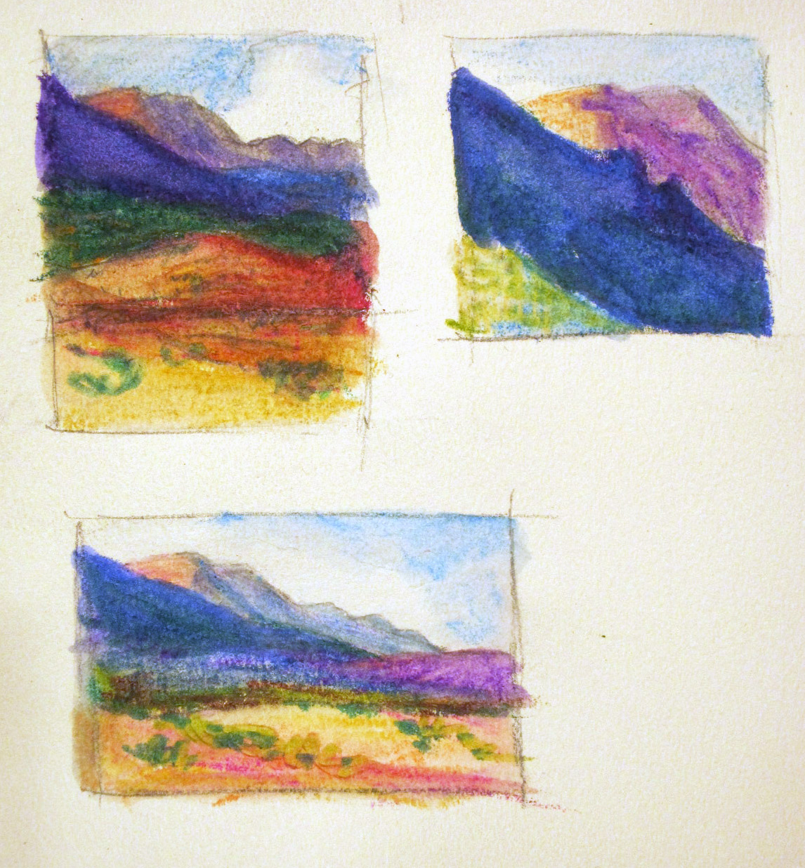
The idea was to repaint something that didn't quite satisfy you. I saw a lot of different subjects, all of which were promising paintings in their own right. We did a lengthy critique of each one, examining the strengths and weaknesses in them, and making suggestions on various ways to approach changing things. I showed some sketches I did last night, just to prime the pump. (I had planned to repaint one of these, but my plans changed, so I'm not showing the original pastel paintings.) Anyway, here are the drawings I did:


Each one of these is maybe 1.5" x 2" in size. The idea is to take the original painting and nudge it. Change the underlying shapes, or the color or composition, or choose one part you're most intrigued with and crop in close to it. I used a plain old #2 pencil and some Aquarell Crayons that were a gift. Interesting and fun to do. It's such a good way to get the juices flowing without spending too much time or materials...

I decided to paint from this old pastel painting that I found interesting but not particularly successful:


There are some very compelling parts to it, but all in all the underlying shapes don't work at all well, and the colors are pretty weird. It's on Canson paper, so there isn't much hope of reworking it.

In class today I used a piece of white Pastelmat paper and Createx Pure Pigments with soft charcoal, to make this WIP:


Here's a side-by side comparison that shows the light, color and energy of the new one even better:

 I still plan to go into the painting with gouache, I think, to add some opacity to it and continue the details. It's much improved already, IMHO.


I want to share a painting Bill did in watercolor that I think shows how exciting and fun it can be to play with a new medium:

Bill--watercolors
He remarked on how it wouldn't let him do the details he's so used to using, which is a distinct advantage for him at this stage of his development. He was painting on Wallis sandpaper, so he plans to use some pastel over the watercolor--I hope with a light hand.

Keep painting, gang!

Monday, January 17, 2011

Class 2— Jan. 20 – Repaint It

First a reminder: You can find the current class schedule here. Copy it and print it out for your records, if you like.
 
This week we'll be using a painting that you feel came close but just didn’t quite make it. My challenge is to repaint it, but instead of painting with your usual medium I want you to change your medium. I believe that this will enhance the process you use in your more accustomed medium. We’ll begin with a short group critique of the painting to help you decide what needs to be done. When completed we’ll look at the two paintings side-by-side. 
 
Let's talk a little about using another medium. I know most of us work in pastel or oil in the classroom currently, and you might not have a complete set of supplies to take you into another medium, however, think of it this way: How can you challenge yourself to think differently about your painting? Personally, over the years, I've found that when I get stuck on a painting it's incredibly freeing to go to another medium because it forces me to think about it all differently. 
 
 Don't keep doing the same thing hoping for change.
 
So instead of pastels or oil, try pencil, pens, charcoal, colored pencils, water soluble pencils, watercolor, gouache, or your kids' crayons--or any other medium you have on hand and want to try. 
 
Bring in a painting that you like but you know you can improve on, perhaps, instead of the one you hate and can't stand to look at. (The hated one should be wiped out, most likely.) We'll look at this almost-there painting together, and brainstorm how you could approach it in your new medium. Line up the materials you plan to use and bring them along so we can all help one another think about how to go about creating the second version. It need not be the same size, and I advise using the painting alone. If you happen to have the source photo, feel free to bring it along too, but it's not necessary.
 
No, I don't want to see a new, improved version of the old painting! At the end of our class on Thursday, I'm going to set aside the last half hour so the entire class can tour your easels and see the old and new versions side-by-side, in whatever state they've reached. You will probably continue to work on the new one at home, so feel free to bring both back the following week to show us, as well. (And if, after we've seen the old and new comparison, you believe you know how to continue to work on the original, of course you're more than welcome to do that. Just don't jump the gun on this.)
 
Pencil drawing
I think you'll be amazed at the fresh insight using a different medium will give you. This is a great technique to use when you get 'stuck' on a painting, or when you find yourself in the doldrums, unable to paint, which happens to every painter I know.
 
Too often we develop tunnel vision and think some new technical approach to the medium we're using will solve the problems, when in fact it's the thought processes and insight we bring to a painting that work effective changes most of the time.

I'm looking forward to seeing what you decide to do! If you have any questions feel free to ask. 

I'd also like to view and comment on your Emulation painting from last week at your easel, if you want to share it with me.

See you on Thursday,
Deborah