Saturday, November 19, 2011

The Sky and Clouds class results

CLOSED--CLASSES NO LONGER BEING OFFERED
Please see box to your left.
Blessings!
~Deborah Secor


Cloud demo, PanPastels and sticks on Pastelmat, 9" x 15"
If you would like all the details on how to paint the sky (Chapter 7) and clouds (Chapter 8), please visit my free book blog:  Landscape Painting in Pastels

If you're interested in purchasing my pastel paintings visit: Paintings for a Song

If you're interested in viewing or purchasing my gouache paintings go to: Deborah Secor: Gouache

Farewell! Keep painting, gang!

Deborah

Monday, November 14, 2011

November 17--The Sky and Clouds

Sangre Storm, 9x12"
Come along to the final class this week! 

I'll be teaching my favorite subject, the sky and clouds. We’ll review beautiful clouds, luscious grays, the light of the sky and how to achieve clouds that float. I'll do a lecture that's fairly extensive, plus a quick demonstration so that you have time to paint. 

Please bring your own resource photograph. Any size or color paper will do. Any medium is welcome. 

The studio opens about 11:00, and class is from 11:30-2:30. $25.00 at the door. Please RSVP to reserve a spot so I can be sure there's space for you at a table. Our space is limited.

See you Thursday!
Deborah

Friday, November 11, 2011

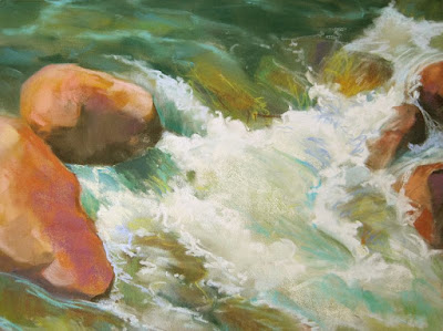
Moving Water class results

Rushing water demo in progress, 9x12"
The idea of this painting is to express rushing, tumbling, splashing, energetic, lively, and powerful water. These are the rapids, where water fights its way downstream against the impediments of rocks and boulders.

To paint this effectively, remember that gravity constantly moves water to the lowest point, so first find the direction the water is moving. Then analyze what's happening under the water, which always affects what you see on top. Ask what's shaping the water: a large boulder, a crevice between two or more rocks, a sandy beach, a graveled pit.

Think about the volume of the water that you see. Deep water moves more sluggishly much of the time, due to its own weight. Shallower water can more easily bounce and splash over and around rocks in the rapids.

Whitewater gives the impression of movement—the more churned up, the whiter it is. I suggest you start with darker colors beneath to establish what is affecting the shapes of the moving water before adding lighter colors. Put pure white away until the very end. Whitewater becomes opaque, which means that unlike clear water it tends to cast shadows, and shows shadows cast on it, too. This adds to the impression of depth, mass and volume in your painting.

Use different strokes to add rhythm.  Find a characteristic stroke, but vary it slightly in direction or gesture. Repeated identical strokes become a dull pattern that is NOT rhythmic. Varying textures also makes the water more believable. Use the haiku principle. A simple and stylized impression that's brief but powerful will have more visual impact than excessive detailing. 

It's also a good idea to analyze whether your composition will be best expressed in a horizontal or vertical format. Horizontal gives a low, swinging style, while vertical gives dramatic drops. You might consider exaggerating this for effect, perhaps using a long, narrow sheet of paper.Consider different colored ground, as well. An overall color commitment unifies a painting oftentimes, while using strongly contrasting or complementary colors can give some *pop* to the view. 

I hope you have fun painting this energetic and lively subject.
Keep going, gang!
Deborah


Monday, November 7, 2011

November 10— Moving Water


------- 
 
Please RSVP. **Note this, even if you're a 'regular' student and think you're signed up! The  space is limited--there are four remaining spaces. If you physically wrote your name on the list at class last week, you have a space reserved. Otherwise, please send me a quick email saying you're coming. I just want to make sure we can organize the space. Thanks. 

------- 


The beauty and energy of rushing, tumbling water is the subject of this week's class. Find a photo that shows lots of splashing, moving, energetic water. Look for good color, interesting shapes and strong value contrasts. 

We'll examine how express the tumble (downhill) and direction of water, how it moves and swirls around and over rocks, places where you're likely to find slow or fast moving water, and the creative ways you can use color, line, edge, value, and different kinds of strokes. 

Any type or size paper, and any medium you want to use, is welcome. Think creatively! Does this painting want to be small, an exquisite gem of a little painting--or would a larger, much more close-up section delight you more? Bring your own photos, please!

As usual, the class is $25.00, payable at the door. Again, your RSVP is  appreciated.
 
See you Thursday!
Deborah

The Mesa (and Volcanoes) class results

Class demo in progress, 9x12", Pans on Pastelmat
Our class last week was standing room only! It was fun to have that much energy going on in the classroom. I sneaked in a good long lecture on painting foregrounds, which is of course what these paintings of the grassy mesa often are comprised of, and did the above demonstration to get people thinking a little more. It's painted on a piece of 9" x 12" yellow Pastelmat, using mostly PanPastels and a few sticks.

Probably the most salient points about painting such a piece are:
  • The foreground must function to support the subject of the painting and not distract the viewer’s eye.
  • Allow your viewer to arrive at the focal area, providing a visual pathway of some sort.
  • Arrange various components to direct the eye, moving it quickly or slowing it momentarily, or perhaps allowing it to rest briefly in an area of quiet calm before moving on.
  • Because the greatest color, contrast and detail reside at your feet, it’s necessary to walk a fine line between enough and too much, if your center of interest does not reside there.
  • Use shapes to give movement to the work, making the foreground a vitally important and motivating part of the composition, an appealing and lively portion that does not distract. 
  • Oftentimes patterning is the key to solving foreground dilemmas simply because it creates an illusion or suggestion of detail without becoming disruptive. Look for the repeated overlapping colors and characteristic shapes found on the ground, such as low-growing grasses, small bushes, flowers, weeds and dirt.

Break up the foreground using:

• a fence line                                       • contrasting colors
• a vertical bush or tree                    • rocks
• overlapping grasses or bushes      • a change in plane
• shadows                                            • a reflection in a puddle
• a streak of light                                • patches of snow
• a road or pathway                            • a dry wash or sand patch

Keep going, gang!
Deborah