Friday, April 29, 2011

Seascapes class results

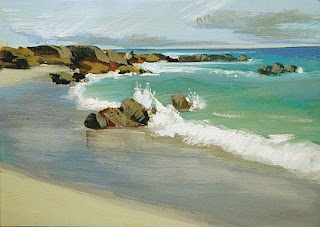
"Island Sea"

I’m no specialist in seascapes, since I've lived in New Mexico for 30 years, but I grew up on the beaches of California and spent a lot of time looking at the sand, cliffs, water and waves. This class is thus a survey of a few things to pay attention to as you paint the beach and ocean, not a specific inquiry into each element, which would require far more study.

Obviously we’ll be working from photographs, so let’s start with a good candidate for your painting. The shot of the beach and wave looking straight out to sea (A) can be boring, creating horizontal stripes that require a lot of creative widths to be very interesting. That’s actually a more challenging composition than you think. Too often it’s static, so if you choose this composition, carefully vary the widths of each band of color and be certain no line rests on the horizontal center line.

A


B

Instead a slight angle looking up or down the beach (B and D), including some of the sea, can often be more inspiring and interesting to paint. If there are cliffs or rocks, waves or splashes, wet sand or foam, you have many more opportunities for a compelling and vibrant scene.

C
     
Or you might find a shot taken from above (C) gives a great vista, showing cliffs, waves, water, rocks, and possibly shadows, etc. This can be equally fascinating.

D
No matter what, you should analyze the view and look for any tangents, such as the rock that‘s just kissing the horizon line in D. Push that rock up slightly, or drop it significantly under the horizon to create a sense of depth in different ways.

It might also be advisable to rotate your photo so that any horizon line is level as you paint it (D.) The ocean doesn’t slope sideways but a photo can make it appear that way. Establish a straight and level line of the visible horizon on your paper. Rulers are great tools invented for this purpose.


Let’s look at the sandy beach. I find it advisable to establish the local color of the sand, including sand wet by the incoming tide. Keep in mind that all beaches slope down toward the water, whether steeply inclined or not. Notice that you can see the sand color beneath the water in the shallows. Depending on the medium you’re using you might lay this color in first and layer over it, but no matter the procedure keep this sand color in mind as you paint. Wet sand is slightly darker and reflective. Add darks first, establishing the color of the wet sand as containing the dry sand color in a darker value, and then add light sky colors over the top. 


Add footprints last, often made up of a rim of lighter sand color on one edge and shadowy colors beside it.

Beach rocks can be interesting and compelling elements in the composition. All of the rules for rocks need to be observed (planes, planes, planes!) However, these rocks are softened by wave action.  Paint them with planes that have softened edges, paying attention to the characteristic fractures or holes.


Look at the submerged rocks as a darker color beneath the water, and add the flow patterns in the sand created by the receding water to capture the sense of rocks set down into the wet sand.


Cliffs along the beach will also add recession to a painting. Use more contrast and stronger, more saturated colors in the foreground, progressively using bluer and paler colors in the distance. 


Look for sets of waves, although the intervals and interrelationships of these sets is widely variable. Notice they all enter the beach from the same direction, usually following the beach line, but affected by any rocky outcroppings, manmade breaks, or a shallow or steeply inclined bay.


A wave is a complex shape. The water is moving due to its own energy, the contours of the sand and rocks beneath it, and whether or not there is a swell in front of it impeding its travel or behind it pushing it on. Keep all the lines of a wave rounded and fluid, no matter how hard-edged they are. Simplify the contours to see the relationships, defined by the values. Paint the colors beneath these shapes and add lighter colors as you progress, as well as reserving details for last.
           
The curl of a wave has a foamy splash where it lands on top of itself, and sea foam describes swells, cross-currents, back washes, and breakwaters. Oftentimes the brightest light in view is not this foam but sparkling reflections where sunlight dazzles. Notice in the photo below where the strongest lights are located, in opposition to the direction of the sunlight.


There’s a small but sometimes key element to pay attention to as you paint an incoming wave that has flattened and now speeds its way up the beach in a gently curving arch, marked with foamy bits. Look for the shadow you will often see along its edge there. It isn’t a hard line, and its edges fluctuate like a ribbon, helping to make the wave seem fluid and lively. 


Simplify the wet sand if the foam patterns are too complex to portray well. For instance, in the photo above you might make the arc of wet sand lavender, forgetting the foam there (yellow arrow.) Look for the color of the sand influencing the wave color, progressively growing darker as the water deepens, and use foam patterns to suggest water movement.

Is the color of the ocean darker near the horizon or lighter?


There is no hard and fast rule regarding this. It depends on the angle of the light, the conditions of the sky and the relative height from which you’re viewing things. I suggest you rely on your photograph to give you needed evidence of water color and value. However, I often find that the horizon line can become so blurry as to be nonexistent in some photos. I usually choose to show it somewhat more clearly in at least one location, which I find gives the viewer a solid sense of distance.

Let me share a few of my gouache paintings with you, each of which is 2.5" x 3.5" in size, on various kinds of paper:


"Sparkle"
               
"Sandy Shore"

"Sentinels"

"High Tide"


"Summer Bay"

"Wet Sand"


Monday, April 25, 2011

Class 6— April 28 – Seascapes

'Honeymoon Sea', pastel, 9" x 12"

Even though we don’t live near the sea, let’s take some time to explore some of the rules of painting the ocean, waves, cliffs and sky. Bring a good photo with excellent contrast, a simple subject, and good color.

I'll be concentrating on how to paint the incoming waves, the beach along the shore, and a bit on rocks and reflections. 

'Beach', gouache, 2.5" x 3.5"

'Cliffside View', gouache, 3.5" x 2.5"

'Island Sea', gouache, 2.5" x 3.5"

You're welcome to approach this subject in any medium, any size you like, and on any paper that works for you, although I generally recommend using a lighter colored ground. 

See you on Thursday!
Deborah

Monday, April 18, 2011

Reminder--No class

There's no class this week, but I hope you'll paint anyway.

  • You might take another look at the interiors painted by David Lloyd and be inspired. Set up in the house and paint a quick, loose piece capturing the light and color there, or perhaps shoot a photo at the restaurant you visit and give that a go. 
  • Or take your easel out into the sunlight and paint the garden. My iris are blooming!
  • Or spend a quiet couple of hours at the easel completing work you began in class. After all, you have a "spare" day, since you won't be coming to class.

And may each of you enjoy this season when we celebrate the Passover and the resurrection of Christ!

Blessings--but I won't see you on Thursday this week.
Deborah

Monday, April 11, 2011

Class 5— April 14 – Be Inspired by: David Lloyd (interiors)

Last session I presented the first inspirational slide show and discussion (devoted to Robert Genn), and it was so well received and instructional that I'm doing another one.

This time we'll look at the interiors painted by a favorite of mine, David Lloyd. Although he isn't as high profile as Genn, I think his light-filled, painterly visions of gracious homes painted in acrylics are quite worthy of study. I'm always looking for inspiration to try new subjects, and the idea of painting a "roomscape" or cafe scene is something I think would be interesting, so I offer this class to encourage and stimulate both of us.

(c) David Lloyd , @ Edward Montgomery Fine Art
'Tradition and innovation are of equal interest to David, and he believes one need not be shunned for the sake of the other. The familiar, impressionistic underpinning exhibited in his work reveals his roots as a traditional oil painter, while he currently utilizes the vibrancy and flexibility of modern acrylics to push the boundaries of this orthodox foundation. Often working in the abstract, David believes that freeform rehearsals are key in keeping his realistic pieces fresh, loose, and full of movement. This marriage of abstraction to verism, and modern medium to classical technique serves the artist's drive to create exceptionally dynamic paintings. Whether using simple washes, complex layers, or impasto techniques, David stretches his medium to its limits.

Influenced by 20th century illustrators, graphic artists, and classical painters alike, from realists to abstractionists, the breadth of David's interests yield a technique he describes as "a painterly fusion."'


We will also do a mini-critique of anything you're painting. This is meant to give you a boost along the way on one or two works-in-progress, to help you see where to go or trust what is already working. (Please understand that this is not meant to replace the final critique, at which I want to see how you have RESOLVED some of the issues we discuss in the mini-crit, as well as viewing a small body of your work and talking about your goals for the future.) And bring along your 10 Minute Challenge paintings to show us, please!

We'll have an open painting session after that, in which you can begin to apply some of the critique information, under my supervision, so bring along your materials and supplies as usual.

See you on Thursday!
Deborah


Friday, April 8, 2011

Ten Minute Challenge class results


Personally, I found this exercise to be one of the BEST we've done in my classroom in a long, long time. I learned a lot from it, and I saw some wonderful things happening in my students' work, as well. I must give a hearty thank you to Carol Marine for this idea, which was one of the Daily Paintworks Challenges in February this year. I've admired her paintings for a long time and I know she's a busy workshop instructor. No wonder!

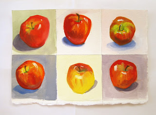
At the top is the sheet I painted yesterday and below are some close-up shots to show you the details. I found gouache to be a great medium for this experiment, although I was certainly tempted to use pastels. The ease of making color adjustments, as well as using edges and overlapping in pastel, lends itself to quick work, while the color shift and drying time of gouache may seem to work against you, but in actuality I think it resulted in some 'happy accidents' (a phrase I'm a bit tired of using...let's say 'pleasing incidents' instead.)

apple 1

apple 3
apple 5

Let me share some of the work done by my students. These were all in progress, and all are in pastel. Most of the divisions were in the 4"x6" range or smaller. We painted a total of 80 minutes yesterday, in 10-minute increments with breaks, of course. A few were a little frustrated at first, some just took off flying, and we all had to push ourselves to do the last couple of them, but in the end I think each of us benefited from this.

Annie's apples

A couple by Carol

 Jaffa's red bottle


Lisa's apples

All in all, this was another good class. I hope those of you who are taking part remotely will try this one and find it as helpful as we did.

Good job, gang!
Deborah

PS I have had to adjust this class schedule. Some dates have been changed and one class has been added, so please see the Current Class Schedule page for details.

Monday, April 4, 2011

Class 4— April 7– Ten Minute Challenge

You’ll divide your paper or canvas into eight smaller squares/rectangles, select a single simple object and paint it eight times, allowing only ten minutes for each one! You can change the viewpoint, alter the light, angle it differently—but only ten minutes per section. Can you say spontaneous? 

This class was inspired by the Daily Paintworks Challenge posted by Carol Marine. I suggest you take a look at the paintings there for some wonderful inspiration! 

It's easiest if you use one simple object and paint from life. I find it inspiring to have a colorful ground, too, since I'm painting the object over and over, so you might bring colored paper, a cloth or whatever you desire as a background. You aren't trying to paint the thing in radically different settings, or vary things too much, it's just that painting the same object eight times can get a little bit boring, so if you want to change the shadows or vary the arrangement a little, I think that's fine. However, don't lose sight of the main point and get bogged down in the variations. 
 
Go look at Carol Marine's painting, as well as what the others have done at DPW, but with an eye to the lesson, not the final product. It's not a competition to be creative or original, it's an opportunity to learn to express an object quickly and effectively. Speed will add fresh strokes to your work, and repetition shows you how to most effectively describe what's there. In theory the progression will show!

The idea is to paint it fast and well, learning to distill your strokes as you go, in order to express the thing effectively. If the object or the ground is too complex, with too many details, it takes longer to paint it effectively. I'll have my timer on hand and we'll paint together for ten honest minutes at a time. So remember KISS--keep it simple, sweetheart!

I think it's best if the squares or rectangles are in the 4x6" range, minimum, or a little larger. You can also use two small pieces of paper/canvasses and divide each one into four. Keep them the same size. I'll do a demo of one quick example in class.

See you on Thursday!
Deborah