Saturday, November 19, 2011

The Sky and Clouds class results

CLOSED--CLASSES NO LONGER BEING OFFERED
Please see box to your left.
Blessings!
~Deborah Secor


Cloud demo, PanPastels and sticks on Pastelmat, 9" x 15"
If you would like all the details on how to paint the sky (Chapter 7) and clouds (Chapter 8), please visit my free book blog:  Landscape Painting in Pastels

If you're interested in purchasing my pastel paintings visit: Paintings for a Song

If you're interested in viewing or purchasing my gouache paintings go to: Deborah Secor: Gouache

Farewell! Keep painting, gang!

Deborah

Monday, November 14, 2011

November 17--The Sky and Clouds

Sangre Storm, 9x12"
Come along to the final class this week! 

I'll be teaching my favorite subject, the sky and clouds. We’ll review beautiful clouds, luscious grays, the light of the sky and how to achieve clouds that float. I'll do a lecture that's fairly extensive, plus a quick demonstration so that you have time to paint. 

Please bring your own resource photograph. Any size or color paper will do. Any medium is welcome. 

The studio opens about 11:00, and class is from 11:30-2:30. $25.00 at the door. Please RSVP to reserve a spot so I can be sure there's space for you at a table. Our space is limited.

See you Thursday!
Deborah

Friday, November 11, 2011

Moving Water class results

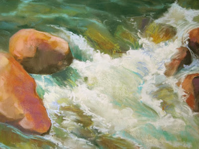
Rushing water demo in progress, 9x12"
The idea of this painting is to express rushing, tumbling, splashing, energetic, lively, and powerful water. These are the rapids, where water fights its way downstream against the impediments of rocks and boulders.

To paint this effectively, remember that gravity constantly moves water to the lowest point, so first find the direction the water is moving. Then analyze what's happening under the water, which always affects what you see on top. Ask what's shaping the water: a large boulder, a crevice between two or more rocks, a sandy beach, a graveled pit.

Think about the volume of the water that you see. Deep water moves more sluggishly much of the time, due to its own weight. Shallower water can more easily bounce and splash over and around rocks in the rapids.

Whitewater gives the impression of movement—the more churned up, the whiter it is. I suggest you start with darker colors beneath to establish what is affecting the shapes of the moving water before adding lighter colors. Put pure white away until the very end. Whitewater becomes opaque, which means that unlike clear water it tends to cast shadows, and shows shadows cast on it, too. This adds to the impression of depth, mass and volume in your painting.

Use different strokes to add rhythm.  Find a characteristic stroke, but vary it slightly in direction or gesture. Repeated identical strokes become a dull pattern that is NOT rhythmic. Varying textures also makes the water more believable. Use the haiku principle. A simple and stylized impression that's brief but powerful will have more visual impact than excessive detailing. 

It's also a good idea to analyze whether your composition will be best expressed in a horizontal or vertical format. Horizontal gives a low, swinging style, while vertical gives dramatic drops. You might consider exaggerating this for effect, perhaps using a long, narrow sheet of paper.Consider different colored ground, as well. An overall color commitment unifies a painting oftentimes, while using strongly contrasting or complementary colors can give some *pop* to the view. 

I hope you have fun painting this energetic and lively subject.
Keep going, gang!
Deborah


Monday, November 7, 2011

November 10— Moving Water


------- 
 
Please RSVP. **Note this, even if you're a 'regular' student and think you're signed up! The  space is limited--there are four remaining spaces. If you physically wrote your name on the list at class last week, you have a space reserved. Otherwise, please send me a quick email saying you're coming. I just want to make sure we can organize the space. Thanks. 

------- 


The beauty and energy of rushing, tumbling water is the subject of this week's class. Find a photo that shows lots of splashing, moving, energetic water. Look for good color, interesting shapes and strong value contrasts. 

We'll examine how express the tumble (downhill) and direction of water, how it moves and swirls around and over rocks, places where you're likely to find slow or fast moving water, and the creative ways you can use color, line, edge, value, and different kinds of strokes. 

Any type or size paper, and any medium you want to use, is welcome. Think creatively! Does this painting want to be small, an exquisite gem of a little painting--or would a larger, much more close-up section delight you more? Bring your own photos, please!

As usual, the class is $25.00, payable at the door. Again, your RSVP is  appreciated.
 
See you Thursday!
Deborah

The Mesa (and Volcanoes) class results

Class demo in progress, 9x12", Pans on Pastelmat
Our class last week was standing room only! It was fun to have that much energy going on in the classroom. I sneaked in a good long lecture on painting foregrounds, which is of course what these paintings of the grassy mesa often are comprised of, and did the above demonstration to get people thinking a little more. It's painted on a piece of 9" x 12" yellow Pastelmat, using mostly PanPastels and a few sticks.

Probably the most salient points about painting such a piece are:
  • The foreground must function to support the subject of the painting and not distract the viewer’s eye.
  • Allow your viewer to arrive at the focal area, providing a visual pathway of some sort.
  • Arrange various components to direct the eye, moving it quickly or slowing it momentarily, or perhaps allowing it to rest briefly in an area of quiet calm before moving on.
  • Because the greatest color, contrast and detail reside at your feet, it’s necessary to walk a fine line between enough and too much, if your center of interest does not reside there.
  • Use shapes to give movement to the work, making the foreground a vitally important and motivating part of the composition, an appealing and lively portion that does not distract. 
  • Oftentimes patterning is the key to solving foreground dilemmas simply because it creates an illusion or suggestion of detail without becoming disruptive. Look for the repeated overlapping colors and characteristic shapes found on the ground, such as low-growing grasses, small bushes, flowers, weeds and dirt.

Break up the foreground using:

• a fence line                                       • contrasting colors
• a vertical bush or tree                    • rocks
• overlapping grasses or bushes      • a change in plane
• shadows                                            • a reflection in a puddle
• a streak of light                                • patches of snow
• a road or pathway                            • a dry wash or sand patch

Keep going, gang!
Deborah

Monday, October 31, 2011

November 3— The Mesa (and Volcanoes)


Volcanoes, gouache, 2.5" x 3.5"

I live on the west side of Albuquerque where the mesa rises up, fronting several extinct volcano cones. The views are wide open, spectacular vistas of windswept grasslands, dark lava extrusions, and gentle slopes, or views of the city settled down into the tree-lined river valley with the giant range of the Sandias behind that. It's really quite spectacular, in a gentle, rolling way. On Thursday this week we'll look at the low growing bushes and grasses and various colors of rock surrounding the old volcanoes. 

This subject will give us a chance to discuss the basics of painting a composition that is mostly comprised of the foreground plane, including the issue of patterning, capturing aerial perspective in the horizontal plane, and how to keep the foreground interesting and supportive, but not distracting.

If you don't have any photographs of the area, let me know and I'll email a couple to you ahead of time so that you can print them out. I won't have prints on hand for this class!

As usual, the class is $25.00, payable at the door. Please RSVP  if you haven't signed up already. Because these are my last few classes (ending on November 17th) I've had a little more participation, and our space is limited. If I know you're coming we can arrange things so everyone has enough room. Thanks.
 
See you Thursday!
Deborah

Monday, October 24, 2011

October 27- Sunlit Snow and Shadows


What is more beautiful than sparkling snow and shadows? This gorgeous subject is inspiring. We'll take a good look at the basics of painting snow, including the value shift that occurs and the challenge of a white subject, as well as looking at the rules for shadows that are so clearly seen on snow. This will probably be a rather lengthy lecture and demonstration, but should be packed with information for you to take to the easel.

I’ll be painting in gouache with PanPastels over the top, so you’ll get a taste of wet and dry media together.
 
The studio opens about 11:00, and class is from 11:30-2:30. Any medium is welcome, as long as there are no strong smelling solvents. Bring a drop cloth for the table and floor, please. 

As usual, the class is $25.00, payable at the door. Please RSVP  <---(clickable link) if you haven't signed up already. Because these are my last few classes (ending on November 17th) I've had a little more participation, and our space is limited. If I know you're coming we can arrange things so everyone has enough room. Thanks.
 
See you Thursday!
Deborah

How to Make a Lousy Photo into a Wonderful Painting class results


A less than perfect photograph gives you, the artist, the opportunity to add to what you see, bringing your own vision into the process. Whether you're combining several photos into one, or simply have one of those photos that has something you like but isn't quite satisfying, I encourage you to experiment and see what you can come up with.

Here's one of my awful photos. It has such beautiful shapes in it, but the color and values are awful. Compositionally it needs help, but not a lot.


I suggest doing several credit card sized thumbnails to help you see. Start by drawing what is there, in order to be able to find exactly what it is you really find visually stimulating and interesting. I suspect you will easily spot things that don't please you.


I'm not at all happy with the tall dark tree. Half or less of an object never seems to work very well, plus the shadow it casts really cuts off the entrance to the picture. You can't enter it easily. But I love the massing of the bushes on the left side and the curve of the dirt road. The middle and far planes need work, but they should support the foreground, where I believe the interest lies.


After playing around I found this composition seemed most satisfying. I further refined it in a final thumbnail sketch:


This would be a good starting point for the painting, and from here I would do a more complete drawing, somewhat larger in size and further developed.


'Awful photos' demo, Pans/sticks on gray Pastelmat, 9x12"
 Here is my unfinished class demonstration painting, which combined five photos into one composition. All the photos were taken on the same day in the same location, yet each had different aspects that contributed to the success of the whole thing.

At the moment I wouldn't call it a "wonderful" painting, but I think it holds the promise of becoming one, given a bit more studio time.


You can see the three key photos I cobbled together, and my finished sketch, which is 4x6" in size. I like to sketch in pencil first, then move to the Pitt markers for the values they provide.

I believe that sketching from your photographs will inspire you, whetting your appetite to paint. It should help you see the beauty and rethink the problems.

Often using 'awful' photos as resources results in the most beautiful paintings, perhaps in part because the struggle helps you see more clearly.

Keep painting, gang!
Deborah

Monday, October 17, 2011

November Classes--The End of an Era

As I announced previously, I've decided it's time to move on to some other things, so I'm not planning to teach any more weekly classes next year. As far as I know, these will be my last three classes. Hope you can join me!

November 2011 Classes


November 3— The Mesa (and Volcanoes)

The low growing bushes and grasses, and various colors of rock surrounding the old volcanoes on the west side of Albuquerque are a special subject to me. We’ll examine how to paint the mesa and the beautiful sweeping vista beyond. Look for your own resource photographs of this area to use for paintings.


photo (c) Larry Seiler
November 10— Moving Water

Let’s look at the rhythms and colors of splashing water as it moves over rocks. Find a photo that inspires you to paint, with good color, contrast and interesting shapes.


November 17— Clouds and Skies

What better way to end 23 years of teaching than with my favorite subject? We’ll review beautiful clouds, luscious grays, the light of the sky and how to achieve clouds that float.


Please contact me to reserve your space in these classes now.


October 20- How to Make a Lousy Photo into a Wonderful Painting


I'm no photographer and maybe you aren't either. I usually end up with four different kinds of shots: the really horrible ones that might as well be thrown away; the occasional winner, that probably should just be framed; a certain percentage that are okay and seem like they can be used for paintings just as they are, and all the rest that are pretty awful but are too good to throw out. 

That last type is what we're going to look at this week. These awful photos usually have some promising elements, parts that could become an interesting painting, but miss somehow.  Maybe the composition is blah, needing a little tweak, or the color is dull and needs some oo-la-la added to it. Perhaps you took it from a moving car and the foreground is blurred, or it reminds you of the time and place and is your only shot, so you want to make it work.

I’m going to share several of my own relatively awful landscape photographs with you and discuss how we could go about making them into good paintings. We'll look at how you might use elements from different photos to improve the composition, or add ideas from your own experience or memories to make the painting more successful than the photo. You can use any subject, of course, but because I've worked in the landscape for so long I'll be examining that.
 
Look through your photos for some awful inspiration of your own. If you have multiple shots of a subject, or a series of the same subject taken at different times, bring them along. If you have only one photo, that's okay too. Bring along a sketchbook and pencils or whatever you like to use to draw, so you can do some preliminary sketches. Any size or color paper is fine, any medium will work.

As always, the class is $25.00 payable at the door.  The studio opens about 11:00, and class is from 11:30-2:30.

Please RSVP <---(clickable link) if you haven't signed up already. Because these are my last few classes (ending on November 17th) I've had a little more participation, and our space is limited. If I know you're coming we can arrange things so everyone has enough room. Thanks.
 
See you Thursday!
Deborah


Friday, October 14, 2011

Fall Mountain Vista Paint Along class results

This class turned out to be most interesting. We all painted from the photo below. It has so much going for it, but it's not perfect. We discussed at length what was of interest, what seemed weak, and possible ways to recompose it.

Photo (c) Jeanine Patterson.
Strengths:
  • beautiful colors in sky, lake and trees
  • excellent contrasting values
  • nice shapes in the lake and middle hillside
Weaknesses:
  • low horizon
  • two tall and two medium trees
  • trees the same height
This is a "here and there" painting. In other words, it has trees right up here in front, and a distant view out there. There's little linking here with there. We discussed using one big spruce tree right in front to establish where our feet must be, as well as possibly using one aspen as a 'pointer' to guide the eye up toward the area of greatest interest. The question was, which ones and where?

We agreed that the area of greatest interest is the sheen on the lake surrounding the curve of the hillside. The complex positive and negative shapes, the contrasting values, and curving shapes draw the eye.

It's best to make some sketches to see what looks good, of course. I tried using one large tree on the left side, but it seemed unbalanced. Then I tried one medium tree on the right to break up the large mass of the middle hill, but that seemed stunted. I liked the higher horizon line.


In the end , as a result of our discussion, I decided the composition worked well with a high horizon, a pointer gently guiding the eye into the area of interest, and the large pine tree establishing the footing for the viewer.

Demonstration (in progress), 9x12" pastel
My students took off with the idea and reinterpreted it in different ways to suit their own style and thoughts. It's always fun to see how the class discussions feed into the resulting paintings. Each one is unique.

Keep painting, gang!
Deborah

Monday, October 10, 2011

October 13- Fall Mountain Vista Paint Along

At this class I plan to hand out a printed photograph you can use for your painting, the same one I will use for my demonstration. This means that I need to receive an email from you CONFIRMING that you're coming to class at least one day in advance, or I won't have a photo for you to use! 

I have a beautiful shot of a grand vista in Colorado with some very interesting challenges in it: distant aspen-dappled mountains, a blue lake, and large pines and aspens in the fore. I’ll pass out the photo at class and lead a discussion on how to solve the problems. 

Bring your materials and come ready to explore what you think will work. I'll be working in PanPastels and sticks on Pastelmat paper, but you're more than welcome to bring any medium. The image is horizontal, and you may use any size paper or canvas you like, but it's in the standard 8" x 10" or 16" x 20" format.

This is more of a composition, design and color theory class than an actual "paint along"--but it's a close as 
I get to that, so come on along and let's give it a try together!


As always, the class is $25.00 payable at the door, and this week I need your RSVP to provide a photograph for you. 

The studio opens about 11:00, and class is from 11:30-2:30.

See you Thursday!
Deborah

Colorful Aspens class results

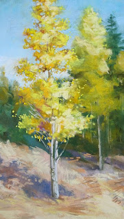
Aspens, 12" x 7", pastel

At last week's class we took a closer look at the anatomy of these lovely aspen trees, examined the bark a little, and discussed how to paint the light, leafy foliage and sky holes. Above you can see my demonstration painting, completed in the course of that day.

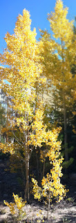
I cropped it and saturated the color of the original photo, blurring the tree behind it so I wouldn't be tempted to paint too much detail there. I removed the scanty little trees in the foreground, and reshaped the foreground considerably, as you can see. I never meant to copy the photo--in fact, it only launched my thinking and helped me to show the students how to begin the drawing/painting process. Very soon I brought to it the memory I have of the lively look of these lovely trees that shimmer in the breezes. For the purposes of our demonstration I wanted to draw near enough to show a bit about how to paint the bark and some of the details of foliage.

My best advice, when painting taller trees particularly, is to find the entire outside geometric shape of the foliage and trunk. In this case I began with a long, slim oval. If a few leaves protrude beyond the edge of that initial shape it's no problem, but encompass the entire top-to-bottom, side-to-side shape in essence. In this case I let the treetop go off the page and shrunk the trees behind it for more of an organic sense of perspective.

The light colored bark is diagnostic, but please don't use too much white to paint it. Find many colors that may be combined to create 'gray', the color that really best describes this bark, both in the sunlight and shadow. Don't pick up your standard, everyday gray. Locate the darker (not black) striations in areas where there might be stress, such as where branches protrude or the tree flexes in the wind.

Foliage is open and leafy, with the 'balloons' often elongated and loose. (See the chapters on how to paint trees and how to paint foliage for further information.) Use a characteristic rounded shape to describe aspen leaves, utilizing the 'haiku' approach at the intersections of the balloons of foliage, the sky or background. Details should be implied, not over-described.The color of the foliage can be almost a rainbow, with emphasis on warm, pale yellows, oranges and greens. Flavor those colors with lavender or magenta underneath, to give *pop* to the colors, relying on the blue sky behind the oranges for the same.

Sky holes shouldn't be mechanical, large-medium-small holes where the balloons intersect, but should be well designed, rhythmic and visually interesting. These openings give the tree dimension and help to lead the eye around the tree. Smaller gaps are slightly darker in value (but the same color) as the sky, because of intervening small branches.

I hope everyone is having fun painting these colorful, lively trees.

Keep going, gang!
Deborah


Monday, October 3, 2011

A Change of Direction


To my dear students and friends--


For over 23 years now I've enjoyed teaching art classes, but recently I've begun to feel a divine nudge to move in a different direction.

My husband and I have been actively involved in various ministry opportunities over the last 13 years, primarily reaching out to the poor and homeless. After a time of caring for my aged mother before she passed on, we now feel that we're being called back into another more intense period of service. Neither of us is sure what that will be, but it's time for me to take a sabbatical from teaching in order to be available to find out from the Lord where He will lead us.

This gives me a lot of mixed feelings, as you can imagine. It saddens me to think that I won't prepare and teach a weekly class, and see those who have become friends over so many years together, but it also lifts my heart to think that I may end up serving in a way that is exciting for its spiritual implications. Since you know me, no doubt you know that I believe with all my heart, mind, soul and strength that I must be about the business of spreading the gospel, the good news of salvation from the Lord Jesus. So you know this is most important and uplifting to me, too.

Because several of you have generously paid in advance for a few classes, I can't simply disappear--which I wouldn't actually do anyway (although I admit it was a temptation, as it's hard to say goodbye to weekly classes after this length of time.) As it stands, I plan to offer classes each week from now through November 17th, the week before Thanksgiving, so that those of you who have already paid for classes have the opportunity to attend. I already have the October classes planned and posted, and will post the November plan in a couple of weeks, too. So I ask you to please consider what you've invested and take the remainder of what I owe you in the next few weeks.

If there's one thing I've learned in my walk with the Lord it's that I shouldn't try to read His mind, so I'm not making any plans that are more definite than this. Is this the end of classes, my total retirement from ever teaching again? I don't know. My plan is to finish this year (we always take a break after Thanksgiving, so that ends my teaching year), and to wait on Him to see what comes next.

I have begun writing another book, and may present it in a weekly blog format, as I did with Landscape Painting in Pastels. This one may be for sale at a modest cost. I don't  know yet. The topic is a bit different, but one I feel really compelled to write. It actually derives its content from this class blog and a lot of other classes I've taught over the years. I'm giving it the working title of:

BREAKTHROUGH!
Exercises and experiments you can do to
·    advance your artwork to a new level
·    break out of the doldrums
·    or just have some fun!

When/if it becomes a reality I'll be sure to post a link here for you.

So, that's the big news, the new plan, and my hopes, all rolled into one BIG announcement. We'll see where this leads next.

Meantime, see you in the next six weeks, I hope.

Keep painting, gang!
Deborah

October 6- Colorful Aspens

 
This week is the PERFECT time to study aspen trees! It's cooler and the trees along Sandia are already painting the top with licks of gold. I’ll show you some of my tips on how to capture the gorgeous colors of aspen trees turned to gold. 

Well start with a review of the basics of tree anatomy so that you can draw the trunk, branches and balloons of foliage more accurately. I'll also show you a bit about how to approach light colored bark in and out of  shadows, and talk about ways you can handle the background trees or mountains. I want to take some time to discuss tree holes and the sky behind the foliage, too. 


Bring your own photos or borrow one of mine. I have a wealth of photos that a friend took recently and I'm more than happy to share them with you. I can't afford to print a zillion copies, but if you'll let me know I'll send a couple of files to you ahead of time and you can print your own.
 
Any medium is welcome, as long as there are no strong smelling solvents. Bring a drop cloth for the table and floor, please.
 
As usual, the class is $25.00, payable at the door. If you plan to attend, please RSVP now.  
 
The studio opens about 11:00, and class is from 11:30-2:30. Feel free to bring your lunch. Remember, we're at the new location at CCF.
 
See you Thursday!
Deborah

Monday, September 26, 2011

October Class Schedule

October 2011 Classes


  • October 6- Colorful Aspens
I’ll show you how to capture the gorgeous colors of aspen trees turned to gold. 

You’ll get a review of the basics of tree anatomy, a bit about how to approach light colored bark in and out of the shadows, and some ideas about how to handle a background and the sky behind them.


Bring your own photos or borrow one of mine (reserve your print in advance, please). Any medium is welcome.


  • October 13- Fall Mountain Vista Paint Along

A NEW class!
Join me to paint an inspirational photograph together! I have a beautiful shot of a grand vista in Colorado with some very interesting challenges in it: distant aspen-dappled mountains, a blue lake, and a large pine and aspens in the fore. I’ll pass out the photo at class and lead a discussion on how to solve the problems. You bring your materials and come ready to explore what you think will work. Use any media you like. I'll be working in PanPastels.

 
  • October 20- How to Make a Lousy Photo into a Wonderful Painting

I’m going to share several of my own ‘awful’ photographs with you and discuss how we might go about making them into good paintings. So often a picture has some promising elements, but it just misses. Don’t toss those out! Let’s discuss how you can use several photos and combine them into one successful composition. So look through your photos for some awful inspiration! 

  • October 27- Sunlit Snow and Shadows

The rules for shadows are so clearly seen in the snow. I’ll also give you a review of the basics of how to paint snow in sparkling sunlight (but I'm not going to paint all those snow-dotted trees--come see why and what I do instead!)

I’ll be painting in gouache with PanPastels over the top, so you’ll get a taste of wet and dry media together. Any medium is welcome.


  • PLEASE NOTE: At the present time I plan to continue classes until November 17th, so if you have any credited classes, please arrange to use them during this time. No carryovers  to 2012, please! Thanks, gang!

September 29- Critique and Potluck Brunch


We’re planning a painting critique and potluck brunch this Thursday, and we’d love to have anyone join us. You might have attended our critiques before-- if you have you know how fattening delicious it can be and how much fun we have!

Bring your paintings ready to show, but not necessarily matted or framed. I’ll be happy to look at work in progress, as well. I’d love to view a small body of work so that we can get a sense of the direction you’re traveling, and will happily guide you in questions you have about individual paintings, too. Any medium, style, or subject matter is welcome.


At the critique we’ll start with brunch and a discussion about what it means to grow as an artist, especially as you become more mature in your work. Does that mean that you cease to change? Of course not. But the changes change, if you know what I mean. Let’s talk about it! Then we’ll view the work of one artist at a time.

We’re in a new location, in case you haven’t joined us recently, at Christ Community Fellowship church. We still have a small kitchen with a microwave, if you need to heat anything. It’ll be informal--we’ll be using paper plates. Bring your artwork and some kind of wonderful dish to share. 

Class begins at 11:30, but the doors open earlier to set up the meal. As usual, the cost is $25.00, payable at the door. If you plan to attend, please RSVP. 

See you Thursday!
Deborah


Tuesday, September 20, 2011

Cloud Boxes Tutorial

I just have to link you to this wonderful little tutorial by artist John Hagan on CLOUD BOXES.

I've used this as a theory for years, taking things a little farther, but I want you to see the original idea, and his wonderful illustrations. Here in New Mexico we often see this kind of perspective in the sky.

Put this one into your favorites!
Deborah

Monday, September 19, 2011

September 22- Extract Nature’s Colors


Let nature inspire the colors you use.

The colors of nature are truly the inspiration for the way we think about and use color, of course. In this class I want you to spend some time making a record of various colors you see together in the natural world, extract color charts from what you observe, and then create an interesting abstract painting using the charts. 

Perhaps you see cottonwood leaves turning colors, or the grasses in the front yard. Maybe you’re inspired by a ristra on your deck or some flowers, or weeds that are beautiful (the colors can be!) Remember—not the pot on the porch, not the paint on the wall—only natural colors. It’s best if these are strictly related colors (i.e. not the sky behind the trumpet vine, only the colors of the plant itself; the flowers and their leaves, not the warm, dark dirt below them.) 

You can see in the photo how I've chosen some of the colors from the trumpet vine and arranged them into a palette of colors above the photo. You can do one of several things: 
  • You might want to take good color photos that are fairly current before this class and print them out to bring with you.
  • You could make some color studies on location and bring photos with you of the things you studied. This could be more practical if you decide the entire cottonwood tree is your best inspiration, for instance. 
  • You may alternatively choose to bring items to study in class, perhaps a ripe pear, a beautiful flower or weed, some leaves on a branch, whatever you like.

In class we’ll make a palette of colors from nature, whether you use a photo or work from life—but the trick is, we will NOT paint those references. Instead, I want you to find beautiful harmonies of colors and analyze the proportions of each one, as well as analyzing the dark and light, warm or cool colors, and then use them to make a color chart.  

From this you will paint an interesting abstraction in class. Do I hear someone muttering that you don’t like abstracts, that they never work out? Well, never fear--this exercise will give you a template to use, so that won’t be a problem.

To do the class you'll need a clean, white surface large enough to accommodate a palette of five to seven color swatches, as well as whatever paper or canvases you want to use to paint the abstractions. I have templates for the experiment in abstraction that are 7" x 8" or 6" x 6"-ish, which you can adapt to make larger. I suggest keeping it somewhat smaller in size, however, because if you're inspired by this experiment, you might want to make more than one palette and/or abstraction. It's really quite interesting to see the results.

So come this week with an adventurous spirit and see what happens! I'm sure it will be fun and inspiring! 

As usual, the class is $25.00, payable at the door. If you plan to attend, please RSVP now.  
 
The studio opens about 11:00, and class is from 11:30-2:30. (Feel free to bring your lunch. We have a microwave.) Remember, we're at the new location at CCF.
See you Thursday!
Deborah

Inspired by the Artist class results

I often find the work of other artists inspirational, and over the years have come to rely on dipping into the visual stimulation of looking at artwork to spur me to be more creative. In this Internet age that has become easier to do than ever before. Our recent class was meant to stir up some creativity this way.

We began by reviewing the elements of art to help analyze what this artist did so well and give us a handle to grab onto as we experimented. I challenged my students to look at this list and find three of the key descriptors about the artwork they were examining. It's just too easy to be overwhelmed by how good an artist is at doing what you would like to do, and thus missing the way or ways you might actually learn from them!

Here's a list of basic art elements to examine:
  • Color
    • Is the color soft, harmonious, monochromatic or brilliant, exciting and saturated? Is there a pleasing unity or contrasting variety of color? Color creates mood.
  • Contrast
    • Many elements may contrast in a painting; size, colors, values, etc. The area of highest contrast draws the eye first.
  • Texture
    • Physical strokes on the paper make texture, as does the look of a surface quality. Varied textures makes interest: rough, smooth, soft, hard. One texture is flat and boring.
  • Strokes
    • Consider the variety, energy, and the scale of strokes. They can be thick, juicy and descriptive, contrasted with smooth passages.
  • Detail
    • Smaller touches that describe how something looks. Eye-catching. Too much overall becomes no detail at all.
  • Edges
    • Soft and hard edges, both “lost and found”, help to sculpt space in a painting.
  • Line
    • The continuous mark made on some surface by moving a pen or brush, or the edge created when two shapes meets. Often an outline, contour or silhouette. Adds emphasis, but can detract if over used.
  • Gradation
    • Gradating of elements in size makes linear perspective, and in color and value makes aerial perspective. It creates form, and moves the eye around a form.
  • Repetition
    • Repeated elements make interesting variety. Monotony results when there is little variation.
  • Balance
    • Balance is created by repeating same shapes or giving equal weight to all quadrants or parts of a composition, or may result from a harmonious use of the elements.
  • Dominance
    • One to three dominant elements are interesting and may harmonize a composition, adding needed emphasis.
  • Form
    • Form has height, width, depth, defined by light and shadows. There are two types of form, geometric (man-made) and natural (organic form). Often key in painting a still life or a portrait.
  • Movement 
    • The overall direction of the eye through the painting, giving action to the piece.
  • Rhythm 
    • Syncopated movement that starts and slows the eye’s path through the painting.
  • Proportion
    • Creates a sense of correct scale so that all the objects appear to be related properly in space.
You'll recall from last my last post that I was inspired by Richard Schmid's floral sketches. My demonstration painting was meant to use three key elements of his work that I wanted to emulate: the clean edges and soft transitions he creates; the exquisite rhythms of his work, and the beautiful variations in texture he uses, especially in the backgrounds.

I worked in gouache on a piece of Arches 300 lb. cold pressed watercolor paper that's approximately 6" x 8" in size, using a photograph of some flowers I had on hand.


While I can't claim to have digested all of the information in this one quick painting, I was greatly inspired by his work and I learned a lot from emulating him. That's exactly what I hope this lesson will do for my students. Be inspired!

Keep going, gang,
Deborah